Scoring genre clarity...
Scoring genre clarity...
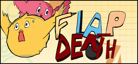
FlapDeath scores 62/100 — better than 1% of Co-op capsules (n=1,776).
$0.99 · Released Apr 10, 2026 · By DEVOC
FlapDeath scored 62/100 on Steam Analyzer — Solid for a Co-op capsule. Top priority fix: [composition] Reposition title to the top or bottom edge with clear safe margins, removing overlap with character art to establish a single focal point.
Steam app ID: 4303460 · Tags: Co-op, Online Co-Op, Multiplayer, Cartoon, Hand-drawn