Scoring genre clarity...

Working Through The End capsule

Working Through The End

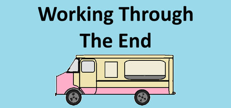
Working a weird ice cream truck as the world ends around you. Day after day, apocalypse after apocalypse, you keep working because even as the world ends, those bills need to be paid. Working Through The End is a point-and-click game where you take orders, deal with problems, and work off your debt.

$2.00Positive(10)
SimulationActionPoint & Click
Slippery GamesFeb 2, 2026

Working Through The End scores 60/100 — better than 0% of Simulation capsules (n=5,188).

Positive (10 reviews) · $2.00 · Released Feb 2, 2026 · By Slippery Games

Quick text summary

Working Through The End scored 60/100 on Steam Analyzer — Solid for a Simulation capsule. Top priority fix: [contrast_color] Add a darker background or gradient layer behind the truck to increase value separation and ensure the capsule pops against Steam's #1b2838 background during quick scrolling.

Capsule scores by dimension

  • Genre Clarity: 5/10 — Ambiguous gameplay, clear setting. The ice cream truck is immediately recognizable and sets a service/management expectation, but the apocalypse context is not visually communicated at any size. At TINY size, viewers see only a colorful truck on a light blue background with no cues about the apocalyptic or debt-driven narrative, making it read as a lighthearted simulation rather than a darker indie point-and-click experience. Genre messaging conflicts between the cheerful aesthetics and the serious thematic premise.
  • Title Readability: 7/10 — Clear but generic presentation. The title 'Working Through The End' is rendered in clean, black sans-serif font centered above the truck with strong contrast against the light blue background. At FULL size it reads perfectly; at SMALL size it remains legible with no distortion. At TINY size the text becomes compressed but remains readable due to high contrast and bold weight, though the impact softens considerably due to size reduction.
  • Contrast & Color: 7/10 — Strong value separation, limited depth. The black title text pops decisively against the light blue background, and the pastel truck with pink and cream tones creates clear silhouette separation even at TINY size. The overall palette is bright and friendly but lacks the visual punch needed to compete in quick Steam scrolling; the light blue background does not provide dark contrast like the Steam #1b2838 color, creating a jarring visual shift when viewed on the platform's dark interface.
  • Uniqueness & Polish: 5/10 — Competent but generic indie aesthetic. The simplified line-art truck style is clean and intentional, matching typical indie game presentation standards. However, the visual does not communicate the unique hook of working an ice cream truck during an apocalypse; the design reads as a cheerful service-game capsule without narrative weight or distinguishing visual storytelling that hints at the debt and apocalypse themes. Compared to top performers like DAVE THE DIVER or DREDGE, this lacks a memorable visual signature or tonal clarity.
  • Brand Consistency: 6/10 — Consistent but underdeveloped identity. The art style is internally cohesive—the flat, outlined truck illustration with soft pastel colors shows a consistent approach to rendering. However, without reference to store screenshots or other brand materials, there are no iconic motifs, symbols, or recognizable identity cues that would anchor the brand; the truck itself could be generic, and the palette is pleasant but not distinctive enough to be remembered or associated with this specific game.
  • Composition: 6/10 — Balanced but centered and static. The layout places the title centered at the top and the truck centered below, creating symmetrical balance but little dynamic hierarchy or depth. The truck is the clear focal point and remains readable at all sizes, but the composition feels static and lacks layering or supporting visual elements that would add sophistication. Safe margins are maintained, but the centered approach and empty sky space create a feeling of wasted prime real estate without adding narrative context or visual storytelling.

What works

  • Strong title contrast and readability. Black sans-serif text is crisp and legible at all sizes, maintaining clarity even when compressed to TINY size on Steam's dark interface.
  • Clear focal point with the truck. The ice cream truck illustration is instantly recognizable and immediately communicates the core service mechanic without ambiguity.
  • Internally consistent art style. The flat line-art rendering and pastel palette are cohesive throughout, demonstrating intentional visual direction.

What hurts the capsule

  • No visual hint of apocalyptic theme. The cheerful truck and bright blue background completely omit any visual cue about the game's darker narrative of working through the end of the world, creating a tone mismatch.
  • Light background conflicts with Steam dark mode. The light blue background does not translate well against Steam's #1b2838 dark interface, reducing contrast impact and visual pop during quick scrolling.
  • Generic indie aesthetic lacks distinctive hook. The simplified truck design and pastel palette are pleasant but do not communicate a unique selling point or core mechanic that distinguishes this game from other management simulators.
  • Static centered composition feels uninspired. The symmetrical layout with centered title and truck lacks dynamic hierarchy, depth layering, or visual storytelling that would elevate the capsule above baseline competency.

Priority fixes

  1. [contrast_color] Add a darker background or gradient layer behind the truck to increase value separation and ensure the capsule pops against Steam's #1b2838 background during quick scrolling.
  2. [genre_clarity] Incorporate subtle apocalyptic visual cues such as a darkened sky, storm clouds, or environment decay to communicate the game's unique thematic premise and differentiate it from cheerful service sims.
  3. [uniqueness_polish] Introduce supporting visual elements or narrative context—such as stressed customer silhouettes, overgrown surroundings, or a debt meter—that hint at the core emotional and mechanical conflict.
  4. [composition] Shift to an asymmetrical layout with the truck positioned off-center and title integrated into the design space to create dynamic hierarchy and visual interest at SMALL and TINY sizes.

Store copy priority fixes

  1. [feature_communication] Replace 'When the world is ending, each day brings new challenges' with specific examples: 'Meteor showers damage the truck,' 'Zombie hordes steal supplies,' 'Government collapse freezes your bank account'—give players 2-3 concrete threats they'll face.
  2. [uniqueness] Expand the apocalypse variety paragraph to explain how apocalypses escalate or differ: 'Each day presents a new doomsday scenario—from alien invasions to economic collapse—forcing you to adapt your strategy or face ruin.'
  3. [feature_communication] Rewrite the 'Extra Stuff' section with concrete value propositions: 'Unlock Survival Mode to face relentless catastrophe, Endless Mode for high-score chasing, and 20+ achievements tied to specific strategies or catastrophes.'

Related guides

Steam app ID: 4305510 · Tags: Simulation, Action, Point & Click, 2D, First-Person