Scoring genre clarity...

Soko Pirates capsule

Soko Pirates

Classic Sokoban in a pirate style with hand‑drawn pixel art - push crates, solve carefully designed puzzles, and relax in short sessions.

$2.992 user reviews
CuteCasualRelaxing
Matrix ReliabilityApr 16, 2026

Soko Pirates scores 65/100 — better than 9% of Cute capsules (n=4,529).

2 user reviews · $2.99 · Released Apr 16, 2026 · By Matrix Reliability

Quick text summary

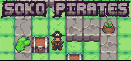
Soko Pirates scored 65/100 on Steam Analyzer — Solid for a Cute capsule. Top priority fix: [title_readability] Redesign 'SOKO PIRATES' title with a bolder, simpler sans-serif font that maintains legibility when scaled down to 120x45px

Capsule scores by dimension

  • Genre Clarity: 7/10 — Puzzle mechanics clear, pirate theme readable. The pixel art grid layout with crates, a character in pirate attire, and the title 'SOKO PIRATES' immediately signal a sokoban-style puzzle game with thematic dressing. At tiny size, the grid structure and character silhouette remain recognizable as a puzzle game, though the pirate aesthetic is less distinct when squinting. The green/grey color scheme and blocky layout effectively communicate the puzzle genre without ambiguity.
  • Title Readability: 6/10 — Title legible but pixelated at small sizes. The 'SOKO PIRATES' title uses a chunky pixel font with purple/grey coloring on a bright green background, which provides reasonable contrast. At full size it reads clearly, but at tiny size the letterforms become difficult to distinguish due to the serif-heavy pixelated style losing definition. The title placement at top-center is safe, but the font choice sacrifices small-size legibility for retro aesthetic.
  • Contrast & Color: 7/10 — Bright green creates value separation effectively. The lime green background provides strong contrast against the dark Steam background (#1b2838), and the grey stone/crate elements create clear silhouettes against the bright field. In grayscale, the value separation between foreground elements and background holds up well at small size. However, the purple title text could have higher luminosity contrast for maximum legibility at tiny scales.
  • Uniqueness & Polish: 6/10 — Competent pixel art, generic puzzle presentation. The hand-drawn pixel art is clean and well-executed with consistent sprite quality, but the overall composition feels like a straightforward sokoban reskin rather than a distinctive visual hook. The pirate character and thematic elements are present but don't communicate a unique selling point or core mechanic that differentiates it from other puzzle games. The capsule reads as polished craft without memorable visual storytelling.
  • Brand Consistency: 6/10 — Consistent pixel style, weak identity markers. The art direction is internally cohesive with uniform pixel proportions, consistent color palette of greens and greys, and a recognizable sprite-based aesthetic that matches the game's retro puzzle roots. However, there are no distinctive brand motifs, iconic character poses, or signature visual symbols that would create recognition beyond the sokoban genre itself. The pirate theme is present but generic without a memorable identity hook.
  • Composition: 7/10 — Clear focal point, well-balanced layout. The center character sprite provides a clear primary focal point, with crates and environmental elements arranged in a balanced grid composition that doesn't feel cluttered. The title anchors at top with adequate safe margins, and the layering of foreground sprites over the grid background creates readable depth. At tiny size the central figure remains the clear anchor, though some detail definition is lost in the peripheral grid elements.

What works

  • Strong value contrast against dark background. The bright lime green pops distinctly against Steam's dark theme and maintains silhouette clarity even at tiny thumbnail sizes.
  • Clear sokoban genre communication. The grid layout, crates, and puzzle-game visual language immediately convey the genre without confusion or mixed messaging.
  • Balanced and uncluttered composition. Elements are arranged with clear hierarchy and breathing room, making the capsule easy to parse in quick scrolling.

What hurts the capsule

  • Pixelated font loses legibility at small scale. The serif-heavy pixel title becomes difficult to read at tiny size due to excessive detail in letterforms that collapses under reduction.
  • Generic puzzle-with-theme feeling. The pirate aesthetic feels like surface-level decoration rather than core visual identity, lacking distinctive hooks that differentiate from similar casual puzzle games.
  • Limited visual storytelling. The capsule shows puzzle mechanics but doesn't communicate what makes Soko Pirates unique compared to competing indie puzzle titles in the genre.

Priority fixes

  1. [title_readability] Redesign 'SOKO PIRATES' title with a bolder, simpler sans-serif font that maintains legibility when scaled down to 120x45px
  2. [uniqueness_polish] Add a distinctive visual hook—distinctive character design, signature UI element, or unique puzzle mechanic hint—that differentiates from generic sokoban reskins
  3. [genre_clarity] Strengthen pirate thematic presence with more distinctive character animation pose or iconic pirate prop that reinforces brand identity at all sizes

Store copy priority fixes

  1. [uniqueness] Add 1–2 sentences explaining why the pirate theme matters beyond aesthetics—does it shape puzzle design, story progression, or character progression? Specify a concrete differentiator vs. other Sokoban games (e.g., 'only Sokoban game where you manage a pirate crew's cargo logistics').
  2. [hook_strength] Replace the opening short description with a verb-forward, character-driven hook: e.g., 'Become a pirate quartermaster: push crates, solve mind-bending puzzles, and outsmart the cargo hold—all at your own pace with hand-drawn pixel art.'
  3. [feature_communication] Remove or consolidate the 'Key features' section at the end—it repeats earlier copy and weakens the structure. Instead, add 1–2 features missing from the main copy (e.g., number of levels, estimated playtime, or a standout level type).

Related guides

Steam app ID: 4307500 · Tags: Cute, Casual, Relaxing, Puzzle, Logic