Scoring genre clarity...
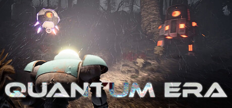
Quantum Era capsule

Quantum Era

Explore, Fight, Upgrade. Join the roguelite action in third-person, every fight raises alert levels! Conquer outposts, unlock weapons and powerups in an unpredictable procedural environment, get out before the island turns against you!

Action RoguelikeThird-Person ShooterBullet Hell
Mario Cola, Tomás Rodríguez, Davide Ferrara, Massimiliano Semenzato, Andrea ZanoliniTo be announced

Quantum Era scores 68/100 — better than 14% of Roguelite capsules (n=2,404).

Released To be announced · By Mario Cola

Quick text summary

Quantum Era scored 68/100 on Steam Analyzer — Solid for a Roguelite capsule. Top priority fix: [uniqueness_polish] Introduce a distinctive visual element or environment cue that signals the procedural island and roguelite mechanic—such as a pulsing alert indicator, procedurally-shifting terrain, or iconic weapon/upgrade visual specific to Quantum Era.

Capsule scores by dimension

  • Genre Clarity: 7/10 — Action gameplay clear but setting unclear. The capsule communicates third-person action combat through the visible character with weapon and glowing enemies/robots firing at the player, establishing an action-adventure tone. However, the sci-fi procedural roguelite nature and island survival stakes are not visually evident at tiny size—the setting reads as generic sci-fi rather than specifically communicating the alert-level escalation or roguelite escape mechanics that define the game. At TINY size, you see action but not the unique roguelite premise.
  • Title Readability: 8/10 — Strong readable title with good spacing. The 'QUANTUM ERA' text is large, white, and positioned in the lower third with excellent contrast against the darker background, maintaining legibility at SMALL and TINY sizes. The letterforms are clean and geometric, supporting readability even at reduced scale. One minor note: no tagline or supporting text is visible, which is appropriate for clarity but misses an opportunity to hint at the roguelite mechanic.
  • Contrast & Color: 8/10 — Strong value separation and silhouettes. The capsule features bright white title text, glowing yellow/orange enemy elements, and a luminous character that all contrast sharply against the dark bluish-gray environment, creating clear silhouette separation. The warm orange and cool dark tones create natural depth and visual pop against the Steam dark background. At TINY size, the bright elements and dark background maintain good separation, though some mid-tone details in the character and environment become muddy.
  • Uniqueness & Polish: 6/10 — Competent but generic sci-fi action scene. The capsule shows solid technical execution with particle effects, lighting, and a posed action moment, but visually it resembles many sci-fi action games without a distinctive hook or memorable art style that communicates Quantum Era specifically. The scene—character under fire from robots in a dystopian setting—is functional but could describe dozens of action titles. There are no iconic motifs, unique mechanics visualization, or narrative cues that make this stand out as a premium indie roguelite.
  • Brand Consistency: 5/10 — Generic sci-fi aesthetic lacks identity. The capsule does not establish a recognizable visual identity or memorable motifs that would signal this specific game on repeat exposure. The dark sci-fi setting, generic humanoid character, and standard robot enemies lack a distinctive palette, character design, or signature visual element that would support brand recall. Without reference to the 14 available screenshots, this capsule communicates 'sci-fi action' generically rather than 'Quantum Era' specifically.
  • Composition: 7/10 — Balanced layout with clear focal point. The character and combat action are centered as the primary focal point, with glowing enemies positioned to the sides, creating natural eye movement and hierarchy. The title sits safely in the lower third with ample margin from edges and no crop risk. The composition is well-layered with background ruins, midground characters, and foreground effects, though at TINY size the depth collapses slightly and supporting elements blur together.

What works

  • Excellent title contrast and legibility. White 'QUANTUM ERA' text is large, well-spaced, and maintains strong readability at all sizes including TINY thumbnails against the dark background.
  • Strong visual hierarchy and focal point. The character-in-action is clearly primary, with enemy glows and environmental elements supporting rather than competing, creating natural eye flow.
  • Good value separation and silhouettes. Bright character and enemy glows stand out clearly against dark background, with warm-cool color contrast that pops against Steam's #1b2838 background.
  • Safe composition with no crop vulnerability. Title and key elements are positioned away from edges with adequate margins, ensuring resilience to Steam's cropping across different display contexts.

What hurts the capsule

  • Generic sci-fi setting without unique identity. The dark ruins, humanoid character, and robot enemies communicate generic action rather than establishing a distinctive visual brand for Quantum Era specifically.
  • Roguelite and alert mechanic not visually communicated. The capsule shows combat but does not visualize the procedural island, escalating threat system, or escape objective that are core to the game's identity and appeal.
  • No memorable motif or signature element. There are no iconic characters, symbols, or visual hooks that would make this capsule recognizable or distinctive compared to other sci-fi action titles.

Priority fixes

  1. [uniqueness_polish] Introduce a distinctive visual element or environment cue that signals the procedural island and roguelite mechanic—such as a pulsing alert indicator, procedurally-shifting terrain, or iconic weapon/upgrade visual specific to Quantum Era.
  2. [brand_consistency] Develop and feature a signature palette or character design detail in future iterations that becomes recognizable as Quantum Era across all marketing materials.
  3. [genre_clarity] Add subtle UI or environmental elements at composition level (alert meter, procedural terrain pattern, or power-up effect) that communicate the roguelite escalation mechanic without cluttering the title area.

Store copy priority fixes

  1. [hook_strength] Rewrite the short description to lead with the core tension instead of verb list: 'Every action triggers the island—move silent, go loud, or run: a third-person action roguelite where escalation is the enemy.' This frontloads consequence and curiosity over generic action words.
  2. [uniqueness] Add a sentence articulating what differentiates this from other roguelites, e.g., 'The reactive AI escalation system means no two runs follow the same threat level progression' or highlight a specific mechanical innovation in the detailed description.
  3. [audience_targeting] Clarify playstyle depth by mentioning one sentence about pacing or difficulty: e.g., 'Suits methodical players who value planning and adapting to enemy patterns, not reflexes alone.'
  4. [feature_communication] Expand the KEY FEATURES section or add a line explaining how procedural generation affects replayability (e.g., 'Procedurally seeded biomes with dynamic weather ensure no two infiltrations play identically').

Related guides

Steam app ID: 4307950 · Tags: Roguelite, Action, Sandbox, Open World, Arcade