Scoring genre clarity...
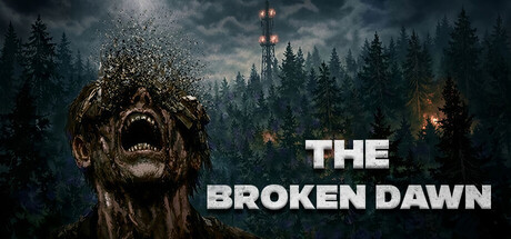
The Broken Dawn is a psychological horror in which you have to explore the abandoned city of Greyfield to find your friends. Explore spooky houses, solve puzzles, and enjoy the atmosphere of this mystical city.
$5.995 user reviews
AdventureHorrorPsychological Horror
Rage GamesMar 20, 2026