Scoring genre clarity...

Baby'S Day Out capsule

Baby'S Day Out

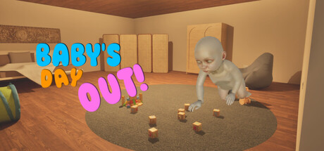
Baby'S Day Out! is a chaotic asymmetric hide-and-seek game. While babies hide and interact with lights to escape, the parent must use a HookGrab tool and flashlight to put them back in the crib. Use voice chat with friends and pick your side in this fun household chase!

$2.991 user reviews
CasualRPGSimulation
Duende GamesApr 2, 2026

Baby'S Day Out scores 60/100 — better than 0% of Casual capsules (n=10,153).

1 user reviews · $2.99 · Released Apr 2, 2026 · By Duende Games

Quick text summary

Baby'S Day Out scored 60/100 on Steam Analyzer — Solid for a Casual capsule. Top priority fix: [contrast_color] Increase background contrast by adding a darker saturated accent wall or staging area behind the baby to create stronger value separation from the Steam dark background.

Capsule scores by dimension

  • Genre Clarity: 7/10 — Clear casual asymmetric gameplay premise. The capsule immediately communicates a household hide-and-seek concept through the baby character crawling on a living room floor with toys scattered around. The 3D indoor domestic setting and baby protagonist clearly signal a casual, lighthearted game rather than action or competitive. At tiny size, the baby silhouette and interior environment remain readable enough to convey the core mechanic of chase gameplay in a home setting.
  • Title Readability: 6/10 — Readable but color contrast varies. The title 'BABY'S' in cyan and 'DAY OUT' in magenta/pink are clearly legible at full size with distinct letterforms and spacing. However, at tiny size the thin cyan and magenta strokes lose some definition against the warm tan background, and the playful staggered layout begins to compress into visual noise. The title placement in the upper left avoids the baby character but sits on a relatively textured tan wall background rather than a controlled region.
  • Contrast & Color: 6/10 — Warm interior tones limit pop. The dominant warm tan and brown wooden interior palette creates a cohesive scene but provides limited value separation from the Steam dark background when viewed at small sizes. The cyan title and magenta 'OUT' offer local color pop, but the overall image relies on mid-tone browns and warm yellows that blend together in a grayscale test. The baby character reads as a light gray-white silhouette with reasonable separation, but the background furniture and floor compete for attention rather than creating a clear focal point hierarchy.
  • Uniqueness & Polish: 6/10 — Competent 3D scene, generic execution. The 3D render quality is solid with believable lighting, textures, and spatial depth showing a living room with boxes, toys, and a rug. However, the composition and camera angle feel like a standard gameplay screenshot rather than a strategically designed capsule moment—it reads as 'a scene from the game' rather than 'an image designed to sell the game.' The playful title treatment with mixed colors is the strongest identity signal, but the scene itself lacks a hook or distinctive visual storytelling beyond showing the core asymmetric mechanic.
  • Brand Consistency: 5/10 — Minimal identity signals present. The baby character and household setting are consistent with the game's premise, but there are no iconic visual symbols, recurring color palette, or signature design elements visible that would make this image instantly recognizable as 'Baby's Day Out' versus any other household-based casual game. The cyan and magenta title colors do not carry through into the scene composition or UI design, missing an opportunity for unified branding. Without reference to the other 10 store screenshots, this capsule alone establishes minimal memorable identity beyond the concept.
  • Composition: 6/10 — Centered subject, balanced but static. The baby crawling toward center-frame creates a natural focal point with foreground toys, midground baby, and background furniture providing depth layering. The composition is well-balanced and avoids dead space, but the centered baby and symmetrical room layout feel static and predictable, lacking dynamic visual tension or storytelling hierarchy. At small and tiny sizes, the scattered toys and multiple furniture elements create competing points of interest, and the title placement in the upper left corner does not guide the eye to a dominant read sequence.

What works

  • Clear gameplay hook through visuals. The baby protagonist and domestic interior setting immediately communicate the asymmetric hide-and-seek core mechanic without requiring text explanation.
  • Solid 3D render quality and lighting. The scene demonstrates competent technical execution with believable textures, spatial depth, and warm atmospheric lighting that feels cohesive.
  • Title color stands out locally. The cyan and magenta text provide local color contrast and visual interest in the upper region of the composition.

What hurts the capsule

  • Limited contrast against Steam background. The warm tan and brown interior palette provides poor value separation against the dark Steam browsing background, reducing immediate pop at small sizes.
  • Generic screenshot-like composition. The scene reads as standard gameplay footage rather than a strategically designed capsule moment, with no clear visual hook or distinctive storytelling beyond showing the core mechanic.
  • Scattered visual hierarchy at small size. Multiple furniture elements and scattered toys create competing focal points that fragment attention when viewed at tiny thumbnail size.
  • Minimal brand identity and memorability. No iconic symbols, signature palette integration, or visual motifs exist that would make this image distinctly recognizable as this specific game.

Priority fixes

  1. [contrast_color] Increase background contrast by adding a darker saturated accent wall or staging area behind the baby to create stronger value separation from the Steam dark background.
  2. [uniqueness_polish] Reframe the shot to capture a more dynamic asymmetric moment—such as the parent's hook-grab tool in frame or a baby mid-escape near a light switch—that visually communicates the core gameplay tension.
  3. [composition] Simplify the background furniture and toy scatter to reduce competing focal points; use selective focus or staging to guide the eye directly to the baby character at small sizes.
  4. [title_readability] Add a subtle dark outline or background shape behind the cyan and magenta title text to maintain legibility and prevent letterform collapse at tiny thumbnail size.

Store copy priority fixes

  1. [feature_communication] Add a sentence explaining win conditions and round objectives: 'Babies win if all escape and reach [goal]; the Parent wins by catching all babies before time runs out' or similar.
  2. [uniqueness] Rewrite the opening to emphasize the specific appeal: 'Baby's Day Out combines household physics, asymmetric roles, and light-based stealth mechanics—no two chases are alike' rather than relying on 'chaotic' alone.
  3. [feature_communication] Clarify the RPG and Simulation tags by adding details on progression, customization, or persistent elements if they exist; if not, consider removing misleading tags.
  4. [audience_targeting] Add a sentence explicitly addressing the intended player type: 'Perfect for couch co-op chaos with friends' or 'Best played online with voice chat for maximum taunting.'

Related guides

Steam app ID: 4313030 · Tags: Casual, RPG, Simulation, Action-Adventure, Action RPG