Quick text summary

Aseprite scored 87/100 on Steam Analyzer — Excellent for a Pixel Graphics capsule. Top priority fix: [title_readability] Verify tagline remains readable at 120×45 by testing at actual Steam thumbnail size and increasing font size if needed.

Capsule scores by dimension

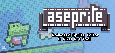
  • Genre Clarity: 9/10 — Pixel art tool identity crystal clear. The capsule immediately communicates a pixel art and animation tool through the animated sprite character in the lower left, the pixelated grid background, and the explicit tagline 'Animated Sprite Editor & Pixel Art Tool' in white text. At tiny size, the green and pink pixel character and grid pattern are unmistakable visual shorthand for sprite editing and animation.
  • Title Readability: 9/10 — Bold retro logo reads perfectly. The 'aseprite' logo is rendered in a clean, thick bitmap font with strong white-on-dark contrast, placed prominently in a dark brown frame banner across the upper half of the capsule. The letterforms remain completely legible at small and tiny sizes, and the framing device provides strategic placement away from noisy background textures.
  • Contrast & Color: 9/10 — Strong value separation throughout. The capsule uses bright white title text and bright green/pink sprite character against a medium blue gradient background, creating excellent contrast that reads clearly at all sizes. In grayscale, the white logo and colorful sprite elements maintain distinct silhouettes with clear separation from the blue background, ensuring visibility during quick scrolling.
  • Uniqueness & Polish: 8/10 — Distinctive retro aesthetic with purpose. The pixel art style and animated sprite example communicate authentic tool identity rather than generic marketing; the grid background, bitmap typography, and character animation all reinforce the product's core function. The craft is intentional and cohesive, though the overall concept (pixel art tool shown with pixel art) is somewhat expected for this category.
  • Brand Consistency: 8/10 — Strong pixel art brand language. The capsule establishes a recognizable identity through consistent use of bitmap fonts, grid patterns, and animated sprite graphics that reflect the tool's output format. The color palette (green, pink, blue, white, brown) and retro-digital aesthetic create an iconic visual signature that would be memorable across multiple touchpoints.
  • Composition: 9/10 — Clear hierarchy with focal point. The title logo dominates the upper portion with the dark frame as a containing device, while the animated sprite character and tagline occupy the lower third with clear visual separation. At tiny size, the strong logo-to-character hierarchy ensures the capsule reads instantly, with good use of safe margins and no critical elements at risk of Steam cropping.

What works

  • Logo legibility at all scales. The thick, bold bitmap typeface and white-on-dark contrast ensure the 'aseprite' title remains completely readable even at tiny thumbnail size.
  • Genre identity through visual language. The pixel sprite character, grid background, and bitmap aesthetic immediately communicate this is a pixel art tool without ambiguity.
  • Strategic frame design. The dark brown banner frame provides a controlled background region that isolates the title and prevents it from competing with the gradient background.
  • Cohesive art direction. All elements (typography, sprite, grid, palette) work together to reinforce the tool's purpose and create a distinctive, premium feel.

What hurts the capsule

  • Tagline readability at tiny size. The 'Animated Sprite Editor & Pixel Art Tool' text is small and may lose legibility at the smallest thumbnail size, though not critical since the title and visuals are clear.
  • Limited visual variety. The capsule concept (showing pixel art to promote a pixel art tool) is straightforward and somewhat expected within the design tool category, reducing distinctiveness premium.

Priority fixes

  1. [title_readability] Verify tagline remains readable at 120×45 by testing at actual Steam thumbnail size and increasing font size if needed.
  2. [uniqueness_polish] Consider adding a secondary visual element (e.g., animation frame UI mockup or tool feature hint) to add conceptual depth beyond generic sprite demonstration.

Store copy priority fixes

  1. [hook_strength] Rewrite the short description to lead with a creator benefit: 'Aseprite is the fastest pixel art tool for animating game sprites—used by indie developers and pixel artists worldwide.' This immediately communicates why someone should care.
  2. [uniqueness] Add 1-2 sentences after the feature list explaining what makes Aseprite's approach distinctive (e.g., 'Unlike free alternatives, Aseprite combines real-time animation preview with industry-standard onion skinning, letting you iterate faster') to justify the purchase decision.
  3. [tone_match] Inject brief, authentic language into the feature list (e.g., 'Real-time animation preview so you see your work instantly') to match the voice of creators rather than pure technical documentation.
  4. [feature_communication] Briefly explain the primary workflow or use case in the opening paragraph (e.g., 'Load a sprite sheet, animate frame-by-frame with built-in timeline tools, export directly to your game engine') to help newcomers understand the process.

Related guides

Steam app ID: 431730 · Tags: Pixel Graphics, Design & Illustration, Animation & Modeling, Software, Game Development