Scoring genre clarity...

Black Sword capsule

Black Sword

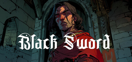
Black Sword is a narrative-driven light RPG set in a dark fantasy world. Play as a lone knight on pilgrimage to plague-cursed Canterbury. Features turn-based combat, dice-roll skill checks, tactical targeting, vampiric abilities, exploration, and choice-driven storytelling.

$4.49
AdventureCasualRPG
Nexus MediaFeb 4, 2026

Black Sword scores 77/100 — better than 84% of Adventure capsules (n=7,922).

$4.49 · Released Feb 4, 2026 · By Nexus Media

Quick text summary

Black Sword scored 77/100 on Steam Analyzer — Good for a Adventure capsule. Top priority fix: [uniqueness_polish] Introduce a distinctive visual element—such as a glowing black sword, vampiric aura effect, or unique armor detail—that signals the game's core identity and differentiates it from generic dark fantasy competitors.

Capsule scores by dimension

  • Genre Clarity: 8/10 — Dark fantasy RPG clearly signaled. The cloaked figure in burgundy robes, Gothic stone architecture, and warm candlelit mood immediately establish a dark fantasy setting. At tiny size, the silhouette and atmospheric tone remain readable, though specific RPG mechanics (turn-based, dice, tactical) are not visually communicated—only the genre tone is clear.
  • Title Readability: 8/10 — Strong gothic serif typography. The 'Black Sword' title uses a bold, high-contrast white serif font that reads clearly at full size and maintains legibility down to tiny thumbnail size. The text placement in the upper-middle region avoids busy background detail and benefits from a subtle dark outline that preserves contrast against the shadowed stone backdrop.
  • Contrast & Color: 8/10 — Warm candlelight against cool shadows. The pale orange/amber facial lighting and burgundy robe create strong warm-value separation from the cool blue-teal stone and deep shadows. The character's face and upper body pop clearly against the recessed background, and in grayscale the silhouette reads as distinct and the facial highlight maintains separation even at small sizes.
  • Uniqueness & Polish: 7/10 — Atmospheric and moody but familiar. The capsule achieves a premium, cinematic mood with careful lighting direction and a painterly quality that feels intentional and well-crafted. However, the composition—lone hooded figure in Gothic stonework—echoes a familiar dark fantasy archetype seen in similar narrative-driven indie titles like Slay the Princess and DREDGE, reducing the distinctive edge.
  • Brand Consistency: 7/10 — Consistent dark fantasy identity. The burgundy-and-shadow color palette, Gothic architecture, candlelit atmosphere, and solemn knight figure create internal cohesion and establish a recognizable dark fantasy brand voice. While no signature icon, symbol, or unique visual motif stands out as franchise-defining, the mood and aesthetic would likely be consistent across marketing materials and screenshots.
  • Composition: 8/10 — Clear focal point, balanced depth. The character's face is the primary focal point, positioned slightly off-center with warm lighting that draws the eye. The recessed stone architecture creates believable depth layering (foreground figure, shadowed mid-ground, architectural background), and the title placement does not compete with the character. At small and tiny sizes, the figure remains the clear anchor with minimal clutter.

What works

  • Title clarity at small sizes. Bold serif typography with strong contrast maintains excellent readability down to thumbnail, ensuring discoverability in store browse.
  • Cinematic lighting and mood. Warm candlelit accents on face and robe create premium production value and atmospheric storytelling that signals narrative depth.
  • Silhouette strength. The cloaked figure reads as a cohesive shape at tiny size, with the burgundy robe providing color separation that survives aggressive scaling.

What hurts the capsule

  • Generic dark fantasy trope. The lone robed knight in Gothic stone is a familiar archetype that lacks distinctive visual hook or unique selling proposition beyond mood.
  • No gameplay mechanic visibility. Turn-based combat, dice rolls, and tactical systems are not communicated through visual elements, leaving the capsule purely atmospheric and narrative-focused.
  • Limited memorable brand symbols. No iconic character trait, signature weapon detail, or unique symbol present that would make this capsule instantly recognizable in future marketing.

Priority fixes

  1. [uniqueness_polish] Introduce a distinctive visual element—such as a glowing black sword, vampiric aura effect, or unique armor detail—that signals the game's core identity and differentiates it from generic dark fantasy competitors.
  2. [genre_clarity] Add a subtle visual cue that hints at RPG mechanics, such as a dice motif, spell glow, or tactical grid echo, to signal the turn-based strategic gameplay beyond pure atmosphere.
  3. [brand_consistency] Develop and lock a signature color accent or symbolic motif (e.g., crimson corruption, pilgrimage emblem) that can carry across all marketing and store assets to build recognizable brand identity.

Store copy priority fixes

  1. [hook_strength] Rewrite the opening to lead with 'Play as a lone knight on pilgrimage to plague-cursed Canterbury, where ancient curses and a dark plague block your path' instead of 'Black Sword is a narrative-driven light RPG'—move the genre label lower in the short description.
  2. [uniqueness] Add a sentence that articulates what makes Black Sword's combination of mechanics (vampiric feeding + holy relic + redemption skill checks) distinctly powerful or story-defining compared to other dark fantasy RPGs.
  3. [tone_match] Replace technical language ('VATS-style targeting') with tone-aligned descriptions that reinforce the dark fantasy atmosphere while preserving mechanical clarity.

Related guides

Steam app ID: 4319020 · Tags: Adventure, Casual, RPG, Interactive Fiction, Choose Your Own Adventure