Scoring genre clarity...
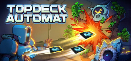
Topdeck Automat capsule

Topdeck Automat

The roguelike auto-battler where your deck prints itself! Supply a brave worker droid with synergistic blueprints to defend the planet against hordes of alien invaders. Combine hundreds of cards with custom upgrades and infinitely stackable modules to discover broken builds.

Auto BattlerStrategyRoguelike
LudokulturTo be announced

Topdeck Automat scores 77/100 — better than 81% of Auto Battler capsules (n=487).

Released To be announced · By Ludokultur

Quick text summary

Topdeck Automat scored 77/100 on Steam Analyzer — Good for a Auto Battler capsule. Top priority fix: [uniqueness_polish] Enhance the worker droid character with more distinctive design details or iconic pose that reinforces personality and memory-ability compared to generic robodc characters in the space.

Capsule scores by dimension

  • Genre Clarity: 8/10 — Clear deck-building strategy gameplay. The capsule immediately communicates an auto-battler deck-building game through the visible card mechanics, explosion effects, and alien invader silhouettes on the right side. The worker droid protagonist and modular card-like UI elements reinforce the roguelike deckbuilding genre at full size and remain recognizable at small size due to strong visual iconography. At tiny size, the explosion and card symbols still suggest strategy gameplay, though specific subgenre nuance is slightly diminished.
  • Title Readability: 8/10 — Bold, readable title with strong outline. TOPDECK AUTOMAT uses a thick white and cyan outlined sans-serif font positioned on the left side with solid backing color support, ensuring excellent legibility at all sizes. The letterforms maintain clarity even at tiny thumbnail scale due to consistent stroke weight and high contrast against the dark background. No tagline clutter or decorative fonts compromise readability.
  • Contrast & Color: 8/10 — Strong value separation and vibrant accents. The capsule employs excellent dark-to-light contrast with the golden explosion at center-right serving as a bright focal point against the darker droid and background. Cyan and orange highlights pop distinctly against the Steam dark theme #1b2838, and the blue worker droid silhouette on the left reads cleanly in grayscale due to clear value separation. The green plant elements and yellow-orange explosion create visual hierarchy that survives at small and tiny sizes.
  • Uniqueness & Polish: 7/10 — Solid craft with recognizable game identity. The art direction shows competent 3D rendering with a cohesive sci-fi aesthetic featuring the worker droid, card mechanics, and alien threat elements that align with the game's core loop. The explosion effect and modular visual language communicate the 'synergistic build discovery' selling point effectively, though the overall composition uses familiar indie game visual tropes. Polish is evident in lighting and particle effects, but the design leans toward solid execution rather than distinctive standout innovation.
  • Brand Consistency: 7/10 — Consistent art style with clear character identity. The worker droid character and blue-orange-cyan color palette appear intentionally designed as brand identity elements that could carry across marketing materials and UI. The sci-fi industrial aesthetic with glowing effects and card-based visual language is internally coherent and reinforces the game's mechanical identity. Without access to other store assets, this reads as a well-considered visual language, though it would benefit from even more distinctive iconography.
  • Composition: 8/10 — Strong focal hierarchy with clear depth layering. The golden explosion at center-right acts as a primary focal point, with the worker droid on the left providing secondary interest and the title anchoring the upper left in safe margins. Depth is created through foreground (droid, cards), midground (explosion), and background (plant life and ambient environment), guiding the eye naturally without clutter. The composition remains legible at small size with the explosion and droid as clear primary elements, though at tiny size some plant detail fades appropriately into background noise.

What works

  • Legible title with strategic placement. White and cyan outlined sans-serif positioned safely on the left with strong backing ensures readability across all viewport sizes without competing with the focal explosion.
  • High-impact focal point. The golden explosion at center-right immediately draws attention and communicates action and strategy gameplay, reading clearly even at tiny thumbnail scale.
  • Clear character and gameplay identity. The blue worker droid and visible card mechanics establish both character recognition and mechanial clarity that differentiate this from generic strategy games.
  • Vibrant color palette pop. Cyan, orange, and gold accents create strong separation against the Steam dark background and survive grayscale contrast testing.

What hurts the capsule

  • Generic sci-fi indie aesthetic. While executed competently, the visual style relies on familiar 3D sci-fi tropes that blend with other indie strategy games rather than establishing a truly distinctive visual signature.
  • Ambient plant elements lack purpose. The green foliage in the upper right and corners feels decorative rather than integrated to the core game narrative, adding visual noise without reinforcing gameplay or story.
  • Limited secondary visual hierarchy. Beyond the explosion and droid, supporting elements (cards, UI elements) lack clear emphasis or arrangement that reinforces the 'infinite synergies' selling point.

Priority fixes

  1. [uniqueness_polish] Enhance the worker droid character with more distinctive design details or iconic pose that reinforces personality and memory-ability compared to generic robodc characters in the space.
  2. [composition] Integrate floating card elements or blueprint visuals more prominently into the composition to better communicate the deck-building core loop and build discovery mechanic.
  3. [brand_consistency] Establish a signature visual motif or icon (e.g., repeating circuit pattern, distinctive UI element) that could serve as a recognition symbol across all marketing materials and store pages.

Store copy priority fixes

  1. [feature_communication] Expand the modules section with 1–2 sentences explaining how stackable modules differ from card upgrades and provide an example synergy (e.g., 'Modules are persistent passives that modify your entire deck or engine—stack speed modules with a fast-printing card to accelerate your output exponentially').
  2. [genre_clarity] Add a sentence to the short description or opening paragraph that explicitly names the roguelike + auto-battler fusion earlier, so players unfamiliar with auto-battlers understand the deck shuffles and plays automatically while they manage strategy.
  3. [hook_strength] Replace or supplement the lore paragraph with a sentence that ties the sci-fi premise directly to gameplay ('Reprogram alien tech into your own arsenal, or rely on junkyard innovations—your choices shape your droid's combat identity').
  4. [feature_communication] Add clarity on daily challenges: specify whether they are time-limited, how they modify runs, and whether they offer exclusive rewards, so players understand the engagement cadence.

Related guides

Steam app ID: 4321920 · Tags: Auto Battler, Strategy, Roguelike, Roguelite, Card Game