Scoring genre clarity...
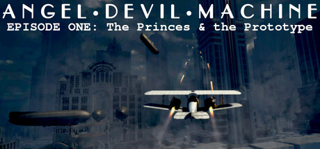
A third-person adventure game AND flight-combat shooter... with Zeppelins and a Mech Aircraft Carrier!!! Fly your jet-powered biplane on a secret mission in this first episode of the Angel Devil Machine videogame series. A short-play (20min story) with great replay-ability and massive exploration!
$2.004 user reviews
CyberpunkExplorationAction-Adventure
Baron MarcusMay 2, 2026