Scoring genre clarity...
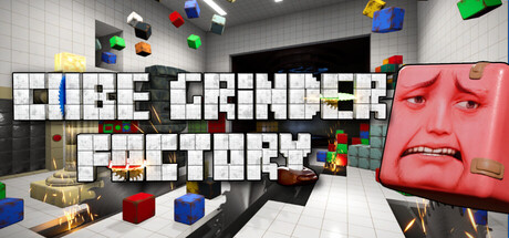
Cube Grinder Factory capsule

Cube Grinder Factory

Dismantle, sort, and build cube structures in this first-person work simulator. Grind crazy combinations of cheese, marble, salami, and even stars for nine cube beings with impossible obsessions - pay with cubes, upgrade your tools, and uncover the secret of the Cube Grinder Factory.

CraftingDestructionFirst-Person
Knidaria GamesComing soon

Cube Grinder Factory scores 68/100 — better than 14% of Crafting capsules (n=1,340).

Released Coming soon · By Knidaria Games

Quick text summary

Cube Grinder Factory scored 68/100 on Steam Analyzer — Solid for a Crafting capsule. Top priority fix: [uniqueness_polish] Refine the red cube character design with a distinctive silhouette or iconic facial feature that becomes the primary visual anchor and recognizable mascot across all marketing materials.

Capsule scores by dimension

  • Genre Clarity: 7/10 — Quirky indie puzzle-crafting vibe clear. The factory setting with grinding mechanics, colorful cube assets, and surreal red character face on the right clearly signal a unique indie game with crafting elements. At tiny size, the cube objects and factory environment remain visible enough to suggest a construction or crafting game, though the specific 'grinder' mechanic is not immediately obvious without context.
  • Title Readability: 8/10 — Strong white text hierarchy readable. The title 'CUBE GRINDER FACTORY' uses bold white block lettering with clear blue accent line separation between words, positioned centrally over a controlled mid-tone background. At tiny and small sizes, the text remains legible due to high contrast and generous letter spacing, though the tagline below becomes unreadable at thumbnail size.
  • Contrast & Color: 7/10 — Good value separation with bright accents. White title text and colorful primary cubes (blue, red, yellow, green) provide strong contrast against the mid-gray factory background and dark floor. The red character face on the right stands out clearly in grayscale due to its saturated hue converting to distinct mid-light value, though the overall composition relies on scattered bright pops rather than unified silhouette strength.
  • Uniqueness & Polish: 6/10 — Competent but visually generic indie aesthetic. The capsule uses recognizable indie visual language—floating cubes, surreal character design, factory setting—but lacks a distinctive art hook that would make it memorable or stand apart from similar puzzle-crafting indies. The red cube face is striking but feels more like surreal novelty than core visual identity; the execution is clean but the overall concept reads as familiar indie quirk rather than premium or innovative.
  • Brand Consistency: 6/10 — Minimal visual identity, relies on concept. The capsule establishes tone through cube motifs and factory architecture, which likely align with game assets, but offers no iconic character, signature color palette, or visual symbol that would aid recognition on repeat browsing. The red cube character appears to be a unique entity but is not reinforced as a memorable brand marker; internal cohesion between title, environment, and asset style is functional but interchangeable with generic indie crafting games.
  • Composition: 7/10 — Clear focal points with layered depth. The composition uses foreground cubes (left and center), mid-ground factory structure, and background ceiling to create readable depth layering that works at small size. The title anchors the center, and the red character face provides a strong secondary focal point on the right; however, the scattered cube placement feels somewhat arbitrary, and the layout edges too close to the frame limits for safe cropping on some platforms.

What works

  • High-contrast title legibility. White block letters with blue accent line read clearly at small and tiny sizes due to strong value separation and strategic placement over neutral background.
  • Readable factory setting with depth. Multi-layered composition (foreground cubes, mid-ground structure, background ceiling) creates clear visual hierarchy that survives scaling and quick scanning.
  • Cohesive core asset integration. Cube motifs, factory environment, and surreal character all reinforce the game concept and appear to reflect actual in-game visual language.

What hurts the capsule

  • Generic indie visual language. Floating cubes, surreal character design, and factory setting feel familiar and interchangeable with other indie crafting games, lacking distinctive memorable identity.
  • Scattered composition without strong focal hierarchy at tiny size. At thumbnail scale, multiple cubes spread across the frame compete for attention rather than guiding the eye to a single memorable visual hook.
  • Red character lacks brand reinforcement. The surreal red cube face is striking but not positioned or styled in a way that would make it instantly recognizable as a signature brand symbol on repeat exposure.

Priority fixes

  1. [uniqueness_polish] Refine the red cube character design with a distinctive silhouette or iconic facial feature that becomes the primary visual anchor and recognizable mascot across all marketing materials.
  2. [brand_consistency] Establish and reinforce a signature color palette or visual motif (beyond generic cubes) that ties the game's identity together and would be recognizable in isolation.
  3. [composition] Reduce visual clutter by anchoring 2-3 key cube assets strategically rather than scattering many objects; ensure critical elements stay within safe margins for cross-platform Steam cropping.

Store copy priority fixes

  1. [hook_strength] Rewrite the short description opening to lead with a core gameplay verb, such as: 'Grind impossible materials into exact structures for nine obsessed cube beings—upgrade your tools, manage your earnings, and uncover what the factory is really hiding.'
  2. [feature_communication] Add a one-sentence explanation of Anton the Ant's programmable mechanic immediately after his introduction (e.g., 'assign him specific grinding or building tasks and watch him work autonomously').
  3. [audience_targeting] Insert a sentence after 'THE JOB' section explicitly addressing who this game suits (e.g., 'Perfect for players who love tactile puzzle-solving, progression systems, and light narrative mystery in bite-sized sessions').
  4. [tone_match] Consider moving the lore exposition ('Long after humanity, cubes rule!') to a lore section after feature descriptions, and open with 'You're a worker in a bizarre cube factory—grind, build, upgrade, and decide which of nine obsessed personalities get to rebuild the world' to prioritise gameplay immediately.

Related guides

Steam app ID: 4329200 · Tags: Crafting, Destruction, First-Person, Indie, Lore-Rich