Scoring genre clarity...
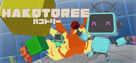
This is a game where you control "Hakorobo" and enjoy various actions using boxes. You can experience various actions using boxes, such as grabbing a box and slamming it into your opponent. The actions are very simple. Even people who are not good at action games can enjoy the action of "HAKOTOREE"
$3.992 user reviews
ActionBattle Royale3D Platformer
studio coreMar 12, 2026