Scoring genre clarity...

MicroFab capsule

MicroFab

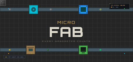
Build automated chip factories in a post-collapse 2047. Process silicon wafers, research advanced tech, and scale from basic processors to legendary quantum chips. Optimize your production lines, outmaneuver mega-corps, and dominate the semiconductor market.

$4.99Mostly Positive(16)
SimulationPuzzleColony Sim
FlirpMay 15, 2026

MicroFab scores 73/100 — better than 51% of Simulation capsules (n=5,188).

Mostly Positive (16 reviews) · $4.99 · Released May 15, 2026 · By Flirp

Quick text summary

MicroFab scored 73/100 on Steam Analyzer — Good for a Simulation capsule. Top priority fix: [title_readability] Increase tagline font size or weight, or reposition it to remain semi-readable at small size without sacrificing title dominance

Capsule scores by dimension

  • Genre Clarity: 7/10 — Factory simulation intent clear. The grid background, colored square icons (cyan, blue, orange, green), and conveyor-like horizontal lines immediately signal a production or factory management sim. At tiny size, the geometric icons and orderly layout successfully communicate an industrial/tech sim, though the specific 'semiconductor' angle is not visually obvious without context. The retro-pixel aesthetic supports the tech/sci-fi factory vibe well.
  • Title Readability: 8/10 — Strong hierarchy, legible at all sizes. MICRO in small caps at top and FAB in large, bold white sans-serif create clear visual hierarchy with good contrast against the dark grid background. The tagline 'EVERY NANOMETER COUNTS' is small but readable at full size; at tiny size it becomes illegible but the core title FAB remains perfectly clear. Title placement is centered and safe, with no edge-hugging risk.
  • Contrast & Color: 8/10 — Excellent separation against dark background. White FAB text pops sharply against the near-black grid, and the cyan, blue, orange, and green icon squares create strong value separation through saturation and brightness. In grayscale, the white title and light-colored icons maintain clear silhouettes against the dark background. The horizontal cyan/teal accent lines reinforce hierarchy and guide the eye without clutter.
  • Uniqueness & Polish: 7/10 — Clean retro aesthetic, functional polish. The pixel-art grid and flat colored icons deliver a cohesive, intentional retro-tech look that feels premium for a sim game rather than generic. The minimalist approach with ordered geometry avoids clutter and communicates efficiency/optimization core to the gameplay. However, the visual style, while clean, is not entirely distinctive—factory/tech sims often use similar grid-based layouts, limiting standout factor against comps like Techtonica.
  • Brand Consistency: 6/10 — Coherent internal style, limited identity. The grid, flat icons, sans-serif typography, and dark palette are internally consistent and suggest a mature, technical brand. Without access to store screenshots, the retro-grid motif appears to be a signature visual, but the color squares (cyan, orange, green, blue) lack a memorable branded character or iconic symbol. The design reads as intentional but does not yet feel distinctly recognizable as MicroFab versus a generic tech-sim brand.
  • Composition: 8/10 — Balanced hierarchy, clear focal point. The title FAB is centered and dominant, with MICRO above and tagline below creating natural top-to-bottom hierarchy. The four colored icon squares distributed horizontally across the grid act as supporting visual anchors without competing for focus. At tiny size, the white FAB and surrounding colored icons remain clear and balanced; the composition is resilient to cropping and does not rely on edge elements.

What works

  • Title contrast and readability. White FAB lettering with bold sans-serif maintains perfect legibility at all sizes including tiny, ensuring fast recognition during Steam scroll.
  • Genre-appropriate visual language. Grid background, ordered icon squares, and horizontal conveyor lines immediately communicate factory/production sim intent without requiring detailed reading.
  • Strong value separation. Vibrant colored icons (cyan, blue, orange, green) stand out sharply against the dark grid background in both color and grayscale, creating visual pop.
  • Uncluttered composition. Minimal, balanced layout with clear focal point on the title and supporting elements that guide rather than distract, avoiding visual noise common in sim games.

What hurts the capsule

  • Tagline illegibility at small size. The subtitle 'EVERY NANOMETER COUNTS' becomes unreadable at small and tiny sizes, reducing the opportunity to reinforce the semiconductor-specific pitch.
  • Generic factory aesthetic. While cohesive, the grid and colored squares are standard visual language in factory/tech sims, offering limited distinctiveness compared to competitors like Techtonica.
  • Limited brand identity hook. No iconic character, symbol, or unique color palette that would make MicroFab instantly recognizable or memorable in a crowded sim genre.

Priority fixes

  1. [title_readability] Increase tagline font size or weight, or reposition it to remain semi-readable at small size without sacrificing title dominance
  2. [uniqueness_polish] Introduce a distinctive branded motif—such as a signature icon, mascot, or unique color accent—to differentiate MicroFab from generic factory-sim templates
  3. [brand_consistency] Ensure the grid pattern and icon colors are repeated consistently across all marketing materials to build instant visual recognition

Store copy priority fixes

  1. [audience_targeting] Add one sentence early in the detailed description clarifying the intended audience: e.g., 'Whether you're a logic puzzle enthusiast or a factory optimization veteran, MicroFab scales from relaxing to brutally challenging.' This removes ambiguity about who should buy.
  2. [feature_communication] Reorder the Features section to lead with the prestige/progression loop and alternate dimensions first, as these are the unique hooks, then list mechanical depth; this prioritizes differentiation over feature volume.
  3. [hook_strength] Strengthen the opening of the detailed description by adding a one-sentence competitive stakes line after 'You are one of them,' such as 'Compete against mega-corporations for market dominance while Helena Voss plots your downfall.' This reinforces the antagonistic tension from the short description.
  4. [tone_match] Reduce technical jargon where possible or add brief clarifying asides (e.g., 'EUV lithography (the cutting-edge manufacturing process)') to ensure the comedic tone reaches players without chip manufacturing expertise.

Related guides

Steam app ID: 4338780 · Tags: Simulation, Puzzle, Colony Sim, 2D, Pixel Graphics