Scoring genre clarity...

LetMeSee capsule

LetMeSee

A collection of fun and relaxing puzzle games.

$4.89
PuzzleTower DefenseStrategy
DaicyGameStudioJun 25, 2026

LetMeSee scores 72/100 — better than 44% of Puzzle capsules (n=4,541).

$4.89 · Released Jun 25, 2026 · By DaicyGameStudio

Quick text summary

LetMeSee scored 72/100 on Steam Analyzer — Good for a Puzzle capsule. Top priority fix: [uniqueness_polish] Introduce a subtle mascot, character, or visual motif unique to LetMeSee that could serve as a recognizable brand signature across store materials

Capsule scores by dimension

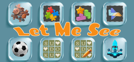
  • Genre Clarity: 7/10 — Clear puzzle game collection signal. The capsule effectively communicates a puzzle game bundle through recognizable iconography: Tetris-like blocks, Sudoku grids, a soccer ball, and colorful tile puzzles in distinct glass-fronted containers. At TINY size, the grid of distinct mini-games reads as 'puzzle collection' without ambiguity. The variety of game types is immediately apparent, though individual game mechanics require some visual literacy.
  • Title Readability: 8/10 — Bold orange title, excellent legibility. The title 'Let Me See' uses a thick, chunky sans-serif font in bright orange (#FF9933 approx) positioned centrally below the game icons on a neutral blue-gray background. At SMALL and TINY sizes, the letterforms remain distinct and readable with strong value separation from the background. The centered placement and absence of competing text ensures clarity across all viewing sizes.
  • Contrast & Color: 8/10 — Strong pop with vibrant palette. The orange title, colorful puzzle icons (bright yellows, pinks, blues, reds), and light glass containers create excellent value separation against the muted blue-gray background (#708090 approx). In grayscale, the light glass frames and bright puzzle elements maintain clear silhouette definition. The design pops immediately on Steam's dark theme background without relying on muddy mid-tones.
  • Uniqueness & Polish: 7/10 — Polished presentation, modest originality. The glass-container UI frame is a neat stylistic choice that gives the capsule a cohesive, craft-like appearance and elevates it above generic puzzle game promotions. The arrangement feels intentional and premium. However, the concept of showing 'game variety' in a grid is somewhat familiar in indie bundles, and the visual execution, while clean, doesn't introduce a truly distinctive hook or memorable art direction that separates it from other casual puzzle collections.
  • Brand Consistency: 6/10 — Functional consistency, no iconic signature. The capsule maintains internal cohesion through consistent glass-frame styling, a unified color palette (blues, oranges, pastels), and clean rendering across all eight mini-game icons. However, there is no memorable character, motif, or signature visual that would make 'LetMeSee' instantly recognizable in isolation. The identity is competent but generic within the puzzle-game space.
  • Composition: 7/10 — Well-balanced grid, centered title anchor. The 4x2 grid of game icons creates natural visual balance and a clear focal region at the top half; the orange title provides a strong anchor below without competing for attention. Safe margins are respected, and the composition is resilient to Steam's typical cropping. At TINY size, the grid of distinct boxes remains legible as a unit, though individual icon details blur slightly. The layout avoids clutter and dead space effectively.

What works

  • Readable title at all sizes. The chunky orange 'Let Me See' logotype maintains legibility even at TINY thumbnail size thanks to thick letterforms and high contrast against the neutral background.
  • Clear game variety communication. Eight distinct mini-game previews in glass containers immediately signal a puzzle collection without ambiguity, setting correct expectations.
  • Strong color pop against Steam dark theme. Bright oranges, yellows, and primary colors in the game icons create vibrant separation from both the capsule background and Steam's #1b2838 theme color.
  • Polished glass-frame UI styling. The consistent glass container treatment across all eight games creates a premium, intentional visual presentation that elevates the capsule above generic grid layouts.

What hurts the capsule

  • Generic puzzle collection concept. While well-executed, the 'show variety through a grid' approach is familiar in indie bundles and lacks a distinctive visual hook or narrative angle.
  • No recognizable brand identity motif. The capsule has no iconic character, symbol, or signature palette cue that would allow the game to be recognized in isolation outside this capsule context.
  • Limited narrative or thematic depth. The capsule communicates 'puzzle games exist here' but offers no emotional hook, story angle, or unique selling proposition beyond variety.

Priority fixes

  1. [uniqueness_polish] Introduce a subtle mascot, character, or visual motif unique to LetMeSee that could serve as a recognizable brand signature across store materials
  2. [brand_consistency] Develop a signature color or icon system (e.g., a recurring symbol or visual language) that ties all eight mini-games together and becomes synonymous with the LetMeSee brand
  3. [genre_clarity] Add a small, readable tagline such as 'Relax & Puzzle' or 'Brain Breaks' to reinforce the casual-relaxation angle and differentiate from competitive puzzle games

Store copy priority fixes

  1. [hook_strength] Rewrite the short description to open with a specific gameplay hook and emotional appeal—e.g., 'Solve seven unique puzzle games at your own pace, or command heroes in tactical tower defense battles. Perfect for players who want brain teasers without time pressure.'
  2. [feature_communication] Restructure the detailed description with a clear headline for each game mode followed by 2-3 concrete bullet points about mechanics and appeal, replacing the fragmented sentences.
  3. [uniqueness] Add 1-2 sentences explaining what distinguishes LetMeSee from competitor puzzle collections—specific art direction, all modes included in one package with shared progression, or a unifying theme.
  4. [audience_targeting] Clarify upfront in the short description whether this game is for casual/family players, puzzle enthusiasts, or hardcore strategy fans, and address the 'relaxing' vs 'high difficulty' tension.

Related guides

Steam app ID: 4341280 · Tags: Puzzle, Tower Defense, Strategy, Casual, Sokoban