Scoring genre clarity...
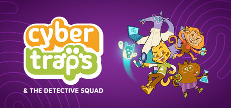
Set in a Brazilian school, it is a Point-and-Click game focused on solving puzzles and mysteries concerning the dangers of the digital environment. The plot features anthropomorphic characters inspired by Brazilian fauna, known as the 'Bando Detetive'.
$2.99
AdventureCasualDetective
Alpha StudiosFeb 18, 2026