Scoring genre clarity...

Brick Breaker Upgrade capsule

Brick Breaker Upgrade

Brick Breaker Upgrade is a game about growing stronger by breaking bricks. Break bricks to earn resources and upgrade items to improve your mining efficiency.

$2.99Mixed(25)
CasualIdlerIncremental
HausooMar 3, 2026

Brick Breaker Upgrade scores 73/100 — better than 54% of Casual capsules (n=10,153).

Mixed (25 reviews) · $2.99 · Released Mar 3, 2026 · By Hausoo

Quick text summary

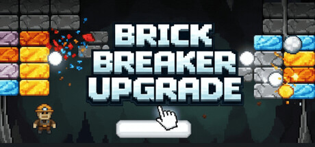
Brick Breaker Upgrade scored 73/100 on Steam Analyzer — Good for a Casual capsule. Top priority fix: [uniqueness_polish] Add a visual element that hints at the upgrade/progression mechanic (e.g., stat indicators, upgrade tiers, or a character progression silhouette) to communicate the core selling point beyond text.

Capsule scores by dimension

  • Genre Clarity: 8/10 — Clear casual brick-breaker mechanic. The capsule immediately communicates a brick-breaker/arcade game through the prominent grid of colorful bricks at the top and the paddle with ball element at the bottom center. The pixel art style and retro aesthetic reinforce the casual indie game positioning. At tiny size, the brick grid and paddle silhouette remain recognizable, though the upgrade/progression angle is less obvious without text.
  • Title Readability: 9/10 — Excellent legibility across all sizes. BRICK BREAKER UPGRADE is rendered in large, bold white sans-serif typography with clean letter spacing and a subtle cyan glow outline that ensures separation from the dark background. The three-line stacked layout maintains readability at small and tiny sizes, and the white-on-dark contrast is maximized. Even when squinting or viewing at 120x45 pixels, the title remains distinguishable.
  • Contrast & Color: 8/10 — Strong value separation and silhouettes. The bright, saturated brick colors (orange, yellow, cyan, blue) create excellent contrast against the dark teal-to-black gradient background, with the white title popping cleanly. The pale paddle and ball at the bottom provide additional focal point separation. In grayscale, the color blocks still maintain distinct value ranges, and the composition doesn't collapse when squinting, though the individual brick details blur slightly.
  • Uniqueness & Polish: 6/10 — Competent retro style, limited differentiation. The pixel art execution is clean and the overall design is professionally assembled, but the brick-breaker concept and retro aesthetic are genre-standard rather than distinctive. The gameplay hook (upgrade progression) is communicated through text rather than visual storytelling. While the craft is solid, the visual presentation doesn't signal what makes this game mechanically different from other brick-breaker clones.
  • Brand Consistency: 6/10 — Coherent retro pixel art direction. The capsule maintains consistent pixel art rendering throughout (character, bricks, UI elements), and the dark teal-to-black palette is cohesive. However, there are no distinctive brand identity signals—no iconic character, unique color signature, or memorable motif that would make this recognizable as Brick Breaker Upgrade specifically rather than a generic upgraded brick-breaker.
  • Composition: 7/10 — Strong hierarchy with minor spacing issues. The composition establishes clear focal hierarchy: brick grid draws attention at top, title anchors the center-upper region, and the paddle with outstretched hand guides the eye downward. The hand cursor adds narrative depth and guides interaction expectation. Safe margins are generally respected, though the brick grid edges sit somewhat close to the top boundary; the composition remains resilient at small/tiny sizes with the paddle and title remaining primary focus points.

What works

  • Readable title at all scales. Bold white sans-serif with cyan outline maintains legibility from full header down to 120x45 thumbnail without any collapse or letterform loss.
  • Immediate genre recognition. The brick grid and paddle-ball mechanic instantly communicate arcade/brick-breaker gameplay at first glance, even at tiny size.
  • Clean pixel art consistency. All elements (character, bricks, UI) follow unified retro pixel-art style with coherent rendering and no visual discord.
  • Strong contrast against dark background. Vibrant brick colors and white text create excellent value separation that pops on Steam's dark #1b2838 background.

What hurts the capsule

  • Generic visual identity. No distinctive brand motif, signature color, or iconic character element that differentiates this capsule from other brick-breaker games in the genre.
  • Upgrade hook not visually communicated. The core mechanic (progression through upgrades) is only conveyed by the word 'UPGRADE' in the title, not through visual storytelling or UI cues that hint at progression systems.
  • Limited art direction novelty. While pixel art is executed cleanly, the retro aesthetic and brick-grid layout are standard expectations in casual brick-breaker games with no standout visual hook.

Priority fixes

  1. [uniqueness_polish] Add a visual element that hints at the upgrade/progression mechanic (e.g., stat indicators, upgrade tiers, or a character progression silhouette) to communicate the core selling point beyond text.
  2. [brand_consistency] Introduce a distinctive visual motif or color accent (secondary palette or iconic symbol) that becomes recognizable as Brick Breaker Upgrade's signature style across future marketing.
  3. [genre_clarity] Consider adding subtle UI elements or visual effects that hint at the resource/upgrade progression loop to better communicate why this brick-breaker stands out from standard arcade games.

Store copy priority fixes

  1. [hook_strength] Rewrite the short description opening to emphasize a specific progression fantasy: e.g., 'Mine deeper into endless gem layers by shattering bricks and evolving your equipment into an unstoppable engine' instead of the generic 'growing stronger.'
  2. [uniqueness] Add a concrete 2-3 sentence explanation of what differentiates this game—e.g., highlight the 'compact' playtime claim, describe one unique ball type's ability, or explain how the evolving brick difficulty curve differs from standard clickers.
  3. [feature_communication] Expand the Features section to explain one mechanic in depth: e.g., replace 'Unique ball types and specialized helper units' with 'Recruit helper units with passive mining boosts—combine them with unique ball types to unlock synergy bonuses that accelerate ore breaking.'
  4. [audience_targeting] Add an explicit sentence addressing idle/offline progression: e.g., 'Designed for casual play and offline progression—check back later to see your setup working without you' in the short or opening paragraph.

Related guides

Steam app ID: 4346980 · Tags: Casual, Idler, Incremental, Strategy, Arcade