Scoring genre clarity...

Clicker Kids capsule

Clicker Kids

A clicker / idle incremental game with simple gameplay, deep progression, and endless strategy. Level heroes, unlock powerful upgrades, and watch the numbers go up. Easy to start, hard to stop.

Free to PlayMostly Positive(11)
2DFree to PlayIndie
ForgeFeb 13, 2026

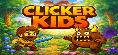
Clicker Kids scores 73/100 — better than 55% of 2D capsules (n=8,980).

Mostly Positive (11 reviews) · Free to Play · Released Feb 13, 2026 · By Forge

Quick text summary

Clicker Kids scored 73/100 on Steam Analyzer — Good for a 2D capsule. Top priority fix: [uniqueness_polish] Introduce a distinctive visual signature or recurring motif (upgrade particles, level aura, or signature UI element) that makes the brand instantly recognizable independent of title text.

Capsule scores by dimension

  • Genre Clarity: 7/10 — Clicker mechanics clear, adventure theme present. The central character interaction with an enemy creature and bright fantasy setting clearly signal an incremental/clicker game with adventure flavor. At tiny size, the character-vs-monster visual immediately reads as action-oriented gameplay, though the specific clicker mechanic is not explicitly obvious from visuals alone. The cheerful, colorful scene communicates casual indie game rather than strategy complexity.
  • Title Readability: 9/10 — Bold yellow title reads excellently at all sizes. CLICKER KIDS uses a thick, bright yellow sans-serif with strong black outlines that maintains perfect legibility from full header down to tiny thumbnail. The text is positioned prominently in the upper-middle with ample clear space around it, avoiding noisy background elements. At tiny size, every letter remains distinct and the words are instantly recognizable even under quick scroll conditions.
  • Contrast & Color: 8/10 — Vibrant palette with strong light-dark separation. Bright sky gradient at top and saturated greens, purples, and yellows create strong value contrast against the dark Steam background #1b2838. The yellow title punches forward dramatically, and character silhouettes are well-separated from midground foliage. In grayscale test, the composition maintains clear depth layering with good edge definition between foreground creatures and background elements.
  • Uniqueness & Polish: 6/10 — Competent but genre-typical casual game aesthetic. The art style is clean and well-executed with consistent hand-drawn character design and detailed landscape painting, showing solid craft throughout. However, the whimsical fantasy adventure setting with cute monsters and bright colors closely follows standard mobile/indie clicker game visual templates without a distinctive hook or memorable unique selling point. The execution is professional but the concept feels familiar within the clicker/idle space.
  • Brand Consistency: 6/10 — Consistent internal style, limited distinctive branding. The character designs, color palette, and art rendering are cohesive throughout the composition with no jarring style breaks or mismatched elements. However, there are no immediately iconic motifs, signature symbols, or distinctive visual identity cues that would make Clicker Kids uniquely recognizable across multiple marketing materials without relying on the title text. The presentation is professionally unified but generically pleasant.
  • Composition: 8/10 — Clear focal point, balanced depth, excellent hierarchy. The two characters in the center-lower area form a strong primary focal point that immediately draws attention, with the sky gradient and distant trees providing supporting background depth. Title placement at top leaves breathing room and doesn't compete with the action; supporting elements like colorful flowers and foliage guide the eye naturally. At small and tiny sizes, the composition collapses to a readable silhouette with clear subject distinction and no confusing competing elements.

What works

  • Outstanding title legibility across all sizes. Thick outlined yellow text on the title maintains perfect readability from full header to tiny thumbnail with zero degradation.
  • Strong value contrast and color saturation. Vibrant palette of greens, purples, and yellows pops crisply against dark Steam background and maintains clear silhouettes in grayscale.
  • Focused composition with clear focal point. Central character group creates an obvious primary subject that reads cleanly at all scales without scattered attention or visual competition.
  • Coherent internal art direction. Character designs, landscape painting, and color rendering maintain consistent style throughout with no jarring asset mismatches.

What hurts the capsule

  • Generic visual identity without memorable hooks. The whimsical fantasy-adventure aesthetic follows predictable clicker game conventions with no distinctive brand symbol or iconic motif.
  • Clicker mechanic not visually communicated. While the adventure theme is clear, the incremental/idle gameplay loop is not explicitly suggested by the composition or visual language.
  • Limited premium differentiation in market space. Execution is solid but the overall concept and presentation feel familiar within crowded casual indie game landscape without clear standout appeal.

Priority fixes

  1. [uniqueness_polish] Introduce a distinctive visual signature or recurring motif (upgrade particles, level aura, or signature UI element) that makes the brand instantly recognizable independent of title text.
  2. [genre_clarity] Add subtle visual storytelling cues that hint at progression and numbers growth—such as visible upgrade auras, level indicators, or multiplicative visual effects on the main character—to clarify the clicker mechanic.
  3. [brand_consistency] Develop and feature a more iconic primary character or mascot design that could serve as recognizable brand identity across store materials and marketing.

Store copy priority fixes

  1. [feature_communication] Add a brief explanation of prestige mechanics (e.g., 'reset your progress to unlock permanent bonuses and new challenges') so players understand the core progression loop.
  2. [audience_targeting] Clarify guild system status: explicitly state 'guilds are fully optional for solo players' or 'guilds unlock after X hours' to reduce friction for solo-first audiences.
  3. [uniqueness] In the short description, replace 'deep progression' with a more specific claim tied to the copy (e.g., 'level 46 unique heroes with no single correct build' or 'unlock prestige layers that reshape everything').

Related guides

Steam app ID: 4355950 · Tags: 2D, Free to Play, Indie, Strategy, Automation