Scoring genre clarity...

Feed THE DEMON Incremental capsule

Feed THE DEMON Incremental

Unleash carnage in this dark incremental clicker. Sacrifice humans to fuel your demonic evolution and explode your wealth.

CasualStrategyIncremental
DMKTo be announced

Feed THE DEMON Incremental scores 77/100 — better than 74% of Casual capsules (n=10,414).

Released To be announced · By DMK

Quick text summary

Feed THE DEMON Incremental scored 77/100 on Steam Analyzer — Good for a Casual capsule. Top priority fix: [composition] Increase the blue sacrifice character size or add visual emphasis to strengthen its role in the composition and create better focal balance.

Capsule scores by dimension

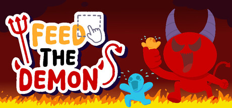
  • Genre Clarity: 8/10 — Clear dark comedy incremental theme. The red demon character, sacrifice motif (trident), and flame effects immediately signal dark incremental gameplay. The playful art style and cartoon demon distinguish this from serious horror games. At tiny size, the red demon silhouette and fire remain readable enough to convey the demonic incremental theme without ambiguity.
  • Title Readability: 8/10 — Bold readable title with strong hierarchy. The title uses clear white outline lettering with the iconic trident logo on the left. 'FEED' and 'DEMON' in red and black respectively maintain strong contrast and hierarchy. At tiny size, the text remains legible because of generous letter spacing and bold weight, though fine details of the trident soften slightly.
  • Contrast & Color: 8/10 — Strong red-yellow value separation. The bright red demon and yellow flame gradient contrast sharply against the dark burgundy background, creating excellent silhouette clarity. The cyan blue sacrifice character adds a complementary accent that draws the eye. In grayscale, the demon and flames still read clearly as distinct bright values separated from the darker background.
  • Uniqueness & Polish: 7/10 — Playful dark theme stands out. The cartoon art style combined with dark sacrifice mechanics creates a memorable hook that differentiates it from generic incremental games. The hand-drawn quality and colorful characters give a premium casual vibe, though the execution feels slightly template-like compared to standout indie titles. The concept is distinctive but the visual execution is competent rather than exceptionally crafted.
  • Brand Consistency: 7/10 — Coherent dark comedy identity. The red demon character, trident icon, and flame motif establish a recognizable visual identity consistent with the dark incremental premise. The playful cartoon rendering style feels cohesive throughout the composition. Without comparing additional store assets, the capsule shows internal consistency in art direction and color palette that should carry recognizable brand identity.
  • Composition: 8/10 — Clear focal hierarchy with balanced layout. The red demon on the right serves as the primary focal point, while the title and trident logo anchor the left side with the blue sacrifice character providing secondary interest. The flame footer grounds the composition and fills white space effectively. The layout maintains good balance and clarity at small size, though the title positioning at top-left is safe rather than innovative.

What works

  • Strong demon character silhouette. The large red demon with horns and dark face reads instantly at tiny size and immediately communicates the demonic theme.
  • High contrast against Steam dark background. Red, yellow, and white elements pop distinctly against the #1b2838 background, ensuring visibility during quick scroll.
  • Playful art style differentiates from competitors. The cartoon rendering and dark comedy tone create a memorable visual identity that stands out in the incremental genre.
  • Clear title hierarchy and readability. Bold outlined lettering with white and red colors maintains legibility even at tiny size without collapsing into illegibility.

What hurts the capsule

  • Generic incremental layout structure. Title on left, character on right, flames below follows a predictable template common in casual games.
  • Blue sacrifice character lacks visual weight. The cyan figure is small and somewhat lost in the composition, not contributing meaningfully to the focal hierarchy.
  • Limited depth layering. Elements feel relatively flat without strong foreground-midground-background separation to create visual richness.

Priority fixes

  1. [composition] Increase the blue sacrifice character size or add visual emphasis to strengthen its role in the composition and create better focal balance.
  2. [uniqueness_polish] Add a signature visual element or effect that is unique to Feed the Demon to increase distinctiveness compared to other incremental games.
  3. [contrast_color] Verify that fine details of the trident and demon face remain readable at 120x45 tiny size through additional testing.

Store copy priority fixes

  1. [uniqueness] Add a sentence explaining what mechanic, progression system, or demon-specific feature sets this incremental apart from others in the genre, e.g., 'Unique demon evolutions grant permanent passive abilities' or 'Spell combos create exponential scaling.'
  2. [audience_targeting] Insert a line acknowledging idle players explicitly: 'Play at your own pace—progress offline and return to massive gains,' to signal the hands-off idle appeal.
  3. [feature_communication] Expand on what 'true demonic forms' entails and what the prestige system unlocks, so players understand the long-term progression fantasy beyond 'level up more.'

Related guides

Steam app ID: 4356890 · Tags: Casual, Strategy, Incremental, Relaxing, Idler