Scoring genre clarity...

AstroMatch capsule

AstroMatch

AstroMatch! A unique match-3 style game with multiple game modes and levels to choose from.

$1.99
CasualIndiePuzzle
Perldragon StudiosFeb 12, 2026

AstroMatch scores 77/100 — better than 75% of Casual capsules (n=10,153).

$1.99 · Released Feb 12, 2026 · By Perldragon Studios

Quick text summary

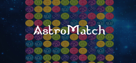
AstroMatch scored 77/100 on Steam Analyzer — Good for a Casual capsule. Top priority fix: [uniqueness_polish] Add a signature visual element—animated astro effect, glowing accent, or iconic symbol—that creates memorable brand differentiation at small size.

Capsule scores by dimension

  • Genre Clarity: 8/10 — Match-3 puzzle clearly signaled. The grid of colorful numbered orbs immediately communicates a match-3 mechanic at all sizes, with zodiac/astrology symbols visible on the tiles reinforcing the thematic twist. At TINY size, the grid pattern and bright orb variety remain identifiable as puzzle gameplay, though individual symbol details blur. The genre is unambiguous and well-executed.
  • Title Readability: 8/10 — Title readable with minor size loss. AstroMatch is centered and rendered in clean white serif/san-serif hybrid font with strong contrast against the dark starfield background. At SMALL size the title remains legible; at TINY size there is minor softening but text structure survives. Spacing is generous and placement avoids the noisy grid, which preserves readability across scales.
  • Contrast & Color: 8/10 — Strong value separation throughout. The white title stands out crisply against the deep blue-black starfield, and the colorful orb grid (yellows, magentas, purples, greens) pops distinctly against the dark background with high saturation. In grayscale, the title and orbs maintain clear edges and silhouette; no muddy mid-tones collapse the design at TINY size.
  • Uniqueness & Polish: 7/10 — Competent astro-themed match-3 aesthetic. The zodiac orb design and starfield backdrop add thematic personality beyond a generic match-3, and the color palette is vibrant and intentional. However, the overall execution feels solidly competent rather than distinctly premium—the grid layout is familiar match-3 convention, and there is no standout visual hook or signature effect that elevates it above mid-tier indie capsule polish.
  • Brand Consistency: 7/10 — Cohesive astro-puzzle visual identity. The astrology + match-3 fusion is internally consistent, with zodiac symbols on tiles and a starfield setting that reinforce each other. The saturated orb palette and clean sci-fi typography feel aligned. Without reference to store screenshots, the identity reads as recognizable within its concept, though it does not establish a unique iconic character or motif that stands apart from other puzzle games.
  • Composition: 8/10 — Well-centered hierarchy with clarity. The title is centered and floats above the grid, creating a clear two-level hierarchy: text first, gameplay visual second. The grid is balanced and symmetrical, drawing the eye to the center, and the starfield background provides sufficient breathing room. At SMALL and TINY sizes, the focal point remains the grid and title without competition; no elements crowd the edges or suffer from Steam crop risk.

What works

  • Genre instantly recognizable. The colorful numbered orb grid is unmistakably match-3 puzzle gameplay at all viewing sizes, supported by clear visual hierarchy.
  • Title legible and well-positioned. White sans-serif text centered on dark background with generous spacing avoids the noisy grid, surviving scale reduction well.
  • Thematic astro identity coherent. Zodiac symbols and starfield setting reinforce the astrology theme consistently throughout the capsule without feeling forced.
  • High color contrast and pop. Saturated orb palette stands out crisply against dark blue-black background with strong value separation maintained at tiny size.

What hurts the capsule

  • Generic match-3 visual hook. While thematically coherent, the grid layout and orb styling lack a distinctive visual signature that separates it from other casual puzzle games.
  • Limited brand memorability. No iconic character, symbol, or animation hook that would make this capsule instantly recognizable in a library of similar titles.
  • Starfield backdrop feels supplementary. The background, while pretty, does not actively support the game's core mechanic or communicate a unique selling point beyond theming.

Priority fixes

  1. [uniqueness_polish] Add a signature visual element—animated astro effect, glowing accent, or iconic symbol—that creates memorable brand differentiation at small size.
  2. [brand_consistency] Introduce a consistent character, mascot, or UI flourish visible across store screenshots and capsule to build stronger recognition.
  3. [composition] Consider subtle depth layering or motion hint in the background to create visual interest without compromising the clear grid focal point.

Store copy priority fixes

  1. [hook_strength] Replace 'A unique match-3 style game' with a verb-forward hook that leads with what the player does: 'Swap and match colorful pieces to trigger chain reactions and unlock special abilities.'
  2. [uniqueness] Add a specific, concrete differentiator: explain what the 3 modes are or how AstroMatch stands apart from other match-3 games in mechanics or progression.
  3. [feature_communication] Expand the detailed description to briefly describe the 3 game modes and what 'Choices Matter' means in gameplay context, so players understand progression and replayability.
  4. [tone_match] Rewrite in a warmer, more inviting voice that reinforces the relaxing, casual experience: 'Take your time and enjoy the satisfying puzzle-solving experience at your own pace.'

Related guides

Steam app ID: 4357150 · Tags: Casual, Indie, Puzzle, Match 3, 2D