Scoring genre clarity...
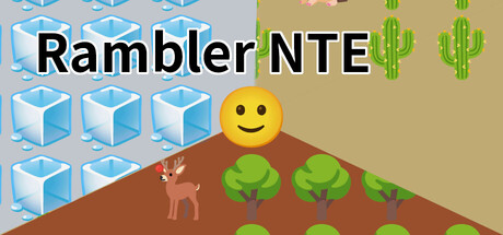
Rambler NTE (NTE = Noto Emoji) An emoji roguelike inspired by Rogue. In this turn-based, tile-based dungeon crawl, you “read” a procedurally changing labyrinth each run and aim to reach the lowest floor. Smart decisions and careful item management are the key to survival.
$3.991 user reviews
Turn-Based TacticsTraditional RoguelikeTactical RPG
RimefuFeb 25, 2026