Scoring genre clarity...

Push The Cart Together capsule

Push The Cart Together

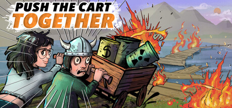
Cargo loaded, cart ready, the customer is waiting. Alone or with a friend, push the load to the finish line. Physics and the world around you won’t be friendly. The cargo will explode many times — so will you. It’ll be very hard, but don’t worry… eventually you’ll make it. Right?

$5.992 user reviews
Early AccessCasualRacing
ANTK StudioMay 15, 2026

Push The Cart Together scores 75/100 — better than 68% of Early Access capsules (n=3,067).

2 user reviews · $5.99 · Released May 15, 2026 · By ANTK Studio

Quick text summary

Push The Cart Together scored 75/100 on Steam Analyzer — Good for a Early Access capsule. Top priority fix: [title_readability] Increase title letterform weight or add subtle white outline to the orange 'TOGETHER' text to improve contrast and anti-aliasing legibility at tiny size.

Capsule scores by dimension

  • Genre Clarity: 8/10 — Clear casual co-op physics game. The capsule immediately communicates a cooperative, comedic physics-based game through two characters pushing an overloaded cart with explosive cargo ablaze. At tiny size, the cart silhouette, fire effects, and two-character setup clearly signal a chaotic local multiplayer or co-op experience. The orange fire and destruction cues override any racing confusion despite the genre tag, landing it firmly in casual physics comedy rather than competitive racing.
  • Title Readability: 7/10 — Readable title with minor scaling issues. The title 'PUSH THE CART TOGETHER' uses a bold italic font split across two lines with 'PUSH THE CART' in black and 'TOGETHER' in orange, positioned in the upper left over a lighter sky region. At full size it reads cleanly, and at small size the contrast holds reasonably well. At tiny size the italic letterforms compress slightly and the two-line split becomes tighter, but remains functionally readable; the orange accent word helps anchor recognition despite the small scale.
  • Contrast & Color: 8/10 — Strong warm-cool separation and silhouettes. The design uses a bright orange/yellow fire palette against cool blue-purple sky and gray-brown cart, creating excellent value separation and warm-cool contrast that pops against the Steam dark background. The character silhouettes and cart edges read clearly even when squinting, and the bright flames cut through any mid-tone noise. Fire effects and character outlines maintain clear definition at small and tiny scales without muddy blending.
  • Uniqueness & Polish: 7/10 — Polished cartoon style with clear hook. The art direction features clean cartoon illustrations with consistent line work, expressive character faces showing panic and effort, and deliberate comedic staging that communicates the core loop: two players struggling with chaos. The execution feels intentional and craft-focused rather than template-based, and the explosion-heavy cart immediately suggests the game's unique selling point of physics-driven destruction comedy. Competent illustration work with a distinctive tone that stands above generic physics game presentations.
  • Brand Consistency: 7/10 — Consistent cartoon style and comedic tone. The capsule maintains internal cohesion through uniform cartoon illustration style, consistent character design with exaggerated expressions, and a clear comedic visual language reinforced by the explosive destruction. The warm color palette and character-driven focus create a recognizable visual identity that could appear across other marketing materials. The style feels proprietary to this game rather than generic, though without prior exposure to other assets it is difficult to confirm full cross-asset consistency; however the internal coherence is strong.
  • Composition: 8/10 — Well-balanced focal point with clear hierarchy. The cart and characters occupy the strong center zone with natural eye guidance from left (pushing characters) to right (explosive payload and fire), creating a clear primary focal point that reads immediately at all sizes. The title sits safely in the upper left on a light sky region with minimal clutter, and the background mountains and water provide supporting context without competing for attention. At tiny size the composition collapses elegantly to cart + characters + fire, preserving the core message despite scale reduction.

What works

  • Immediately communicates co-op chaos mechanic. Two characters, overloaded cart, and explosive flames together tell the core gameplay story without text, making the cooperative physics-puzzle hook instantly clear even at thumbnail size.
  • Excellent color contrast and visual pop. Bright orange-yellow fire against cool blue sky and brown cart ensures the image stands out in Steam browsing and maintains silhouette clarity at all scales including tiny.
  • Polished cartoon art with expressive character work. Clean illustration style and exaggerated facial expressions convey comedic tone and effort, elevating the design above generic physics game templates.

What hurts the capsule

  • Italic font compresses at tiny sizes. The slanted letterforms of 'PUSH THE CART' and 'TOGETHER' lose some clarity when scaled down, making the two-line split tighter and slightly harder to parse at extreme small sizes.
  • Minimal tagline or subtext clarity. No visible descriptive text (such as 'Local Co-op' or 'Physics Puzzle') to reinforce genre beyond the visual metaphor, relying entirely on imagery interpretation.
  • Cart and cargo occupy busy mid-frame space. While composition is generally strong, the cluster of explosion effects and cargo elements in the center could feel slightly crowded compared to simpler focal point approaches used by top-tier indie capsules.

Priority fixes

  1. [title_readability] Increase title letterform weight or add subtle white outline to the orange 'TOGETHER' text to improve contrast and anti-aliasing legibility at tiny size.
  2. [composition] Ensure character faces and cart edges have clear breathing room; consider tightening the explosion particle density slightly to reduce mid-frame clutter without losing impact.
  3. [contrast_color] Test the capsule at actual Steam tiny thumbnail size (120×45) and verify the orange title still separates clearly from sky; add thin dark outline if blending occurs.

Store copy priority fixes

  1. [hook_strength] Rewrite the opening line to lead with the core action and its unique friction: "Push a massive cart in perfect sync with a friend — or fail spectacularly together. Physics and poor communication are your real enemies." This clarifies what you do while hinting at the social comedy angle.
  2. [uniqueness] Add a sentence that articulates the core differentiator: "Unlike other co-op platformers, the real challenge isn't the obstacles — it's coordinating with your partner to keep the cart stable and moving straight." This positions the game's unique twist on cooperation.
  3. [audience_targeting] Explicitly segment audience in the detailed intro: "Built for casual co-op players seeking hilarious failures and hard-won victories, with deeper challenges and speedrun modes for those who master the route." This signals both casual and hardcore appeal upfront.
  4. [genre_clarity] In the short description, replace "Physics and the world around you won't be friendly" with a more concrete mechanic description: "Navigate narrow ledges, explosive obstacles, and unstable physics that threaten your cargo at every turn." This gives clearer gameplay expectations.

Related guides

Steam app ID: 4360180 · Tags: Early Access, Casual, Racing, Co-op, Parkour