Scoring genre clarity...
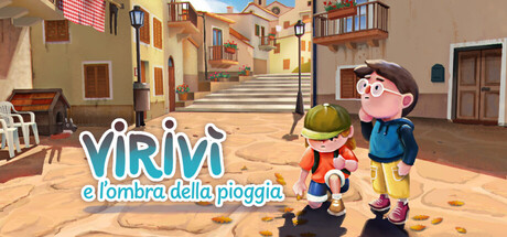
Virivì e l'ombra della pioggia is an educational adventure for kids. Join Donatella to explore flood risks and climate resilience in a Southern Italian village. Overcome eco-anxiety and empower your community through environmental awareness and action!
$1.99
AdventureEducationExploration
WhitesockMar 11, 2026