Scoring genre clarity...

ROCK - PAPER - DEATH capsule

ROCK - PAPER - DEATH

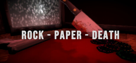
Rock, Paper, DEATH is a short-form horror game about pressure, greed, and knowing when to walk away. Play a deadly game of Rock Paper Scissors, lose fingers when you fail, and decide how far you’re willing to go before the House takes everything.

$0.993 user reviews
ActionCasualArcade
WGameDevStudiosFeb 19, 2026

ROCK - PAPER - DEATH scores 72/100 — better than 46% of Action capsules (n=8,534).

3 user reviews · $0.99 · Released Feb 19, 2026 · By WGameDevStudios

Quick text summary

ROCK - PAPER - DEATH scored 72/100 on Steam Analyzer — Good for a Action capsule. Top priority fix: [uniqueness_polish] Add a distinctive visual motif or signature icon (e.g., a unique card design, branded playing piece, or visual signature) that can become a recognizable brand marker across marketing materials.

Capsule scores by dimension

  • Genre Clarity: 7/10 — Horror game with dark premise clear. The red-tinted lighting, scattered playing cards, and visceral imagery of a bloodied hand establish a horror-tinged game about consequences and danger. At tiny size, the red palette and card elements read as a dark gambling or risk-based game, though the specific 'Rock Paper Scissors' mechanic is not immediately obvious from visuals alone. The title text clarifies the game loop, but the visual alone suggests horror-thriller over casual party game.
  • Title Readability: 8/10 — Clean white sans-serif title stands firm. The title 'ROCK - PAPER - DEATH' uses bold, high-contrast white sans-serif lettering positioned in the center-upper region against a dark red and black background. The text remains legible at small and tiny sizes due to strong value separation and clean letterforms without decorative flourishes. The hyphens add clarity to the three-part structure and aid readability across all viewing scales.
  • Contrast & Color: 8/10 — Strong red-black contrast with clear separation. The warm red gradient background provides excellent value separation from the dark black areas and high-contrast white title text against both. The bloodied hand and scattered cards have clear silhouettes that read distinctly even when squinting or at tiny thumbnail size. The grayscale test shows strong light-dark separation throughout, with no muddy mid-tones that would collapse readability.
  • Uniqueness & Polish: 7/10 — Distinctive horror-gambling aesthetic with craft. The bloodied hand, playing cards, and red-soaked environment communicate a specific dark premise about consequence and risk that sets it apart from generic horror or casual games. The composition and lighting feel intentional and thematic rather than template-based, with a clear visual hook around the mutilation-stakes mechanic. However, the execution is competent but not visually groundbreaking—similar playing-card-and-blood imagery exists in other indie horror titles.
  • Brand Consistency: 6/10 — Coherent internal theme, limited iconic identity. The red palette, playing cards, and hand imagery form a cohesive internal visual language that aligns with the game's core mechanic and tone. The style is consistent and supports the narrative hook of a deadly card game with personal stakes. However, there are no immediately iconic character, symbol, or signature motif that would make this capsule uniquely recognizable in future marketing or brand extensions.
  • Composition: 7/10 — Clear focal point, balanced layers, safe margins. The bloodied hand in the center-right and cards scattered across create a natural visual hierarchy with foreground (hand/cards), midground (red surface), and background (dark void). The title sits safely in the upper-center region away from dangerous edges and does not interfere with key visual elements. At tiny size, the composition reads as one cohesive dark scene with a clear subject; however, at small size the scattered card placement could benefit from slightly more intentional grouping to avoid visual scattered-ness.

What works

  • High-contrast white title on red-black base. The all-caps sans-serif typography in white achieves excellent legibility at all sizes, from full header to tiny thumbnail, with no decorative degradation.
  • Thematic visual hook around core mechanic. The playing cards and mutilated hand immediately communicate the game's dark gambling premise and consequence-driven gameplay loop.
  • Strong value separation and silhouette clarity. The red-black palette with distinct lighting creates clear separation that reads well even in grayscale or when squinting, supporting quick visual parsing during scroll.

What hurts the capsule

  • Scattered card placement lacks intentional hierarchy. The playing cards are distributed across the frame without clear grouping, which can feel slightly chaotic at small sizes and dilutes focal point strength.
  • Limited iconic brand identity or motif. While the theme is cohesive, there is no distinctive character, symbol, or signature visual that would make this capsule instantly recognizable in future marketing or community discourse.
  • Generic horror-gambling aesthetic without standout novelty. The blood, cards, and dark red environment evoke familiar indie horror tropes that are present in multiple other titles, reducing uniqueness differentiation.

Priority fixes

  1. [uniqueness_polish] Add a distinctive visual motif or signature icon (e.g., a unique card design, branded playing piece, or visual signature) that can become a recognizable brand marker across marketing materials.
  2. [composition] Consolidate scattered card placement into a more intentional grouping that strengthens focal hierarchy and reduces visual chaos at small sizes.
  3. [genre_clarity] Consider adding a subtle UI element or gameplay hint (e.g., visible finger counter, choice indicator, or game state visual) to reinforce the 'lose fingers' mechanic and clarify the core loop at tiny size.

Store copy priority fixes

  1. [feature_communication] Add 1-2 sentences explaining the bleedout mechanic in concrete terms: e.g., 'Each loss removes a finger and advances a bleedout counter—run out of fingers or patience and it's game over. Survive long enough and build a chip pool worth cashing out.'
  2. [audience_targeting] Insert a sentence in the short description emphasizing replayability or roguelike structure: e.g., 'Each run lasts 10-30 minutes depending on your risk tolerance' to set expectations for casual vs. hardcore players.
  3. [feature_communication] Clarify what cosmetics are and how they impact play (visual-only vs. mechanical) to answer the implied question 'Why should I unlock them?'

Related guides

Steam app ID: 4362460 · Tags: Action, Casual, Arcade, Point & Click, 3D