ENDPUNK scores 77/100 — better than 79% of Action capsules (n=8,534).

Quick text summary

ENDPUNK scored 77/100 on Steam Analyzer — Good for a Action capsule. Top priority fix: [genre_clarity] Add subtle UI or equipment detail (scavenge resources, gear upgrade indicator) to reinforce the resource management and progression loop central to gameplay.

Capsule scores by dimension

  • Genre Clarity: 8/10 — Post-apocalyptic shooter identity clear. The central character wears tactical gear, sunglasses, and a distinctive red mohawk, wielding an assault rifle against a nuclear-ruined cityscape with dark silhouetted buildings. At tiny size, the weapon, pose, and dystopian setting immediately communicate action shooter gameplay. The punk aesthetic and orange/red color palette reinforce the post-apocalyptic tone distinctly.
  • Title Readability: 8/10 — Bold title with strong contrast. ENDPUNK is rendered in large, solid yellow-orange text positioned directly below the character, utilizing high value contrast against the dark background. The title remains readable at small and tiny sizes due to its weight and saturation, though at tiny size the letterforms become slightly compressed but still recognizable.
  • Contrast & Color: 8/10 — Strong light-dark separation. The character's bright orange and red tones (mohawk, armor accents) and yellow title text create excellent silhouette separation against the dark ruined buildings and gray sky. The warm color palette pops distinctly from the cool dark background, and in grayscale the value contrast remains strong with clear edge definition even at tiny scale.
  • Uniqueness & Polish: 7/10 — Distinctive punk aesthetic, solid craft. The red mohawk, tactical outfit, and confident rifle pose create a memorable character archetype that differentiates from generic military shooters. The composition and rendering quality are competent and polished, though the visual premise—punk survivor in ruins—is a recognizable trope in the post-apocalyptic genre without a particularly novel mechanic hook visible in the imagery.
  • Brand Consistency: 7/10 — Cohesive punk-soldier identity. The character design, warm orange-red palette, dystopian setting, and bold typography create internal visual consistency and a recognizable brand signature. The punk-meets-military aesthetic could be identified on future assets, though without reference to store screenshots, the specific faction identity (Immortal vs. Necrotic) is not communicated here.
  • Composition: 8/10 — Clear focal point, balanced layout. The character occupies the center-upper portion with strong vertical emphasis from the mohawk and weapon, while the title anchors the lower third, creating natural depth and eye flow. At small and tiny sizes, the character silhouette remains the dominant focal point without competing elements, and safe margins protect the composition from cropping risk.

What works

  • High contrast title placement. Yellow ENDPUNK text sits on a dark background region with no competing texture, ensuring excellent readability from full size down to tiny thumbnails.
  • Memorable character silhouette. The red mohawk and weapon pose create an instantly recognizable visual hook that communicates action shooter intent and post-apocalyptic setting simultaneously.
  • Warm color pop against dark UI. Orange, red, and yellow palette elements create strong value separation and saturation that stands out during quick Steam scrolling against the #1b2838 background.

What hurts the capsule

  • Generic post-apocalyptic trope. While distinctive in character design, the punk-survivor-in-ruins premise does not visually communicate a unique gameplay mechanic or core selling point beyond the aesthetic.
  • Faction identity not visible. The capsule does not clarify whether the character represents an Immortal or Necrotic faction, missing an opportunity to communicate game-specific factions or progression systems.
  • Limited environmental storytelling. The ruined buildings are silhouetted and generic, lacking specific visual cues about the game's world, era, or what makes the survival/scavenging loop compelling.

Priority fixes

  1. [genre_clarity] Add subtle UI or equipment detail (scavenge resources, gear upgrade indicator) to reinforce the resource management and progression loop central to gameplay.
  2. [uniqueness_polish] Introduce a distinctive environmental or mechanical element (e.g., glow effect, team identifier, faction marker) that differentiates ENDPUNK from generic post-apocalyptic shooters.
  3. [brand_consistency] Include a subtle color or symbol cue that reinforces whether the character is Immortal or Necrotic, establishing stronger faction identity for later recognition.

Store copy priority fixes

  1. [hook_strength] Rewrite the opening line to lead with a specific, visceral action verb: instead of '
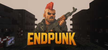
ENDPUNK is a post-apocalyptic online shooter,' try 'Scavenge a radioactive wasteland with your squad—or hunt them down for their loot' to create immediate tension and player agency.
  2. [uniqueness] Add 1-2 sentences explaining what makes the voxel-style visual identity and faction system (Immortals vs Necrotic) mechanically distinct; e.g., do these factions have different abilities, playstyles, or strategic advantages?
  3. [feature_communication] Expand the 'Dynamic combat' and 'Progression' sections with one concrete example each: e.g., 'Enemies respond to footsteps and gunfire—silence your approach or bait them into traps' or 'Every raid's loot permanently upgrades your base loadout, unlocking new weapons and perks.'
  4. [audience_targeting] Add a single sentence clarifying the intended audience: e.g., 'Built for squads seeking hardcore survival with tactical gunplay' or 'Fast-paced team deathmatches for competitive FPS veterans' to tighten audience signal.

Related guides

Steam app ID: 4364940 · Tags: Action, Post-apocalyptic, 3D, FPS, PvP