Slimepatch scores 77/100 — better than 79% of Action capsules (n=8,534).

Quick text summary

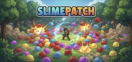
Slimepatch scored 77/100 on Steam Analyzer — Good for a Action capsule. Top priority fix: [title_readability] Remove or enlarge the tagline below SLIMEPATCH to ensure only the main title occupies prime real estate that will survive TINY cropping.

Capsule scores by dimension

  • Genre Clarity: 8/10 — Clear match-3 action gameplay. The colorful slime orbs, top-down arena perspective, and central character surrounded by destructible targets immediately signal a casual action puzzle game. At TINY size, the explosion effects and dense arrangement of colored spheres still clearly read as a match-3 or ball-clearing mechanic, though the exact survivor-roguelike progression is less obvious without context.
  • Title Readability: 8/10 — Strong title legibility. SLIMEPATCH uses a bold, high-contrast cyan and orange two-tone outline font positioned at the top center against clear sky background, ensuring readability at all sizes including TINY. The word split (SLIME | PATCH) with color contrast aids recognition, though the tagline below would be illegible at thumbnail size.
  • Contrast & Color: 8/10 — Vibrant saturation against dark. The palette of bright primary-colored slimes (red, blue, yellow, purple) pops distinctly against both the forest greenery and the dark Steam background. Warm explosion effects in the center create strong focal point luminance, and the sky gradient provides clean separation from the title, though the midtone green foliage could compress slightly at TINY size.
  • Uniqueness & Polish: 7/10 — Polished casual aesthetic. The capsule shows cohesive lighting, particle effects, and a cheerful forest setting that feels intentional and craft-focused rather than templated. The combination of cozy woodland setting with vibrant candy-like slimes communicates the relaxed-but-action tone well, though the core visual idea (match-3 arena) is familiar in the casual games space and lacks a highly distinctive hook at first glance.
  • Brand Consistency: 7/10 — Consistent cozy-action branding. The art style, color palette, and character silhouette align well internally, suggesting a coherent game identity around colorful slime chaos in natural settings. The logo treatment and explosion effects would likely carry across screenshots, though without access to compare the 5 other store images, the distinctiveness of recognizable icons is moderate.
  • Composition: 8/10 — Clear focal hierarchy. The character positioned in the center with radiating slimes creates strong depth layering: forest background, midground slime field, foreground explosions, and title safely anchored above. The composition avoids dead space and guides attention naturally downward through the slime gradient, remaining robust at SMALL and TINY sizes with no critical edge-crop vulnerabilities.

What works

  • Title legibility across sizes. Bold two-tone outline font and top-center positioning ensure SLIMEPATCH reads clearly even at TINY thumbnail scale against the sky background.
  • Strong color pop and saturation. Vibrant primary-colored slimes and warm explosion effects create instant visual separation from the dark Steam background and forest setting.
  • Clear focal point and depth. Central character surrounded by slimes with layered background, midground, and foreground creates natural hierarchy that guides attention without clutter.

What hurts the capsule

  • Familiar match-3 visual archetype. The core visual of colorful orbs and clearing mechanics mirrors many casual puzzle games, limiting distinctiveness in crowded genre sections.
  • Tagline likely illegible at TINY. Small text below the title logo would collapse and become unreadable at thumbnail size, wasting prime real estate.
  • Generic woodland arena setting. While cohesive and pleasant, the forest glade with slimes lacks a signature environmental or character motif that could distinguish this game in memory.

Priority fixes

  1. [title_readability] Remove or enlarge the tagline below SLIMEPATCH to ensure only the main title occupies prime real estate that will survive TINY cropping.
  2. [uniqueness_polish] Consider adding a signature character or mascot silhouette that is more distinctive than the current generic player avatar, or emphasize a unique slime type or mechanic visual.
  3. [genre_clarity] If the survivor-roguelike progression is a core hook, add a subtle progression indicator (e.g., rank badge or upgrade glow) to clarify the replayable ladder system at SMALL size.

Store copy priority fixes

  1. [feature_communication] Add a specific example of 3-4 upgradeable abilities or skill trees (e.g., 'Boost your sword swing, unlock projectile attacks, or enhance your shield defense') to show build variety and replayability.
  2. [uniqueness] Clarify what makes Slimepatch's progression or combat loop distinct—e.g., 'Unlike other survivors, ranks reset on higher difficulties' or 'Cozy tone combined with genuine skill-based combat' to justify why this game stands out.
  3. [audience_targeting] Add one sentence explicitly naming the target player: 'Perfect for players who love roguelike progression without time pressure' or 'Designed for casual gamers who want meaningful advancement at their own pace.'
  4. [feature_communication] Briefly describe how combat *feels*—movement mechanics, attack feedback, or crowd-control options—to help players visualize the moment-to-moment gameplay beyond 'clearing waves.'

Related guides

Steam app ID: 4376760 · Tags: Action, Casual, Indie, Family Friendly, Controller