Dice Goblins Clicker scores 75/100 — better than 56% of Management capsules (n=1,996).

Quick text summary

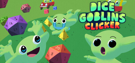
Dice Goblins Clicker scored 75/100 on Steam Analyzer — Good for a Management capsule. Top priority fix: [composition] Consolidate focal points by repositioning the two secondary goblins as smaller supporting elements and emphasizing one primary character expression as the main visual anchor.

Capsule scores by dimension

  • Genre Clarity: 8/10 — Clear casual clicker with playful tone. The bright, colorful art style with goofy goblin characters and oversized dice immediately signals a lighthearted idle/clicker game rather than a serious strategy title. At tiny size, the cheerful green palette, expressive goblin faces, and scattered dice elements remain recognizable as casual gameplay, though the specific 'clicker' mechanic requires prior knowledge. The whimsical aesthetic clearly avoids hardcore or action genres.
  • Title Readability: 8/10 — Bold, legible title with strong colors. The 'DICE GOBLINS CLICKER' text uses bright yellow-green and red with clean sans-serif letterforms positioned in the upper-right quadrant on a controlled background region. At small size the title remains fully readable with good contrast against the green background; at tiny size, individual letters compress but the overall word shapes hold due to bold weight and saturated colors. The logo avoids decorative flourishes that would collapse at small scales.
  • Contrast & Color: 8/10 — Vibrant palette with clean value separation. The capsule uses a bright lime-green background with high-saturation purple dice, red/orange accents, and pale green goblin faces that create strong value separation against the dark Steam background #1b2838. Even at tiny size, the warm yellow-green text and cool purple dice maintain clear silhouettes with good grayscale contrast. The overall brightness and saturation allow key elements to pop without muddy mid-tones.
  • Uniqueness & Polish: 7/10 — Charming art with solid execution. The expressive goblin character design with cartoon eyes and playful poses, combined with the bright color palette and scattered dice motif, creates a distinctive and premium casual aesthetic that feels intentional rather than templated. The visual storytelling clearly communicates 'fun, chaotic number-clicking fun' without relying on generic assets. However, the composition is somewhat crowded, and the overall concept aligns with established indie clicker trends rather than breaking new ground.
  • Brand Consistency: 7/10 — Consistent charming goblin identity. The goblin character design with specific eye style and expression, combined with the signature bright green and purple color palette, creates a recognizable internal brand identity that would carry across store screenshots. The art direction is cohesive—all elements share the same playful, cartoon illustration style with consistent line weight and rendering. The goblin motif and dice imagery form a clear thematic anchor, though without iconic symbolism quite as strong as top-tier indie games.
  • Composition: 7/10 — Balanced layout with clear focal points. The composition uses three expressive goblin characters as primary focal points distributed across the frame, with dice scattered as supporting elements, and the title anchored in the upper right with safe margins. At small and tiny sizes, the grouped characters remain readable as the primary subject despite the visual density. The layout avoids dead center voids, but the scattered dice and multiple character faces create some competing focal points that slightly reduce hierarchy clarity at extremely small scales.

What works

  • Memorable character-driven aesthetic. The expressive goblin faces with distinct eyes and joyful expressions create an immediately charming and recognizable visual identity that communicates fun and personality.
  • Strong color contrast and vibrancy. The bright lime-green background with purple, red, and yellow accents maintains excellent pop against the Steam dark background and remains legible at all viewing sizes.
  • Clear genre and tone communication. The playful art style, whimsical character design, and scattered dice elements instantly signal a lighthearted casual clicker without ambiguity.

What hurts the capsule

  • Competing focal points in composition. Multiple goblins with similarly sized faces and the scattered dice elements create visual noise that slightly dilutes hierarchy, making the singular primary subject less obvious at tiny size.
  • Dense layout with potential cropping risks. Several dice and character elements sit close to the edges, which could be cut off by Steam's cropping at different aspect ratios and display contexts.
  • Limited narrative/mechanic clarity beyond 'clicker'. While the casual tone is clear, the specific gameplay loop (upgrade, automate, chaos elements) is not visually communicated; viewers cannot immediately understand the 'incremental growth' or 'chaos' pillars from the art alone.

Priority fixes

  1. [composition] Consolidate focal points by repositioning the two secondary goblins as smaller supporting elements and emphasizing one primary character expression as the main visual anchor.
  2. [uniqueness_polish] Incorporate a subtle upgrade or progression visual cue (e.g., stacked coins, glowing dice, or ascending number display) to hint at the idle/clicker mechanic and distinguish from purely character-driven games.
  3. [composition] Increase safe margins around edge elements (dice at periphery) and reposition title or elements to avoid cut-off risks on smaller aspect ratio displays.

Store copy priority fixes

  1. [uniqueness] Add 1–2 specific examples of synergies or modifiers (e.g., 'Combine Lucky Dice with the Goblin Doubler to trigger exponential cascades') to show what 'absurd upgrades' actually do and why this game stands out.
  2. [feature_communication] Expand the Features section with brief mechanic summaries: explain what each dice type does, what prestige unlocks, and how upgrade modifiers stack (e.g., 'Prestige resets progress but multiplies your dice roll power permanently').
  3. [uniqueness] Add a sentence contrasting Dice Goblins to other clickers (e.g., 'Unlike typical number games, every upgrade you stack changes how the dice behave, rewarding experimentation over grinding') to clarify the unique appeal.

Related guides

Steam app ID: 4378260 · Tags: Management, Resource Management, Incremental, Dice, Strategy