Scoring genre clarity...

Peaceful Fishing Story capsule

Peaceful Fishing Story

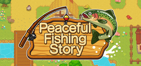
A relaxing fishing game set in a village surrounded by nature. Cast your line in rivers, lakes, and the ocean, fill your fishing encyclopedia, and enjoy peaceful days at your own pace. Catch legendary fish in every location—and eventually take on the rarest and most extraordinary among them.

$11.994 user reviews
IndieSportsPixel Graphics
SAT-BOXMar 20, 2026

Peaceful Fishing Story scores 77/100 — better than 78% of Indie capsules (n=11,449).

4 user reviews · $11.99 · Released Mar 20, 2026 · By SAT-BOX

Quick text summary

Peaceful Fishing Story scored 77/100 on Steam Analyzer — Good for a Indie capsule. Top priority fix: [contrast_color] Increase value separation between foliage background and midground elements by darkening shadows or brightening foreground subjects to strengthen tiny-size legibility.

Capsule scores by dimension

  • Genre Clarity: 8/10 — Clear casual fishing identity. The fishing rod, jumping fish, peaceful village setting, and warm naturalistic palette immediately signal a relaxing fishing game. At tiny size, the fish silhouette and rod remain recognizable anchors that communicate the core gameplay loop without ambiguity.
  • Title Readability: 8/10 — Strong readable title treatment. The title 'Peaceful Fishing Story' uses bold yellow-orange letterforms with a dark outline on a wooden banner background, creating solid contrast against the dark Steam background. At tiny size the text remains legible, though individual letterforms lose definition—the overall shape and color mass still communicate the title clearly.
  • Contrast & Color: 8/10 — Warm palette pops effectively. The golden-yellow title banner, bright green grass, and orange-brown wood tones create strong warm-to-cool separation against the dark background. The jumping fish and title pop clearly at small size due to value separation, though the mid-tone green foliage blends slightly in grayscale at tiny scale.
  • Uniqueness & Polish: 7/10 — Charming art with modest distinctiveness. The pixel-art village setting and hand-drawn fish have a coherent, intentional aesthetic that feels craft-driven rather than templated. The art communicates peacefulness and nostalgia effectively, though the overall composition relies on familiar pastoral game imagery and does not introduce a particularly novel visual hook beyond solid execution.
  • Brand Consistency: 7/10 — Cohesive rustic aesthetic throughout. The warm color palette, wooden UI elements, natural village setting, and cheerful pixel-art style create a recognizable internal identity. The fishing rod, jumping fish, and pastoral landscape form coherent visual motifs, though no single iconic symbol stands out as a potential franchise anchor across future marketing materials.
  • Composition: 8/10 — Well-balanced focal hierarchy. The jumping fish commands the upper right as the primary subject, the title banner anchors the center-left, and the village environment provides context without clutter. The composition resists edge-hugging and maintains safe margins, though at tiny size the distributed elements (fish, rod, foliage) risk losing visual unity and becoming a scattered scene.

What works

  • Genre communicated instantly. The fishing rod, leaping fish, and peaceful pastoral setting leave no doubt about the game's core mechanic and relaxing tone at all sizes.
  • Warm color palette stands out. The golden yellow and green tones create strong separation from the dark Steam background and maintain readability at small scale.
  • Coherent art direction. Pixel-art style, wooden UI, and natural environment combine into a unified aesthetic that feels intentional and craft-driven rather than generic.

What hurts the capsule

  • Limited visual uniqueness. The pastoral fishing scene, while well-executed, relies on familiar game imagery without a distinctive hook or memorable signature element.
  • Mid-tone foliage loses clarity. The green grass and tree elements blend into a uniform mid-tone value when squinting or viewing at tiny size, reducing silhouette contrast.
  • Scattered focal points at tiny size. The distributed fish, rod, title, and environment elements compete for attention when compressed, risking a busy or unfocused read during quick scroll.

Priority fixes

  1. [contrast_color] Increase value separation between foliage background and midground elements by darkening shadows or brightening foreground subjects to strengthen tiny-size legibility.
  2. [uniqueness_polish] Add a signature visual motif—such as an iconic character, distinctive fish species, or landmark—that elevates the capsule beyond competent pastoral scenery.
  3. [composition] Consider tightening the scene focus by anchoring the title and primary fish more centrally to reduce visual scatter and guide eye flow at small sizes.

Store copy priority fixes

  1. [hook_strength] Rewrite the short description opening to lead with a specific, emotionally resonant hook, e.g., 'Escape to a tranquil village where you'll hunt for legendary creatures, befriend quirky locals, and build your dream home—all at your own pace.'
  2. [uniqueness] Add 1-2 sentences explaining what makes this game's fishing, progression, or legendary creature mechanic distinct from other cozy fishing games, e.g., 'Uncover the mystery of the legendary King Fish and unlock a final, extraordinary challenge unlike any other.'
  3. [audience_targeting] Clarify in the opening paragraph whether this is a pure relaxation game or has optional skill-based challenges, e.g., 'Play casually or compete on global leaderboards—it's entirely up to you.'
  4. [feature_communication] Expand the Legendary King narrative with a 2-3 sentence teaser that builds stakes and progression clarity, making it feel like a meaningful endgame rather than a footnote.

Related guides

Steam app ID: 4382520 · Tags: Indie, Sports, Pixel Graphics, Adventure, Casual