Apococlicks scores 67/100 — better than 17% of Adventure capsules (n=7,922).

Quick text summary

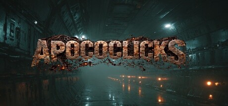
Apococlicks scored 67/100 on Steam Analyzer — Solid for a Adventure capsule. Top priority fix: [title_readability] Simplify the title letterforms or add a clean contrasting outline/shadow to maintain legibility at small sizes without losing the rust aesthetic.

Capsule scores by dimension

  • Genre Clarity: 8/10 — Post-apocalyptic horror mood clear. The dark urban decay, flooded streets, atmospheric lighting, and crumbling architecture immediately signal post-apocalyptic survival horror. At TINY size, the ominous environment and derelict setting remain readable enough to convey genre. The incremental clicker aspect is not visually apparent from the capsule alone, but the apocalyptic theme is unmistakable.
  • Title Readability: 5/10 — Title legible at full size only. The rusty, textured 'APOCOCLICKS' title is readable at full header size with clear letterforms and appropriate placement in the composition. However, at SMALL size (231x87) the textured details begin to blur, and at TINY size (120x45) the individual letters collapse into muddy silhouettes, making confident reading difficult. The decorative rust texture works visually but sacrifices small-size legibility.
  • Contrast & Color: 7/10 — Strong value separation with mood. The dark teal-blue environment contrasts effectively against the warm orange-brown rusty title text and golden ambient lights, creating good silhouette separation against the #1b2838 Steam background. In grayscale, the mid-tone title and bright light sources maintain reasonable contrast. The atmospheric fog and darker building elements create layered depth, though some mid-tone details risk blending at tiny sizes.
  • Uniqueness & Polish: 7/10 — Distinctive apocalyptic atmosphere. The cinematic flooded-city environment with volumetric lighting and decaying infrastructure creates a memorable post-apocalyptic mood that feels deliberately crafted rather than generic. The rust-texture title treatment is thematically appropriate and supports the world-building. However, the composition is relatively straightforward urban decay—while well-executed, it lacks a unique mechanical hook or character element that would distinguish it further from other survival horror titles.
  • Brand Consistency: 6/10 — Thematic but non-iconic identity. The capsule establishes a consistent dark, industrial, flooded-ruins aesthetic that aligns with post-apocalyptic horror branding expectations. The warm rust-textured title and golden lighting create a recognizable color motif. However, without reference to the five store screenshots, there is no clearly distinctive iconography, character, or symbolic element that would make this capsule uniquely identifiable as 'Apococlicks' versus a generic survival game.
  • Composition: 7/10 — Clear focal hierarchy with depth. The title is centered and prominent with the atmospheric environment providing secondary context below. Volumetric lights and floating particles guide the eye without creating clutter. The composition maintains safe margins and the focal point survives cropping well at small sizes. The layered depth (foreground lights, midground structures, background fog) creates visual interest and supports the cinematic mood without scattered attention.

What works

  • Atmospheric mood and genre signals. The flooded ruins, decay, and dark volumetric lighting instantly communicate post-apocalyptic horror and create an evocative, memorable visual impression.
  • Strong color contrast against Steam background. The warm rusty gold title and golden ambient lights pop distinctly against the dark teal environment and dark Steam background, maintaining decent silhouette separation even at reduced sizes.
  • Coherent depth and layering. The composition uses foreground/midground/background elements effectively to create visual sophistication and prevent flatness.

What hurts the capsule

  • Title legibility collapses at tiny size. The decorative rust texture on the title becomes illegible muddy shapes at 120x45 pixels, reducing discoverability during quick scrolling.
  • No mechanical or iconic visual hook. The capsule communicates atmosphere and genre but lacks a distinctive character, object, or gameplay mechanic visual that would make it uniquely memorable as 'Apococlicks' specifically.
  • Incremental clicker gameplay invisible. The game's core clicker mechanic is not visually represented anywhere on the capsule, making it impossible to infer the game type from the image alone.

Priority fixes

  1. [title_readability] Simplify the title letterforms or add a clean contrasting outline/shadow to maintain legibility at small sizes without losing the rust aesthetic.
  2. [genre_clarity] Add a subtle UI element or gameplay visual (progress bar, number counter, click effect) to hint at the incremental clicker mechanic.
  3. [brand_consistency] Introduce a distinctive character, icon, or visual symbol that appears consistently across marketing materials to build recognizable brand identity.

Store copy priority fixes

  1. [hook_strength] Rewrite the short description to lead with a specific curiosity or emotional hook rather than genre tags—e.g., 'Uncover the secrets of a buried research facility one click at a time, and decide if the past should stay buried' instead of listing genres.
  2. [feature_communication] Add a short bulleted or prose section explicitly explaining 1–2 key progression mechanics (e.g., how upgrades scale, how surface-world choices affect player progression) and clarify what 'playable without timed input' means in practice.
  3. [uniqueness] Include a concrete statement of what makes this clicker-narrative hybrid distinct—e.g., 'Your discoveries directly reshape the surface world's survival chances, which unlocks new content for you' rather than vague mutual benefit language.
  4. [audience_targeting] Add 1–2 explicit audience signals in the detailed description—e.g., 'For players who enjoy slow-burn storytelling and thoughtful exploration over fast-paced action' or clarify whether the FPS tag reflects first-person camera perspective (and is secondary to the clicker loop).

Related guides

Steam app ID: 4383810 · Tags: Adventure, Post-apocalyptic, Horror, Incremental, Action-Adventure