Scoring genre clarity...

Galleries capsule

Galleries

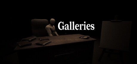
The art you choose is a confession. Enter a gallery that feels slightly off, where every painting you admire, and every prompt you answer, shapes the world around you. A short psychological experience where the system learns your patterns and delivers a final judgement.

$3.99
ExplorationWalking SimulatorFirst-Person
Black Gate StudiosFeb 26, 2026

Galleries scores 68/100 — better than 21% of Exploration capsules (n=4,872).

$3.99 · Released Feb 26, 2026 · By Black Gate Studios

Quick text summary

Galleries scored 68/100 on Steam Analyzer — Solid for a Exploration capsule. Top priority fix: [uniqueness_polish] Introduce a subtle visual anomaly or distinctive art detail (warped frame, uncanny painting, unusual lighting) that hints at the psychological element and differentiates from generic gallery imagery.

Capsule scores by dimension

  • Genre Clarity: 7/10 — Psychological adventure, atmospheric mood. The dimly lit gallery setting with a solitary figure examining artwork clearly communicates an introspective, narrative-driven experience rather than action-heavy gameplay. At tiny size, the silhouette of the person and framed artwork remain readable enough to suggest contemplation and art-focused mechanics, though the psychological/horror undertone is subtle and requires familiarity with indie adventure conventions.
  • Title Readability: 8/10 — Clean, centered, highly legible. The word 'Galleries' is rendered in a classic serif font with excellent contrast against the dark background, positioned centrally with ample breathing room. At tiny size, the title remains clearly readable due to its sans-serif weight and strategic placement away from competing visual elements; the typography does not collapse under compression.
  • Contrast & Color: 7/10 — Strong value separation, atmospheric depth. The white title text pops cleanly against the near-black background, and the warm brown wooden gallery elements provide sufficient mid-tone separation from the darker shadows. At small and tiny sizes, the silhouette of the figure and architectural elements maintain clarity; grayscale conversion shows good edge definition, though the overall palette leans heavily toward dark tones which slightly reduces visual pop on quick scroll.
  • Uniqueness & Polish: 6/10 — Competent but familiar gallery aesthetic. The 3D-rendered gallery scene with a contemplative figure is well-executed and matches the game's concept, but the visual treatment feels like a straightforward representation of the core mechanic rather than a distinctive artistic hook. The minimalist approach is intentional and appropriate, yet the image lacks the visual surprise or unique stylistic signature that elevates top-tier indie capsules; it communicates the concept without memorable polish or standout detail work.
  • Brand Consistency: 6/10 — Thematically aligned, limited identity cues. The gallery setting is internally coherent with the game's premise and description, but there are no distinctive visual motifs, color signatures, or iconic symbols that would make this recognizable as a unique brand across multiple touchpoints. Without access to the referenced store screenshots, the capsule reads as a direct representation of gameplay rather than a signature visual identity that could be instantly recognized in a lineup.
  • Composition: 7/10 — Clear focal point, balanced depth. The contemplative figure in the center-left serves as the primary focal point, with the framed artwork and gallery architecture providing supporting depth and context without overwhelming the primary subject. The composition maintains good balance across all viewing sizes and respects safe margins; at tiny size the arrangement remains coherent, though the dark background consumes significant space which could be perceived as compositional passivity.

What works

  • Title legibility and contrast. The white serif title 'Galleries' maintains excellent readability at all sizes including tiny, with clean letterforms and strong value separation against the dark background.
  • Thematic alignment with core mechanic. The gallery setting with contemplative figure directly communicates the game's psychological art-appreciation focus without ambiguity or genre confusion.
  • Composition depth and hierarchy. The layering of figure, artwork, and architecture creates clear foreground-to-background depth that guides viewer attention without scattering focus across competing elements.

What hurts the capsule

  • Generic indie gallery aesthetic. The 3D-rendered gallery scene lacks distinctive visual personality and could serve as a placeholder for multiple introspective indie titles, offering no memorable brand signature.
  • Limited visual pop and saturation. The predominantly dark, desaturated palette reduces visual impact during quick scroll on Steam's dark background, relying heavily on contrast rather than color appeal.
  • Absence of psychological horror hints. Despite the game's 'slightly off' and 'final judgement' narrative elements, the capsule presents a serene, perfectly normal gallery scene without subtle visual cues that hint at the unsettling premise.

Priority fixes

  1. [uniqueness_polish] Introduce a subtle visual anomaly or distinctive art detail (warped frame, uncanny painting, unusual lighting) that hints at the psychological element and differentiates from generic gallery imagery.
  2. [contrast_color] Introduce warm accent lighting or colored frame highlights on one key painting to add visual interest and pop against the dark background without losing the atmospheric mood.
  3. [brand_consistency] Establish a signature color or visual motif (specific painting style, color palette, or symbolic object) that could become iconic to Galleries across all marketing materials.

Store copy priority fixes

  1. [feature_communication] Specify one concrete example of how the gallery's learning mechanic manifests—e.g., 'if you choose abstract over representational art, the gallery begins showing increasingly fragmented imagery' to make the adaptive system tangible.
  2. [hook_strength] Add a single visceral detail about the gallery's wrongness in the short description—something visual or sonic that grounds 'slightly off' in sensory experience rather than abstraction.
  3. [uniqueness] Include a comparison or distinction line that contrasts Galleries with similar games—e.g., 'unlike traditional branching narratives, your taste itself becomes the variable' to sharpen differentiation.

Related guides

Steam app ID: 4389870 · Tags: Exploration, Walking Simulator, First-Person, 3D, Psychological Horror