Scoring genre clarity...

Enthaur : Lost in Slumber capsule

Enthaur : Lost in Slumber

Enthaur is a poetic and visceral solo first person journey where players are launched in a decaying world made of flesh, where they need to play with body-like mechanics to survive.

Free to Play8 user reviews
AdventureExplorationPlatformer
PerWeak StudioMar 6, 2026

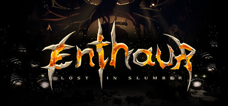
Enthaur : Lost in Slumber scores 75/100 — better than 74% of Adventure capsules (n=7,922).

8 user reviews · Free to Play · Released Mar 6, 2026 · By PerWeak Studio

Quick text summary

Enthaur : Lost in Slumber scored 75/100 on Steam Analyzer — Good for a Adventure capsule. Top priority fix: [title_readability] Increase subtitle size and/or add a contrasting outline to 'LOST IN SLUMBER' so it remains legible at SMALL and TINY sizes without losing visual hierarchy.

Capsule scores by dimension

  • Genre Clarity: 7/10 — Dark horror with unclear mechanics. The grotesque flesh-like biomechanical imagery and decay aesthetic clearly signal horror/dark fantasy, but the first-person exploration or body-mechanic gameplay is not visually apparent at any size. At TINY size, the silhouette reads as a nightmarish creature or environment, which matches the genre tone but doesn't communicate the specific poetic journey or survival mechanics mentioned in the description.
  • Title Readability: 8/10 — Strong stylized title, readable throughout. The 'Enthaur' title uses a bold, aggressive serif-influenced font with orange/gold coloring and distinct letter shapes that maintain legibility from full header down to TINY size. The subtitle 'LOST IN SLUMBER' is smaller but still readable at SMALL size; however, at TINY size the subtitle becomes difficult to parse. The title itself avoids being lost in the dark background by having strong color separation and clean letterforms.
  • Contrast & Color: 8/10 — Excellent warm-dark contrast separation. The orange/gold title and warm creature silhouettes create strong luminance separation against the deep black background (#1b2838 equivalent), making elements pop on quick scroll. The warm color temperature of the biomechanical details in the center and title ensures clear readability and visual punch. In grayscale, the light tones of the creature and text maintain clear edges and distinguish themselves from the dark void, though some mid-tone flesh details lose definition.
  • Uniqueness & Polish: 8/10 — Premium grotesque aesthetic, distinctive vision. The organic biomechanical design language—flesh-like forms with sharp metallic overlays—communicates a unique and intentional art direction that sets it apart from generic horror. The creature or environment design feels purposeful and thematically tied to body-mechanic gameplay, not a random asset grab. This level of craft and narrative visual cohesion elevates it above baseline indie capsules, though it does not reach the iconic simplicity of top-tier comparables like Balatro or Dave the Diver.
  • Brand Consistency: 7/10 — Coherent dark organic style, moderate recognition. The warm gold/orange palette against deep black, combined with the grotesque biomechanical motif, creates a recognizable visual signature that should read consistently across store screenshots. The ornate, organic creature/environment design is a distinctive identity hook; however, without a clear character or logo mark, the brand identity relies heavily on atmosphere rather than an iconic symbol. The internal rendering and art direction show strong cohesion, but the brand feel is atmospheric rather than immediately memorable.
  • Composition: 7/10 — Clear focal point, slight edge-hugging risk. The biomechanical creature or form in the center-right serves as the primary focal point, with the title anchored at top-left, creating good hierarchy. The darker background provides breathing room and prevents clutter. At SMALL size the composition reads well with clear foreground-background separation. However, the title sits close to the top edge and the creature extends toward the right edge, risking Steam's cropping behavior; at TINY size the subtitle nearly disappears due to small letterform size competing for real estate.

What works

  • Strong warm-dark contrast. Orange/gold title and creature details create excellent luminance separation against black background, ensuring visibility at all sizes including quick scroll and grayscale.
  • Distinctive biomechanical aesthetic. The organic flesh-with-metal design language communicates a unique and intentional art direction that feels premium and thematically aligned with the game's body-mechanic concept.
  • Clear visual hierarchy. The centered creature form serves as a strong focal point while the title placement at top guides the eye without competing, and negative space prevents clutter.

What hurts the capsule

  • Gameplay mechanics not communicated. The grotesque imagery signals horror atmosphere but does not visually convey first-person exploration, body-mechanic survival gameplay, or the 'poetic journey' aspect at any size.
  • Subtitle legibility at small sizes. The 'LOST IN SLUMBER' subtitle becomes nearly unreadable at SMALL and TINY sizes, reducing the completeness of the title read and brand messaging.
  • Edge-hugging and crop risk. The title sits close to the top edge and the creature extends toward the right edge, creating potential Steam cropping issues that could cut off visual information.

Priority fixes

  1. [title_readability] Increase subtitle size and/or add a contrasting outline to 'LOST IN SLUMBER' so it remains legible at SMALL and TINY sizes without losing visual hierarchy.
  2. [composition] Reposition the creature and title elements to maintain adequate margins from all edges, ensuring resilience against Steam's capsule cropping on library display.
  3. [genre_clarity] Consider adding a subtle first-person perspective frame, a hand-based UI element, or a mechanical survival hint to the composition to better communicate the core gameplay loop beyond atmosphere.

Store copy priority fixes

  1. [feature_communication] Restructure detailed description with clear section headers: "Core Gameplay" (climbing, lantern, puzzles, stealth), "The World" (homunculus setting), "Story." Use bullet points for the verb-forward mechanic list to improve scannability.
  2. [audience_targeting] Add a 1-2 sentence audience signal after the hook: clarify if this is story-focused for narrative players, identify difficulty/challenge level, and explicitly call out the 30-40 min scope as a strength for players seeking focused experiences.
  3. [hook_strength] Elevate the short description by leading with the emotional/thematic draw: change opening to emphasize the existential survival concept ("As the last homunculus in a dying world...") rather than just the mechanic.
  4. [genre_clarity] Add a sentence early in the detailed description that clearly names the core loop: "Explore the creature's interior, solve environmental puzzles, avoid parasites, and heal critical zones to survive" to anchor the genre blend.

Related guides

Steam app ID: 4395640 · Tags: Adventure, Exploration, Platformer, Atmospheric, Horror