Scoring genre clarity...

Horizon 1990 capsule

Horizon 1990

Gather exotic resources, build defenses, research new technologies, and explore the mysteries of the void, all while being chased by the darkness from the end of time.

StrategySurvivalAction
S.C. 16 BIT NIGHTS S.R.L.To be announced

Horizon 1990 scores 70/100 — better than 28% of Strategy capsules (n=5,305).

Released To be announced · By S.C. 16 BIT NIGHTS S.R.L.

Quick text summary

Horizon 1990 scored 70/100 on Steam Analyzer — Good for a Strategy capsule. Top priority fix: [uniqueness_polish] Replace the numbered feature checklist with a single compelling visual that communicates the core 'darkness chase' mechanic or resource scarcity tension—e.g., a silhouette of the astronaut surrounded by encroaching shadow or corrupted void effect.

Capsule scores by dimension

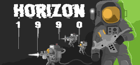
  • Genre Clarity: 7/10 — Sci-fi strategy with unclear primary focus. The capsule communicates sci-fi and strategy themes through the astronaut suit, robotic units, and tech elements arranged in a numbered sequence. However, at TINY size, the visual hierarchy becomes ambiguous—it reads more as a generic sci-fi collection than a cohesive gameplay statement. The void/darkness chase mechanic implied by the description is not visually represented, leaving genre identity somewhat incomplete.
  • Title Readability: 8/10 — Clear title with solid contrast and placement. The 'HORIZON' text is bold, white, and positioned in the upper left with strong contrast against the dark background. The '1 9 9 0' numeric subtitle below maintains readability at all sizes due to clean letter spacing and outline clarity. At SMALL and TINY sizes, both elements remain legible without collapse, though the numeric spacing does become tighter at extreme reduction.
  • Contrast & Color: 8/10 — Strong value separation with accent highlights. The white title text pops clearly against the dark gray-black background, and the bright lime-green vertical bar on the right edge creates a striking visual anchor. The gray robotic units and astronaut maintain adequate silhouette separation from the darker midtones, though some device detail becomes lost at TINY size. The lime-green accent ensures the capsule registers immediately in a dark Steam storefront.
  • Uniqueness & Polish: 6/10 — Competent but visually generic sci-fi presentation. The pixel-art or low-poly robotic assets feel functional and intentional, but the overall composition reads as a standard tech-strategy asset arrangement rather than a memorable hook. There is no distinctive visual storytelling that communicates the core 'chased by darkness' mechanic or the exotic resource gathering loop. The layout feels more like a feature checklist (numbered elements) than a cohesive art direction statement.
  • Brand Consistency: 6/10 — No distinctive identity markers or recurring visual motifs. The capsule lacks a recognizable character, iconic symbol, or signature palette that would establish brand memory. The green accent and monochromatic tech aesthetic are functional but not unique to Horizon 1990—similar color treatments appear across generic sci-fi games. Without reference to the 8 store screenshots, there are no internal cues that signal a specific game identity rather than a category placeholder.
  • Composition: 7/10 — Clear focal hierarchy with some cramping at edges. The astronaut figure on the right serves as the primary focal point, with the numbered robotic units creating a secondary reading path toward the left. The title anchors the top-left safely within margins, and the lime-green bar frames the right edge effectively. However, at SMALL size, the numbered elements (1 9 9 0) become visually compressed, and the left-side robot details risk losing clarity; the composition feels slightly cluttered in the center-bottom transition zone.

What works

  • Strong title contrast and readability. The bold white 'HORIZON' and numeric subtitle maintain clarity across all viewing sizes without font collapse or outline degradation.
  • Lime-green accent edge creates immediate visual pop. The vertical green bar on the right ensures the capsule registers distinctly against the Steam dark background in quick scroll conditions.
  • Clear primary focal point with astronaut silhouette. The suited figure on the right provides an instant human anchor that prevents the design from feeling purely abstract or icon-based.

What hurts the capsule

  • Numbered element layout feels like a feature list, not a narrative. The 1 9 9 0 sequence with arrows pointing to robotic units reads as a checklist or tutorial step visual rather than communicating a core game hook or unique selling point.
  • No visual representation of core mechanic or tone. The capsule does not convey the 'chased by darkness from the end of time' tension or the exotic resource exploration loop that differentiates the game from generic sci-fi strategy titles.
  • Crowded mid-section risks detail loss at SMALL size. The clustered robotic units in the center-left compress significantly at smaller scales, reducing silhouette clarity and making individual asset recognition difficult.
  • Generic sci-fi aesthetic without memorable brand identity. The monochromatic tech style and standard astronaut/robot imagery do not establish a distinctive or recognizable visual signature that would persist in player memory.

Priority fixes

  1. [uniqueness_polish] Replace the numbered feature checklist with a single compelling visual that communicates the core 'darkness chase' mechanic or resource scarcity tension—e.g., a silhouette of the astronaut surrounded by encroaching shadow or corrupted void effect.
  2. [composition] Simplify the left-side robotic cluster to a single iconic unit or symbol that anchors the design without cramping detail at SMALL size.
  3. [genre_clarity] Add a subtle visual element (glowing rift, void particles, or corrupted edges) that immediately signals the 'mysterious void' exploration and eschatological threat core to the game's premise.
  4. [brand_consistency] Introduce a signature color accent or iconic motif (e.g., a recurring symbol on the suit or a unique glow effect) that becomes recognizable across all promotional materials.

Store copy priority fixes

  1. [hook_strength] Restructure the detailed description to lead with a single-sentence gameplay summary after the lore setup—e.g., 'Lead a crew in a hybrid tower-defense base-builder where you drill asteroids, upgrade your ship, and survive waves of interdimensional creatures'—to clarify the game loop before diving into mechanics.
  2. [feature_communication] Replace vague upgrade descriptions with specific outcomes: instead of 'upgrade the ship's efficiency,' write 'Equip your ship with advanced turrets and shields that reduce incoming damage' or name concrete progression examples (e.g., 'Train crew members from Recruit to Elite to unlock stronger weapons').
  3. [uniqueness] Add 1–2 sentences explaining what distinguishes Horizon 1990 from other tower-defense or colony-sim games: e.g., 'Unlike traditional base-builders, your crew's survival directly affects future expeditions' or 'The ever-approaching darkness mechanic forces constant tension and forces difficult retreat decisions.'
  4. [tone_match] Remove or reframe the 'glorified walking simulator' line to be more confident, e.g., 'Don't mistake exploration for passivity—every decision shapes your survival' or simply delete it and trust the mechanics speak for themselves.

Related guides

  • Steam page optimisationCapsule, copy, screenshots, tags — the full Steam page conversion stack.
  • Steam tags guideTag selection, ordering, and how it shapes Steam's recommendation rails.

Steam app ID: 4398490 · Tags: Strategy, Survival, Action, Pixel Graphics, Base Building