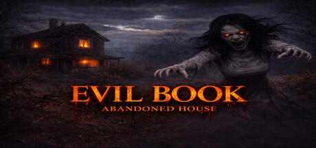
Evil Book: Abandoned House scores 75/100 — better than 74% of Adventure capsules (n=7,922).

Quick text summary

Evil Book: Abandoned House scored 75/100 on Steam Analyzer — Good for a Adventure capsule. Top priority fix: [uniqueness_polish] Integrate a visual representation of the Evil Book itself (leather tome, glowing runes, or symbolic imagery) into the composition to immediately communicate the game's core concept and differentiate it from generic haunted house templates.

Capsule scores by dimension

  • Genre Clarity: 8/10 — Horror atmosphere clearly communicated. The haunted house setting, glowing windows, dark sky, and grotesque creature silhouette immediately signal horror genre at all sizes. At tiny size, the orange-lit house and dark figure remain readable as classic horror iconography, though specific subgenre (first-person exploration vs. action horror) is less distinct.
  • Title Readability: 8/10 — Bold title with minor tagline issues. The main title 'EVIL BOOK' in large orange capital letters reads cleanly at full, small, and tiny sizes with strong contrast against the dark background. The tagline 'ABANDONED HOUSE' is readable at full and small sizes but becomes soft and difficult to parse at tiny thumbnail size due to reduced font size and lower contrast.
  • Contrast & Color: 8/10 — Strong warm-dark value separation. The orange-lit windows and title text create excellent separation against the deep blue-black background, maintaining silhouette clarity at all sizes. The creature figure reads distinctly due to rim lighting and the grayscale test shows strong edge definition, though the overall midtone density of the haunted house could benefit from lighter accent areas.
  • Uniqueness & Polish: 7/10 — Competent horror aesthetic, moderate originality. The composition uses familiar haunted house tropes (lit windows, creature emergence, moody sky) executed with professional lighting and color grading, but lacks a distinctive hook that separates it from generic horror game templates. The Evil Book concept isn't visually foregrounded—the image emphasizes atmosphere over the unique story element that differentiates this game.
  • Brand Consistency: 6/10 — Generic horror palette, limited identity. The visual presentation relies on standard horror color language (orange fire glow, blue-grey shadows, dark silhouettes) without clear iconic symbols or motifs that could anchor recognition. No visible branding elements, character design, or signature visual style that would make this capsule memorable or distinctly associated with Evil Book across future marketing materials.
  • Composition: 8/10 — Clear focal hierarchy with balanced staging. The haunted house anchors the left-center background while the creature commands right-center attention, creating natural visual flow and avoiding dead space. The title placement in the lower-center region is well-protected from cropping and maintains hierarchy at small sizes; the composition remains readable at tiny size with clear foreground (creature), midground (house), and background (sky) separation.

What works

  • Orange-dark value contrast. The warm glowing windows and title pop decisively against the cool dark background, ensuring visibility and visual pop during quick Steam scrolling.
  • Readable title at all sizes. The large, bold 'EVIL BOOK' text maintains legibility and impact from full header down to tiny thumbnail due to strategic size and outline control.
  • Horror genre immediately clear. Haunted house setting, creature emergence, and moody sky communicate atmospheric horror without ambiguity even at 120×45 pixel size.

What hurts the capsule

  • Tagline unreadable at tiny size. The 'ABANDONED HOUSE' subtitle becomes illegible at thumbnail resolution, reducing secondary messaging clarity during quick browsing.
  • Generic horror presentation. The visual execution relies entirely on standard haunted house clichés with no distinctive visual hook or branding element that signals what makes this game unique.
  • Evil Book concept not visually featured. The core unique selling point (an ancient evil book) is absent from the capsule, leaving the image indistinguishable from dozens of generic supernatural horror games.

Priority fixes

  1. [uniqueness_polish] Integrate a visual representation of the Evil Book itself (leather tome, glowing runes, or symbolic imagery) into the composition to immediately communicate the game's core concept and differentiate it from generic haunted house templates.
  2. [title_readability] Remove or significantly enlarge the tagline 'ABANDONED HOUSE' so it remains readable at 231×87 and maintains secondary messaging at thumbnail size.
  3. [brand_consistency] Develop a signature visual motif (book symbol, rune pattern, or color accent specific to the Evil Book) that can anchor brand recognition across multiple marketing assets.

Store copy priority fixes

  1. [hook_strength] Rewrite the short description to open with 'You wake up alone in an abandoned house with an ancient evil book—and every choice you make could kill you' to lead with the scenario and stakes, not the genre label.
  2. [uniqueness] Add 1-2 sentences explaining what makes this game's evil book mechanic, atmosphere, or choice system distinct from existing horror games; consider emphasizing a specific consequence system or atmosphere innovation.
  3. [feature_communication] Expand the Features list with 1-2 concrete examples (e.g., 'Your choices determine which endings you unlock' or 'Sound design evolves as the presence grows stronger') to show how mechanics function in play.
  4. [audience_targeting] Add a brief line clarifying the intended player (e.g., 'For players who crave atmospheric tension over combat' or 'Not a jump-scare fest—a slow-burn psychological experience') to guide audience expectations.

Related guides

Steam app ID: 4403430 · Tags: Adventure, Horror, Atmospheric, Exploration, First-Person