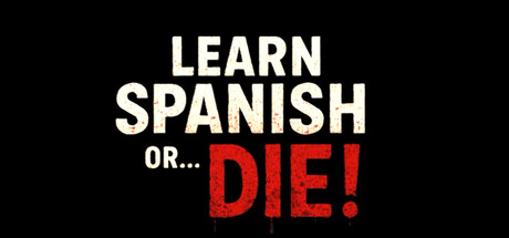
Learn Spanish or... Die! scores 68/100 — better than 14% of Action Roguelike capsules (n=1,675).

Quick text summary

Learn Spanish or... Die! scored 68/100 on Steam Analyzer — Solid for a Action Roguelike capsule. Top priority fix: [uniqueness_polish] Introduce Polly Glot character or a distinctive silhouette/visual element into the background or margins to establish visual identity and gameplay context

Capsule scores by dimension

  • Genre Clarity: 7/10 — Horror-comedy premise clear but game nature ambiguous. The 'DIE!' text in blood-red and threatening tone immediately signal horror-comedy, and the Spanish learning context is explicit. However, at tiny size the visual hierarchy prioritizes text over any gameplay imagery or Polly Glot character, making it unclear whether this is a narrative horror game, a puzzle game, or a parody educational title without seeing the mascot. The premise is readable but visual genre iconography is missing.
  • Title Readability: 8/10 — Bold title reads well across sizes. The primary title 'LEARN SPANISH OR... DIE!' uses strong sans-serif all-caps letterforms with excellent contrast against the black background. At full size and small size this is crisp and readable; at tiny size the text remains legible due to heavy weight and simple geometry. The subtitle 'OR...' acts as a visual break that enhances rhythm without compromising clarity.
  • Contrast & Color: 8/10 — Strong value separation with red accent. Pure white text on solid black background creates maximum contrast at all sizes, and the blood-red 'DIE!' provides a strategic color accent that draws the eye and reinforces the horror tone. In grayscale test, the white remains bright and separated; the red translates to a distinct mid-dark tone. At tiny size the composition still reads clearly due to this stark value separation.
  • Uniqueness & Polish: 6/10 — Conceptual hook strong, execution minimal. The core hook—'learn Spanish or die'—is memorable and absurd, establishing a unique indie sensibility. However, the capsule itself is purely typographic with no character art, visual effects, or distinctive rendering style that would distinguish it from a generic title card. At tiny size it reads as a bold text treatment rather than a polished game cover, lacking the visual personality evident in top-tier indie capsules like DREDGE or Buckshot Roulette.
  • Brand Consistency: 5/10 — No visual identity established, premise-driven only. The capsule is text-only with no visible brand symbols, character design, or signature visual motif that could be recognized in future marketing or related media. The red-black-white palette is functional but generic to horror-comedy; without Polly Glot or distinctive iconography visible, there is no internal visual cohesion that signals a recognizable franchise identity.
  • Composition: 7/10 — Centered hierarchy works, no visual depth. The layout uses strong vertical centering with clear hierarchy: 'LEARN SPANISH' anchors the upper third, 'OR...' provides a mid-point transition, and 'DIE!' dominates the lower third in red. This guides the eye naturally downward and reads well at small and tiny sizes due to the stacked arrangement. However, the flat black background creates no depth layers, and the composition relies entirely on typography with no compositional elements like silhouettes, background elements, or foreground subjects.

What works

  • Excellent title contrast and readability. White and red text on pure black background maintains clarity at all sizes including tiny, with no loss of letterform integrity or spacing collapsing.
  • Memorable conceptual hook. The 'Learn Spanish or Die' premise is immediately understood and absurd enough to stick in memory, differentiating it from standard educational or horror titles.
  • Strategic color accent usage. The red 'DIE!' creates focal emphasis and reinforces the horror tone without overwhelming the composition or creating contrast problems in grayscale.

What hurts the capsule

  • No character or visual representation. Polly Glot, the core antagonist mascot, is absent from the capsule, removing a major opportunity for visual personality and brand recognition.
  • Flat, featureless background. Pure black provides contrast but contributes no depth, visual interest, or gameplay context, making the capsule feel more like a generic title card than a premium game cover.
  • Generic horror-comedy aesthetic. The red-black-white-text treatment is a common indie horror trope without distinctive rendering style, effects, or visual storytelling that would make this stand out among competitors like DREDGE or Buckshot Roulette.
  • No gameplay or setting implied. The capsule communicates premise through text alone and lacks any visual iconography, UI hints, or environmental context that suggests first-person gameplay or interactive elements.

Priority fixes

  1. [uniqueness_polish] Introduce Polly Glot character or a distinctive silhouette/visual element into the background or margins to establish visual identity and gameplay context
  2. [composition] Add a subtle background element or texture (blood splatters, classroom motif, app interface hint) to create depth layers and reduce the flat, generic title-card feel
  3. [brand_consistency] Develop a signature visual motif or icon (app glitch effect, mascot symbol, or Spanish-language design element) that becomes recognizable across future marketing

Store copy priority fixes

  1. [feature_communication] Expand the Adaptive Difficulty line to specify one concrete mechanic: e.g., 'Adaptive Difficulty: As you progress, Polly Glot moves faster, quizzes become harder, and maze complexity increases with each run.'
  2. [feature_communication] Add a sentence clarifying whether Spanish vocabulary unlocks are permanent across runs or reset: e.g., 'Learn new words with each death—progression carries between runs, making later attempts easier.'

Related guides

Steam app ID: 4406680 · Tags: Action Roguelike, Exploration, First-Person, Horror, Psychological Horror