Scoring genre clarity...
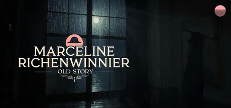
Lost in the post-war haze of the 1920s, Detective Marceline Richenwinnier must survive a distorted open world. Battle creatures, solve the puzzle of Merrieland. Reach the heart of Merrienight in this story-driven action-adventure.
$19.99No user reviews
ActionAdventureStrategy
Gece InteractiveMar 2, 2026