Scoring genre clarity...
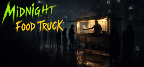
You run an old food truck in the "Gray Zone," where rumored "Pseudo-Humans" mimic or replace humans. Judge customers through dialogue—not appearance—to decide whether to serve them. Your choices uncover truths and shape multiple endings in this narrative-driven game.
$1.991 user reviews
MysteryCasualSimulation
eroAlucardFeb 26, 2026