Scoring genre clarity...
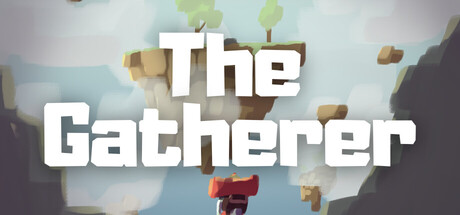
The Gatherer includes survival aspects, but focuses on a fun gliding experience and atmosphere. There are unlockable companions and some small dangers to look out for. As this is a solo side project by one Person that has never made a game before, expect some bugs and irregular updates.
$2.99
ExplorationCasualFlight
Golems & Geckos GamesMar 17, 2026