Scoring genre clarity...
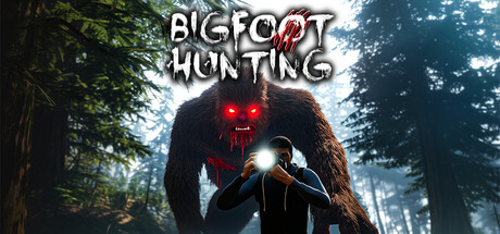
Survive the wilderness in Bigfoot Hunting. Track and hunt the legendary creature using firearms, traps, and survival tools. Explore forests, scavenge supplies, and face random deadly encounters where every step could be your last.
$7.994 user reviews
Early AccessAdventureSimulation
VRCFORGE STUDIOSApr 20, 2026