Quick text summary
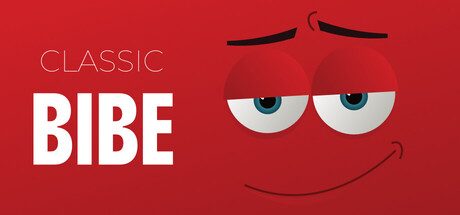
Classic Bibe scored 70/100 on Steam Analyzer — Good for a Action capsule. Top priority fix: [uniqueness_polish] Add a distinctive visual element (signature fruit type, unique trap design, or character trait) that communicates core gameplay and differentiates from generic casual games.
Capsule scores by dimension
- Genre Clarity: 7/10 — Casual party game clear. The bright red background, simplified cartoon character with exaggerated eyes, and friendly smiling face immediately signal a casual, lighthearted game rather than action or horror. The art style and oversized facial features clearly communicate a fun, accessible party or indie game vibe. At tiny size, the character silhouette and bright palette still read as casual entertainment, though the specific mechanics (fruit collection, dodging) are not visually apparent.
- Title Readability: 8/10 — Strong contrast title clear. BIBE is rendered in bold white sans-serif with excellent contrast against the red background, remaining highly legible at small and tiny sizes. The smaller 'CLASSIC' label above is thin but still readable at full size. Both elements maintain clear hierarchy with BIBE as the dominant focal point, and the white color pops decisively against the dark Steam background.
- Contrast & Color: 8/10 — Vibrant red with strong pop. The saturated red background provides excellent value separation from the Steam dark background #1b2838, and the white title text creates maximum contrast for readability. The character's white eyes and light facial features stand out clearly against the red, creating depth and a clean silhouette that reads well even at tiny size. The warm palette feels premium and intentional rather than flat.
- Uniqueness & Polish: 6/10 — Charming but generic casual. The cartoon character design is well-executed and appealing with clean vector-style rendering and a friendly expression that communicates approachability. However, the execution follows common casual game aesthetic conventions without a distinctive visual hook or unique selling point beyond the character's expression. The capsule is competent and polished but lacks memorable identity compared to standout indie titles in the reference list.
- Brand Consistency: 6/10 — Simple consistent palette. The red background, white text, and cartoon character style create internal cohesion across elements. Without access to in-game screenshots for comparison, the capsule presents a clean, unified visual direction. However, the design lacks a distinctive brand identity marker or iconic symbol that would make Classic Bibe instantly recognizable in a crowded store—it communicates genre well but not a unique brand.
- Composition: 7/10 — Balanced focal point layout. The character is centered and dominates the right side while the title anchors the left, creating a natural visual balance that guides the eye from text to character. At small and tiny sizes, this composition holds together well with clear primary subject and supporting text hierarchy. Safe margins are respected and the character does not clip edges, though the composition remains fairly conventional without spatial depth or layering complexity.
What works
- Bold readable title. BIBE in white sans-serif maintains excellent legibility at tiny size with decisive contrast against both the red background and Steam dark interface.
- Clean character silhouette. The cartoon face design is simple, friendly, and reads clearly as a casual game mascot even at small thumbnail size.
- Strong color pop. The saturated red and white combination creates immediate visual impact against the dark Steam background without feeling garish.
What hurts the capsule
- Generic casual aesthetic. The capsule follows predictable indie game design conventions with no distinctive visual hook or memorable brand identity that differentiates it from similar party games.
- Minimal gameplay communication. The visuals do not hint at core mechanics (fruit collection, trap dodging, competitive scoring) leaving potential players uncertain about what makes this game unique within its crowded category.
- Limited compositional depth. The flat single-plane layout with centered character lacks foreground-midground-background layering or spatial storytelling that would elevate visual interest beyond a simple mascot portrait.
Priority fixes
- [uniqueness_polish] Add a distinctive visual element (signature fruit type, unique trap design, or character trait) that communicates core gameplay and differentiates from generic casual games.
- [composition] Introduce subtle background elements or depth layering to create visual hierarchy and suggest game environment (arcade setting, party scenario, etc.).
- [genre_clarity] Include subtle gameplay iconography (falling trap silhouettes, fruit shapes, or score indicators) to clarify what makes Classic Bibe mechanically distinct.
Store copy priority fixes
- [uniqueness] Replace 'colorful, cartoon-style' with a concrete, memorable visual or mechanical differentiator—e.g., 'Classic Bibe is the only fruit-collecting party game where traps cascade in synchronized waves, forcing real-time teamwork to survive.'
- [hook_strength] Rewrite the short description to lead with a specific competitive hook: 'A chaotic 1-4 player arcade battle where every second counts—collect fruit, dodge falling traps, and crush your friends' high scores in solo, split-screen, or online modes.'
- [feature_communication] Add 1-2 sentences explaining trap mechanics and difficulty scaling—e.g., how traps behave, whether difficulty increases over time, and whether solo vs. multiplayer changes the challenge curve.
- [tone_match] Inject more personality into cosmetic and quest descriptions—replace generic phrasing with playful language that reflects the cartoon tone, e.g., 'Unlock ridiculous skins and wacky accessories' instead of 'skins, accessories, and more available in the shop.'
Related guides
Steam app ID: 4414160 · Tags: Action, Casual, Arcade, Party Game, 2D Platformer