Scoring genre clarity...

Clanker Cleanup capsule

Clanker Cleanup

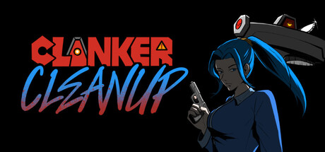
Scrap the Clankers that took your job in this DOOM-like, hyper mobile stealth game. Scavenge weapons and distractions from the environment, destroy the robot uprising in its opening moments, and consume this piece of anti-clanker propaganda

Free to Play7 user reviews
ActionStealthFast-Paced
Team LOCK TF INApr 28, 2026

Clanker Cleanup scores 73/100 — better than 58% of Action capsules (n=8,535).

7 user reviews · Free to Play · Released Apr 28, 2026 · By Team LOCK TF IN

Quick text summary

Clanker Cleanup scored 73/100 on Steam Analyzer — Good for a Action capsule. Top priority fix: [composition] Shift weapon and top-right UI elements inward by 10-15 pixels to ensure no important details sit at crop-risk edges on various Steam display sizes.

Capsule scores by dimension

  • Genre Clarity: 7/10 — Action shooter with neon sci-fi tone. The capsule clearly communicates an action game through the character's aggressive pose holding a weapon and the sci-fi robot aesthetic. The neon blue and orange color scheme, combined with the futuristic silhouette of the character and angular robot design, signals a stylized action or shooter game effectively. At tiny size, the weapon and character stance still read as action-oriented, though the specific DOOM-like stealth gameplay hook is not visually apparent.
  • Title Readability: 8/10 — Bold, legible two-line title. The title uses two contrasting colors—bright orange for 'CLANKER' and blue gradient for 'CLEANUP'—on a solid black background, ensuring strong readability at all sizes. The chunky, sans-serif letterforms maintain clarity even at tiny thumbnail size without collapsing. The uppercase treatment and geometric weight distribution make it one of the strongest elements in the composition.
  • Contrast & Color: 8/10 — Strong neon pop against dark background. The orange and blue neon colors create excellent value separation from the black background, with the warm orange title and cool blue character highlights providing complementary contrast. The character's dark blue suit is reinforced by neon blue edge lighting that pops against the neutral background, ensuring silhouette clarity. At small and tiny sizes, the color palette maintains distinction and doesn't muddy or blend into the Steam dark theme.
  • Uniqueness & Polish: 7/10 — Stylish sci-fi aesthetic with cohesive vision. The capsule demonstrates intentional art direction with a consistent cyberpunk-inspired palette, custom typography treatment, and a character design that feels polished rather than generic. The neon edge lighting on the character and the sleek weapon design show attention to craft and visual storytelling. However, the overall concept of a stylized action character on a dark background is relatively familiar within indie action games, placing it above baseline but not definitively unique.
  • Brand Consistency: 7/10 — Cohesive neon sci-fi identity. The capsule establishes a recognizable visual identity through consistent use of the neon blue and orange palette, geometric typography, and cyberpunk character design that would likely appear across marketing materials. The character's distinctive blue hair and neon-rimmed aesthetic serve as potential brand anchors. The internal color harmony, lighting style, and retro-futuristic tone suggest a unified art direction that should be sustained across other brand touchpoints.
  • Composition: 7/10 — Clear focal point with balanced layout. The character occupies the right side of the frame as the primary visual anchor, with the title positioned to the left, creating a natural flow and clear hierarchy. The background remains neutral, allowing the character and title to command attention without competing visual noise. At small and tiny sizes, the composition holds together well with the character silhouette remaining distinct and the title staying readable, though the weapon details in the right margin risk slight crop loss on certain Steam display formats.

What works

  • Title contrast and color strategy. Orange and blue complementary colors on solid black background ensure the title remains legible at all viewport sizes including thumbnail view.
  • Character silhouette and lighting. The neon blue edge lighting clearly separates the character from the dark background and creates a distinctive sci-fi identity that reads instantly.
  • Left-right compositional balance. Title placement on the left and character on the right creates natural visual flow without dead space or competing focal points.

What hurts the capsule

  • Right-edge weapon overlap. The weapon and top-right objects sit close to the capsule edge and risk being cropped or cut off in some Steam store layouts, reducing composition resilience.
  • Generic action-character archetype. While well-executed, the core composition of a stylized warrior character holding a gun is familiar in indie action games and does not strongly communicate the unique stealth-propaganda angle.
  • Limited visual depth layering. The character and background are relatively flat with minimal mid-ground elements, reducing visual storytelling and environmental context for what makes Clanker Cleanup distinct.

Priority fixes

  1. [composition] Shift weapon and top-right UI elements inward by 10-15 pixels to ensure no important details sit at crop-risk edges on various Steam display sizes.
  2. [genre_clarity] Add a subtle environmental or mechanical element (drone, scrap pile, or industrial setting detail) to strengthen the 'Cleanup' premise and differentiate from generic action shooter capsules.
  3. [uniqueness_polish] Introduce a secondary visual element or unique prop that hints at the stealth or scavenging mechanic to elevate beyond standard action character pose.

Store copy priority fixes

  1. [uniqueness] Add a sentence after the genre hook that explicitly contrasts this game with other stealth or boomer shooter titles—e.g., 'Unlike traditional stealth games, mobility and noise management are real-time challenges in a fast-paced DOOM-like arena' or similar.
  2. [hook_strength] Rewrite the final clause of the short description from 'consume this piece of anti-clanker propaganda' to something more direct that reinforces player agency, such as 'stop the robot uprising before it spreads across the mall.'
  3. [feature_communication] Clarify or relocate the 'invisible threat' plot point in the detailed description, as it conflicts with the gameplay-first tone and feels disconnected from the core stealth-action pitch.

Related guides

Steam app ID: 4416840 · Tags: Action, Stealth, Fast-Paced, Shooter, Boomer Shooter