Scoring genre clarity...

Forsaken Kingdom capsule

Forsaken Kingdom

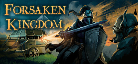
A dark fantasy roguelite-strategy RPG where you lead a medieval expedition through a world consumed by darkness. Command your squad and manage your field camp, choose your path through perilous lands, face terrifying monsters and powerful bosses in your struggle to return alive.

StrategyRoguelikeAuto Battler
Quantum Gear StudiosTo be announced

Forsaken Kingdom scores 77/100 — better than 79% of Strategy capsules (n=5,233).

Released To be announced · By Quantum Gear Studios

Quick text summary

Forsaken Kingdom scored 77/100 on Steam Analyzer — Good for a Strategy capsule. Top priority fix: [brand_consistency] Introduce a distinctive visual signature—either through a unique character silhouette, iconic symbol, or signature color accent—that makes Forsaken Kingdom immediately recognizable across marketing materials

Capsule scores by dimension

  • Genre Clarity: 8/10 — Dark fantasy strategy RPG clear. The capsule clearly communicates dark medieval fantasy with armored soldiers, a commanding general figure in the center, and tactical squad positioning that signals strategy gameplay. The composition of soldiers with weapons and the command hierarchy visible even at small size effectively conveys both the RPG and strategy elements. At tiny size, the silhouettes and armor remain legible enough to recognize the fantasy-tactical genre.
  • Title Readability: 9/10 — Bold gold text excellent contrast. FORSAKEN KINGDOM appears in large, bold gold serif lettering with strong separation from the darker background, maintaining full legibility at all sizes including tiny. The strategic placement in the upper third avoids the action scene below and ensures no important detail overlap. The thick letterforms and warm gold color against cool tones guarantee it reads clearly even under quick scroll conditions.
  • Contrast & Color: 8/10 — Strong warm-cool value separation. The composition uses a strategic warm-cool contrast with golden orange sky and light effects against dark blue armor and shadowed soldiers, creating clear silhouette separation. The glowing magical effect and warm sunburst lighting in the background provide strong value separation from the cool-toned dark fantasy elements. In grayscale, the lighting hierarchy remains distinct, though the mid-ground wagon area could compete slightly for attention at tiny sizes.
  • Uniqueness & Polish: 7/10 — Polished dark fantasy epic feel. The capsule presents a cohesive, well-lit scene with professional rendering, dynamic lighting effects, and clear command composition that conveys narrative weight and strategic gameplay potential. The magical glow effects and dramatic sky treatment elevate it beyond generic medieval imagery, though the core elements—armored soldiers, general figure, wagon camp—represent familiar fantasy-strategy tropes. At small size, the craft quality and lighting design remain visible and impressive, supporting the premium positioning.
  • Brand Consistency: 6/10 — Competent but generic fantasy aesthetic. The capsule uses consistent medieval fantasy rendering with coherent lighting and palette, but lacks a distinctive visual signature or iconic motif that would make Forsaken Kingdom immediately recognizable. The armored soldier archetype and command-camp setting are industry-standard for dark fantasy strategy games, with no unique color palette, character design, or symbol that signals this specific title. Internal consistency is solid across the scene elements, but external brand differentiation is limited.
  • Composition: 8/10 — Clear hierarchy with strong focal point. The composition establishes clear foreground-midground-background layering with the armored commander as the primary focal point, supported by squad members and the wagon camp creating narrative context. The title placement in the upper region avoids competing with the scene, and the dynamic diagonal sword angle creates visual movement that guides the eye effectively. At tiny size, the central general figure and golden title remain dominant, though the supporting soldiers compress slightly without collapsing the overall read.

What works

  • Gold title legibility. FORSAKEN KINGDOM maintains excellent readability at all sizes due to bold serif letterforms and strong warm-cool contrast against the background.
  • Genre messaging through composition. The arrangement of armored soldiers, commanding general, and tactical positioning immediately signals strategy-RPG gameplay without ambiguity.
  • Dynamic lighting and atmosphere. The warm golden glow and dramatic sky treatment create visual interest and a sense of epic dark fantasy adventure that elevates the presentation.
  • Silhouette clarity at small sizes. The armored figures maintain distinct shapes and remain recognizable as soldiers even when compressed to thumbnail sizes.

What hurts the capsule

  • Generic dark fantasy archetype. The core elements—medieval soldiers, general figure, camp wagon—lack distinctive visual identity that would differentiate this title from other dark fantasy strategy games.
  • Limited brand signature elements. No iconic character, unique color palette, or memorable visual motif creates a recognizable identity that would aid brand recall.
  • Wagon detail loses hierarchy at tiny size. The background cart element compresses and becomes visually ambiguous at thumbnail resolution, potentially diluting focus from core squad composition.

Priority fixes

  1. [brand_consistency] Introduce a distinctive visual signature—either through a unique character silhouette, iconic symbol, or signature color accent—that makes Forsaken Kingdom immediately recognizable across marketing materials
  2. [composition] Enhance the wagon or camp element with a unique shape or emblem that reads clearly at small sizes and reinforces the expedition-leadership theme
  3. [uniqueness_polish] Add a subtle environmental detail or effect specific to the game's dark fantasy lore that differentiates it from standard medieval-fantasy strategy aesthetics

Store copy priority fixes

  1. [feature_communication] Add a bulleted list of 4–5 core mechanics with concrete examples: e.g., 'Resource Management: Manage food and morale in your camp to sustain your squad,' 'Squad Formations: Arrange up to 6 characters in tactical positions to unlock synergies,' 'Hero Progression: Unlock unique abilities tied to each hero's playstyle.' This will let players build a clear mental model of gameplay.
  2. [uniqueness] Replace or supplement generic phrases like 'intense, fast-paced battles' and 'each hero is unique' with a specific differentiator: e.g., 'Unlike traditional roguelikes, your camp persists and evolves between expeditions, influencing squad composition and morale,' or 'Combine grid-based tactical positioning with real-time decision-making to adapt mid-battle.' Explain what sets this title apart.
  3. [feature_communication] Clarify the deckbuilding system or remove it from tags: e.g., 'Build decks of abilities and equipment that synergize with your hero's strengths,' or describe how card-like mechanics factor into progression and combat.
  4. [audience_targeting] Add a sentence signaling difficulty and player type: e.g., 'Designed for strategy veterans who enjoy punishing roguelike runs and rewarding team synergies,' or 'Offers scaling difficulty for both roguelike newcomers and hardcore strategists.' This clarifies whether the game suits casual or experienced players.

Related guides

  • Steam page optimisationCapsule, copy, screenshots, tags — the full Steam page conversion stack.
  • Steam tags guideTag selection, ordering, and how it shapes Steam's recommendation rails.

Steam app ID: 4418240 · Tags: Strategy, Roguelike, Auto Battler, Fantasy, 2D