Scoring genre clarity...

Trombone Rumble capsule

Trombone Rumble

Chaotic tail-chasing orchestra madness you can enjoy even after a few drinks! Rhythm + playful brawling smashed into the ultimate party game!

$4.994 user reviews
ActionCasualFighting
Biksari StudioMar 27, 2026

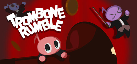
Trombone Rumble scores 70/100 — better than 29% of Action capsules (n=8,535).

4 user reviews · $4.99 · Released Mar 27, 2026 · By Biksari Studio

Quick text summary

Trombone Rumble scored 70/100 on Steam Analyzer — Good for a Action capsule. Top priority fix: [genre_clarity] Add a clear visual cue—such as a trombone in the character's hand, a musical staff, or a chaotic collision effect—to immediately communicate the rhythm or brawling mechanic at TINY size.

Capsule scores by dimension

  • Genre Clarity: 7/10 — Playful chaos, unclear mechanics. The vibrant red background, cartoonish character design, and scattered musical/instrument imagery clearly signal a casual, whimsical game rather than serious action. At TINY size, the pink character and floating objects read as silly and party-oriented, though the 'rumble' and 'trombone' elements don't immediately clarify rhythm versus brawling versus pure chaos. The visual tone strongly suggests indie casual party game rather than competitive or narrative-driven action.
  • Title Readability: 8/10 — Bold white title, strong hierarchy. The white 'TROMBONE RUMBLE' text uses chunky, sans-serif letterforms with clear outline and sits against a controlled dark red background in the upper left, avoiding texture clash. At SMALL and TINY sizes, the title remains legible and maintains weight due to its bold construction and high contrast. No decorative flourishes or fine details collapse under squint or reduction.
  • Contrast & Color: 8/10 — Strong red-to-dark value separation. The rich, saturated red background creates clear separation from the Steam dark background (#1b2838), and the white title pops with excellent value contrast. The pink character silhouette and purple floating objects read distinctly even at TINY size, with warm-cold color interplay that adds visual interest. In grayscale, the mid-tone pink character against dark red background holds enough separation to be recognizable.
  • Uniqueness & Polish: 6/10 — Charming but generic indie visual. The pastel-colored character, rounded soft shapes, and playful floating objects feel genuinely cute and party-game appropriate, but the execution lacks a signature style or memorable hook that distinguishes it from dozens of other indie casual titles. The floating instruments and character pose suggest chaos, but there is no clear visual storytelling of the core mechanic or a standout art direction that feels premium or distinctive beyond 'colorful and silly.' The craft is competent but the overall impression is familiar indie template.
  • Brand Consistency: 6/10 — Consistent but generic warm palette. The warm red-pink-purple color scheme is internally cohesive and the cartoonish character design is recognizable across the visible elements, but there are no iconic motifs, signature symbols, or distinctive visual identity markers that would make this capsule instantly memorable or recognizable in a second viewing. The soft, rounded aesthetic is consistent but not uniquely branded—it could belong to several different casual games without strong identity differentiation.
  • Composition: 7/10 — Clear focal point, balanced layout. The pink character sits as a strong primary focal point in the center-lower area, with the title anchored in the upper left and floating instrument/character objects distributed in the upper right to guide the eye without clutter. At SMALL size the character and title remain clearly separated with good negative space; at TINY the composition still reads as intentional rather than cramped. The layout respects safe margins and the character's silhouette remains uncompromised, though the scattered upper-right elements become visual noise at the smallest sizes.

What works

  • Bold, readable title treatment. The white 'TROMBONE RUMBLE' text maintains legibility and impact across all sizes due to chunky letterforms and high contrast against the dark red background.
  • Strong color separation from Steam background. The saturated red field creates clear value contrast against #1b2838, ensuring the capsule pops in a crowded store list and remains distinct at TINY thumbnail size.
  • Cohesive playful character design. The pink character and floating objects establish a consistent, charming tone that aligns well with a casual party game and reads as intentionally silly rather than confused.

What hurts the capsule

  • Generic visual identity without signature hook. The overall aesthetic—soft shapes, pastel colors, scattered floating objects—feels like a template that could apply to many indie casual games rather than a distinctive brand or memorable visual statement.
  • Unclear core mechanic from visuals alone. While 'trombone' and 'rumble' are in the title, the image does not visually clarify whether the game is about rhythm, brawling, tail-chasing, or orchestral chaos, leaving genre expectations ambiguous.
  • Upper-right floating elements become visual clutter at tiny size. The scattered instruments and secondary character in the top right lose definition and feel busy when reduced to TINY thumbnail, competing for attention against the main title and character.

Priority fixes

  1. [genre_clarity] Add a clear visual cue—such as a trombone in the character's hand, a musical staff, or a chaotic collision effect—to immediately communicate the rhythm or brawling mechanic at TINY size.
  2. [uniqueness_polish] Develop a signature art style or memorable motif (e.g., a unique character design element, a distinctive icon, or a visual hook specific to the game's identity) to differentiate from generic indie casual templates.
  3. [composition] Reduce or consolidate the floating instrument elements in the upper right to minimize visual noise at SMALL and TINY sizes, letting the main character and title dominate the focal hierarchy.

Store copy priority fixes

  1. [genre_clarity] Add a sentence clarifying online vs. local gameplay options, e.g., 'Play locally with friends or jump into online matches against players worldwide.'
  2. [uniqueness] Strengthen the final pitch by emphasizing what makes this specifically different, e.g., 'the only party game that forces you to steal instruments while nailing the rhythm.'
  3. [feature_communication] Fix the typo 'Trumbone' to 'Trombone' in the detailed description to restore credibility.
  4. [hook_strength] Clarify the 'tail-chasing' metaphor with a brief gameplay example to ensure it lands as evocative rather than confusing.

Related guides

Steam app ID: 4418320 · Tags: Action, Casual, Fighting, Party Game, Rhythm