SHAWA scores 62/100 — better than 3% of Simulation capsules (n=5,188).

Quick text summary

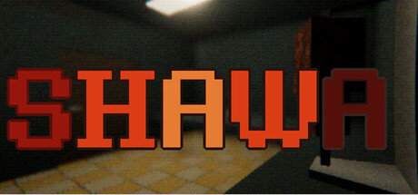
SHAWA scored 62/100 on Steam Analyzer — Solid for a Simulation capsule. Top priority fix: [genre_clarity] Add a shawarma stand prop, counter, or meat rotisserie visible in the interior to immediately signal the food-service genre and game subject matter.

Capsule scores by dimension

  • Genre Clarity: 5/10 — Ambiguous genre signals mixed. The pixelated 3D interior space suggests a management or simulation game, but the horror-game context provided is not visually communicated at any size. At tiny size, you see red text and an interior room, which could be any indie sim—no clear visual hooks for the 'horror when not prepared' unique mechanic. The capsule reads as generic management sim, not the psychological horror-simulation hybrid it actually is.
  • Title Readability: 8/10 — Bold pixelated title reads clearly. The all-caps 'SHAWA' in bright red-orange pixelated font stands out strongly against the dark interior background. At full size it is immediately legible; at small size (231x87) it remains readable with clear letter separation. The pixelated style maintains integrity at tiny size and creates a memorable retro aesthetic, though at tiny size individual pixels become slightly softer.
  • Contrast & Color: 7/10 — Strong value separation, warm tones pop. The red-orange title contrasts well against the dark greenish-gray interior walls and dark background. The warm orange gradient in the title creates strong luminosity separation from the cool-toned room. At tiny size the title remains visually distinct, though the interior detail is compressed into muddy mid-tones that lose definition.
  • Uniqueness & Polish: 5/10 — Clean execution but generic theme. The pixelated 3D interior space is competently rendered with perspective and shadow detail, showing craft in the 3D modeling and lighting. However, the capsule communicates only 'a room' with no visual hint of shawarma, food service, or the psychological horror mechanic that makes this game distinct. It feels like a generic interior scene with a title overlay, not a distinctive visual selling point.
  • Brand Consistency: 6/10 — Consistent style, limited identity signals. The pixelated 3D aesthetic is internally cohesive and matches the game's retro-indie visual language. However, there are no memorable iconographic elements—no shawarma stand details, no character, no signature color palette or motif that would make SHAWA instantly recognizable on repeated exposure. The brand identity relies entirely on the title text, not on visual distinctiveness.
  • Composition: 6/10 — Centered title, static focal point. The title dominates the upper-center area with a clear hierarchical focus, but the interior room below is compositionally flat with no clear secondary focal point or depth layering that guides the eye. The composition feels like title-on-background rather than a unified visual statement. At small and tiny sizes the room details collapse into visual noise, leaving only the title to carry the design.

What works

  • Bold pixelated title legibility. The red-orange 'SHAWA' maintains crisp letter forms and clear readability even at tiny thumbnail size due to high contrast and deliberate pixel-art spacing.
  • Strong color-value separation. The warm orange-red title pops decisively against the cool dark interior, creating immediate visual hierarchy and fast recognition during quick Steam scroll.
  • Coherent retro-indie aesthetic. The pixelated 3D rendering style is internally consistent and reinforces the game's indie identity without feeling cheap or template-based.

What hurts the capsule

  • No shawarma or food service visual cues. A player unfamiliar with the game would not recognize this as a food-service simulator from the capsule alone; the interior is generic and could represent any building type.
  • Missing horror-simulation unique hook. The capsule does not communicate the game's distinctive mechanic (the 'eye-tracking' horror element) visually, making it indistinguishable from standard management sims.
  • Flat composition with no depth storytelling. The room background feels static and decorative rather than purposeful; there is no visual hierarchy beyond the title that draws the eye or creates engagement at small sizes.
  • Interior detail loses clarity at scale reduction. At tiny size, the room geometry and shadow detail compress into muddy mid-tone blur, leaving the composition bottom-heavy and visually weak.

Priority fixes

  1. [genre_clarity] Add a shawarma stand prop, counter, or meat rotisserie visible in the interior to immediately signal the food-service genre and game subject matter.
  2. [uniqueness_polish] Include a visual motif that hints at the 'eye-tracking' horror mechanic—such as an AI camera, a watching figure, or an unsettling detail in the room that makes the game's core concept memorable.
  3. [composition] Introduce a secondary focal point in the room (a character, customer, or critical object) that creates depth layering and gives the eye somewhere to travel beyond the title.
  4. [brand_consistency] Establish a signature color accent or environmental detail in the room that could become an iconic SHAWA visual identifier across future marketing.

Store copy priority fixes

  1. [feature_communication] After 'PHYSICAL COOKING,' clarify the moment-to-moment gameplay loop: 'Spend your shift taking orders, preparing shawarma, and managing the stand. But as paranormal events escalate, survival depends on noticing what's wrong before it's too late.'
  2. [audience_targeting] Add a sentence in the short description or opening paragraph signaling difficulty and horror intensity, e.g., 'Built for horror fans who love observational puzzles and adaptive AI.' This helps self-selection.
  3. [feature_communication] Expand on the 'shawarma ritual' mechanic—briefly explain what it means and how it ties to survival, rather than leaving it cryptic.

Related guides

Steam app ID: 4418900 · Tags: Simulation, Psychological Horror, Horror, Immersive Sim, Shop Keeper