90° North scores 70/100 — better than 27% of Simulation capsules (n=5,188).

Quick text summary

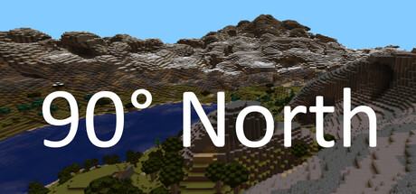
90° North scored 70/100 on Steam Analyzer — Good for a Simulation capsule. Top priority fix: [uniqueness_polish] Add a human figure or shelter structure in the mid-ground to communicate the survival gameplay and emotional scale of the expedition.

Capsule scores by dimension

  • Genre Clarity: 7/10 — Arctic survival setting clear. The voxel-style landscape with snow, rocky terrain, and blue water immediately signals a cold climate survival game. At tiny size, the snowy mountain and water silhouette remain readable and reinforce the polar expedition context. However, the generic blocky terrain does not uniquely distinguish this as a 3-day survival game versus a broader survival or exploration title.
  • Title Readability: 8/10 — Clean white text legible. The title '90° North' uses a bold sans-serif typeface in white with good contrast against the landscape. The text remains readable at small and tiny sizes due to letter spacing and weight. The degree symbol and cardinal direction work as a memorable, literal subtitle for the North Pole setting.
  • Contrast & Color: 8/10 — Strong light-dark separation. The white title text pops cleanly against the mid-tone rocky mountain and darker water below. The blue sky provides warm separation from the white lettering. At tiny size, the title and landscape silhouette maintain clear definition against the Steam dark background, though the mid-tone brown rock competes slightly with typical Steam UI gray.
  • Uniqueness & Polish: 6/10 — Competent but generic voxel style. The voxel-blocky art style is a recognized indie aesthetic but lacks distinctive visual hooks or stylistic flourishes that separate it from other survival games. The landscape is functional and clean but feels like a standard Minecraft-adjacent terrain with no signature art direction or unique survival-specific visual language. The capsule communicates location and theme but not the game's specific mechanical identity or narrative tension.
  • Brand Consistency: 6/10 — Minimal internal style identity. The voxel rendering and color palette (blue sky, brown rock, white snow) are consistent within the image but do not establish a memorable brand signature or iconic visual motif. Without reference to other store assets, this capsule reads as a generic arctic landscape rather than a cohesive branded experience. The title is the only strong identity cue; the environment itself lacks distinctive markers.
  • Composition: 7/10 — Clear hierarchy, safe margins. The title is centered and positioned in the mid-lower third, allowing the landscape to occupy the top two-thirds and create depth. The white text sits on a dark transition zone between sky and terrain, ensuring readability across all sizes. The composition is balanced and safe from Steam cropping, though the landscape fills most of the frame with no secondary focal point to anchor emotional engagement.

What works

  • Strong title contrast and readability. White sans-serif text with good letterform weight and spacing remains legible at tiny size against mid-tone rocky backdrop.
  • Thematic setting immediately apparent. Snowy mountain, blue water, and arctic terrain quickly signal a polar survival game without ambiguity.
  • Safe composition and cropping. Title and focal elements are well-positioned away from edges and maintain clarity across small, medium, and large sizes.

What hurts the capsule

  • Generic voxel aesthetic lacks distinction. The blocky art style is commonplace in indie games and does not visually differentiate 90° North from similar survival or exploration titles.
  • No visual representation of core survival mechanics. The capsule shows only a landscape; there are no visual cues about cold management, shelter building, resource gathering, or the urgency of a three-day deadline.
  • Minimal brand identity or iconic elements. The landscape is functional but interchangeable; there is no signature character, symbol, or stylistic marker that would make this capsule recognizable in future marketing.

Priority fixes

  1. [uniqueness_polish] Add a human figure or shelter structure in the mid-ground to communicate the survival gameplay and emotional scale of the expedition.
  2. [brand_consistency] Introduce a distinctive visual motif or color accent (e.g., warm campfire, survival gear silhouette) that can become a recognizable brand element across assets.
  3. [genre_clarity] Include subtle UI or HUD elements (e.g., temperature meter, resource icons) that visually hint at the survival simulation mechanics and decision-making core.

Store copy priority fixes

  1. [uniqueness] Add a sentence explaining what makes the survival mechanics or decision-making system unique compared to other survival games (e.g., 'loadout choices have permanent consequences' or 'dynamic weather vs. static challenges').
  2. [audience_targeting] Include a brief phrase indicating secondary audience appeal (e.g., 'speedrunners and challenge-seekers' or 'experimental narrative focus') to broaden perceived relevance without diluting core messaging.
  3. [feature_communication] Clarify the scope of world interaction: are there NPCs, environmental hazards, dynamic weather, or other interactive systems that influence survival strategy beyond resource gathering?

Related guides

Steam app ID: 4420290 · Tags: Simulation, RPG, Adventure, Survival, Exploration