Scoring genre clarity...

Bombs And Bugs capsule

Bombs And Bugs

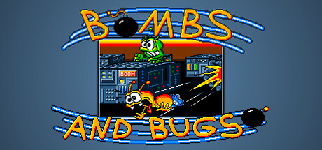
Bombs and Bugs is back! This remaster of the original 1997 DOS version of the game keeps the fun going while four bugs try to bomb each other into oblivion. The last bug standing wins the match! Couch multiplayer at its best.

$4.991 user reviews
4 Player LocalRetroAction
eilowareMar 13, 2026

Bombs And Bugs scores 82/100 — better than 88% of 4 Player Local capsules (n=367).

1 user reviews · $4.99 · Released Mar 13, 2026 · By eiloware

Quick text summary

Bombs And Bugs scored 82/100 on Steam Analyzer — Good for a 4 Player Local capsule. Top priority fix: [uniqueness_polish] Add a subtle visual effect or unique color accent (like a glow or particle element) to the bug character to distinguish it as a premium remaster rather than a straight 1997 port.

Capsule scores by dimension

  • Genre Clarity: 8/10 — Clear arcade action gameplay. The pixel art style, bomb mechanics, colorful bug characters, and retro game UI immediately signal classic arcade action-puzzle gameplay. At tiny size, the bright character sprites and explosive visual language remain readable enough to convey competitive multiplayer chaos. The 1997 DOS aesthetic is authentically communicated through the visual presentation.
  • Title Readability: 9/10 — Bold orange title highly legible. The yellow-orange "BOMBS AND BUGS" text with blue outline strokes is positioned prominently at top and bottom, creating strong framing and excellent contrast against the slate-blue background. At tiny size, the thick letterforms and high saturation ensure the title remains clearly readable without collapse. The double-text approach reinforces brand recall even at minimal sizes.
  • Contrast & Color: 9/10 — Vibrant colors pop cleanly. Bright yellow-orange text, vivid green bug character, neon yellow-orange gameplay elements, and explosive blue outlines create strong value and hue separation against the cool blue background. The high saturation palette and clear light-dark contrast between foreground sprites and background maintain silhouette clarity across all viewing sizes. Even in grayscale simulation, the value range remains distinct and readable at tiny sizes.
  • Uniqueness & Polish: 7/10 — Retro charm with solid craft. The pixel art remaster maintains authentic 1997 DOS aesthetic with clean sprite work and intentional retro styling that feels purposeful rather than lazy. The composition centers the gameplay screenshot with character interaction, clearly communicating the couch multiplayer core mechanic. However, the design reads as competently executed nostalgia rather than a standout visual innovation—it prioritizes period authenticity over distinctive modern polish.
  • Brand Consistency: 8/10 — Strong retro arcade identity. The pixel art style, arcade cabinet UI elements, bright neon color palette, and bug character designs create a cohesive and immediately recognizable brand signature. The consistent yellow-orange and neon-blue color scheme frames both title and gameplay imagery, building visual continuity. The retro aesthetic is so distinctive that it signals "classic arcade game" reliably across sizes.
  • Composition: 8/10 — Well-balanced centered layout. The title anchors top and bottom with gameplay screenshot centered, creating strong vertical rhythm and framing that works across all sizes. The bug characters and bomb action occupy the safe central zone with proper margins, and the composition remains resilient even at tiny 120x45 thumbnail size. The layered depth of title-image-title creates clear hierarchy without clutter or competing focal points.

What works

  • Excellent title contrast and legibility. Yellow-orange stroked text reads clearly at all sizes including tiny thumbnail, with high saturation and outline strategy preventing collapse.
  • Strong genre communication. Pixel art style, bomb mechanics, colorful bug sprites, and arcade UI immediately signal multiplayer action-arcade gameplay without ambiguity.
  • Cohesive retro brand identity. Consistent neon color palette, arcade aesthetic, and character design build a memorable and instantly recognizable visual signature.
  • Clean balanced composition. Centered layout with strong top-bottom title framing maintains hierarchy and focal clarity across full header and tiny thumbnail sizes.

What hurts the capsule

  • Limited visual polish compared to benchmarks. While the retro aesthetic is intentional, the design lacks the premium craft and distinctive artistic innovation seen in top-performing genre capsules like Hades II or DREDGE.
  • Generic retro presentation. The pixel art style, while authentic to the original, reads as derivative nostalgia rather than a unique selling point that differentiates it from other retro arcade games.

Priority fixes

  1. [uniqueness_polish] Add a subtle visual effect or unique color accent (like a glow or particle element) to the bug character to distinguish it as a premium remaster rather than a straight 1997 port.
  2. [genre_clarity] Ensure bomb explosion effects or score UI elements are more prominent in the central screenshot to emphasize competitive multiplayer mechanics at tiny size.

Store copy priority fixes

  1. [uniqueness] Add a sentence explaining what makes the core gameplay compelling: e.g., 'Master bomb trajectory and power-up timing to outmaneuver rivals' or a specific example of tactical depth.
  2. [feature_communication] Expand the power-ups section with concrete examples: 'Collect shields, rapid-fire bombs, speed boosts, and more' so players visualize the gameplay variety.
  3. [hook_strength] Add a secondary hook in the short description for new players, such as 'Whether you're a series veteran or trying it for the first time, chaotic 4-player bomb battles deliver instant fun.' to broaden appeal.
  4. [tone_match] Tighten the awkward phrasing to 'The remaster stays faithful to the original while adding modern comforts:' for clearer, more confident voice.

Related guides

Steam app ID: 4421990 · Tags: 4 Player Local, Retro, Action, Local Multiplayer, Multiplayer