Scoring genre clarity...
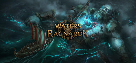
Waters of Ragnarök capsule

Waters of Ragnarök

Waters of Ragnarök is a tactical naval survival game set after the Norse apocalypse. Navigate cursed seas, explore the lands, scavenge the massive corpses of Jötunns, and lead your crew through tactical battles against survivors and monsters in this Norse survival exploration game.

AdventureActionNaval Combat
Polar Region GamesTo be announced

Waters of Ragnarök scores 82/100 — better than 95% of Adventure capsules (n=8,231).

Released To be announced · By Polar Region Games

Quick text summary

Waters of Ragnarök scored 82/100 on Steam Analyzer — Good for a Adventure capsule. Top priority fix: [genre_clarity] Add a subtle gameplay-specific visual cue such as crew silhouettes on the ship deck or tactical UI elements to communicate the naval-tactical survival angle and differentiate from general Norse adventure games.

Capsule scores by dimension

  • Genre Clarity: 8/10 — Norse naval survival clearly signaled. The Viking longship with distinctive red sail and rigging in the left-center, combined with the ethereal blue-glowing giant figure and stormy Norse aesthetic, immediately communicates a Viking-themed action adventure. At tiny size, the ship silhouette and mystical lighting remain recognizable enough to suggest naval and supernatural elements, though the specific survival-tactical gameplay isn't obvious from visuals alone.
  • Title Readability: 8/10 — Gold serif title stands strong. The gold serif text 'WATERS OF RAGNARÖK' is positioned prominently in the center-upper region with warm yellow-gold coloring that contrasts well against the cool blue-teal background. The letterforms remain readable at small size, and the centered placement on a relatively clear background area protects legibility across viewing sizes.
  • Contrast & Color: 9/10 — Excellent cool-warm separation. The composition leverages strong value and temperature contrast: cool cyan-blue mystical lighting and water effects dominate, anchored by warm gold title and reddish-brown ship details, creating excellent silhouette separation against the dark Steam background #1b2838. In grayscale, the giant figure and ship maintain clear edge definition; the design pops immediately on quick scroll.
  • Uniqueness & Polish: 8/10 — Premium Norse mythic production. The image demonstrates high craft quality with sophisticated lighting effects, detailed ship modeling, and a cohesive dark Norse fantasy atmosphere that feels intentional rather than templated. The glowing giant corpse and magical water effects communicate a distinctive post-apocalyptic Norse setting and hint at the unique scavenging mechanic, setting it apart from generic Viking games.
  • Brand Consistency: 8/10 — Strong Norse mythic visual identity. The capsule establishes a clear and consistent visual brand: mystical blue-teal lighting, Norse ship design, giant mythological figures, and apocalyptic atmosphere. These elements align with Ragnarök lore and would be recognizable across promotional materials; the color palette and gothic-mystical tone create a memorable identity distinct from other survival games.
  • Composition: 8/10 — Clear focal hierarchy, well-balanced. The giant figure anchors the right side as primary focal point, the ship provides secondary interest on the left, and the gold title sits cleanly in the center-upper safe zone. The depth layering—foreground ship, midground water effects, background giant and sky—creates readable hierarchy even at tiny size, with no competing elements or dead zones that distract from the core theme.

What works

  • Strong contrast against Steam background. The cool cyan-blue tones and warm gold title separate cleanly from the dark #1b2838 background, ensuring the capsule pops immediately in a browsing context.
  • Legible centered title placement. Gold serif 'WATERS OF RAGNARÖK' is positioned on a relatively clear background region and maintains readability from full size down to tiny thumbnail.
  • Cohesive Norse apocalypse storytelling. The ship, glowing giant corpse, and mystical lighting work together to communicate a distinctive post-apocalyptic Norse setting that hints at core gameplay (scavenging, exploration).
  • Clear focal hierarchy at all sizes. The giant figure anchors attention on the right while the ship and title guide the eye without competing; the composition remains readable even when squinted or viewed at tiny size.

What hurts the capsule

  • Limited tactical/survival gameplay hints. While the Norse theme is clear, the capsule doesn't visually communicate the tactical naval combat or crew-management mechanics that differentiate this survival game from other Norse adventures.
  • Atmospheric but not unique within genre. The dark mystical Norse aesthetic is executed well but resonates with other high-profile Norse titles (God of War Ragnarök), so the visual hook doesn't feel distinctly 'Waters of Ragnarök' specific enough to stand out in a crowded genre.

Priority fixes

  1. [genre_clarity] Add a subtle gameplay-specific visual cue such as crew silhouettes on the ship deck or tactical UI elements to communicate the naval-tactical survival angle and differentiate from general Norse adventure games.
  2. [uniqueness_polish] Introduce a distinctive brand motif—such as a unique sail design, crew emblem, or signature curse effect—that appears consistently across promotional materials to create stronger brand recognition.

Related guides

Steam app ID: 4422960 · Tags: Adventure, Action, Naval Combat, Vikings, Medieval