Scoring genre clarity...

Iron Legacy capsule

Iron Legacy

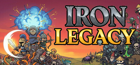
Master the grind in Iron Legacy, a nostalgic 2D Action RPG inspired by the classics. Hunt hordes of monsters, master powerful spells, and push your limits with a deep Reset system. Whether solo or in co-op, forge your legacy through blood, loot, and infinite progression. Become a Legend!

$9.993 user reviews
Class-BasedRPGHack and Slash
Static FluidMar 5, 2026

Iron Legacy scores 78/100 — better than 86% of Class-Based capsules (n=295).

3 user reviews · $9.99 · Released Mar 5, 2026 · By Static Fluid

Quick text summary

Iron Legacy scored 78/100 on Steam Analyzer — Good for a Class-Based capsule. Top priority fix: [brand_consistency] Introduce a more distinctive visual hook or iconic character close-up in future iterations to increase memorability and recognition beyond the retro aesthetic.

Capsule scores by dimension

  • Genre Clarity: 8/10 — Strong action RPG signals. The capsule clearly communicates a 2D action RPG through multiple cues: armored warriors with swords positioned in combat stance, magical blue explosion effect top-center, enemy silhouettes on the right including skeletal and demonic creatures, and a warm fantasy landscape. At tiny size, the character cluster and spell effect remain readable enough to identify the action-RPG genre, though fine detail softens.
  • Title Readability: 8/10 — Bold readable title with strong contrast. IRON LEGACY uses thick metallic gray lettering with solid black outline, positioned prominently in the upper-middle area against the warm gradient background. The title maintains legibility at small and tiny sizes due to high contrast and weight. LEGACY in golden-yellow ensures separation from IRON's silver tone, creating visual hierarchy that survives compression.
  • Contrast & Color: 9/10 — Excellent value separation and saturation. The capsule demonstrates masterful contrast against the dark Steam background through a warm sunset gradient (orange-to-pink sky), cool blue magical effect as a focal pop, and dark silhouetted characters and enemies. The grayscale squint test shows clear light-to-dark transitions: bright sky, mid-tone characters, and deep shadow creatures. The blue explosion reads distinctly even at tiny size due to saturation and position.
  • Uniqueness & Polish: 7/10 — Polished retro style with solid execution. The artwork displays clean pixel-art or sprite-based character rendering consistent with the 'nostalgic 2D Action RPG' positioning, with intentional visual storytelling showing a diverse cast of warriors in varied armor and roles. The composition avoids generic template feel, but the scene itself—adventurers against monsters in a fantasy landscape—is a familiar archetype. Craft quality is evident in the detail work and coherent art direction, though the concept doesn't feel groundbreaking compared to top-tier indie standouts.
  • Brand Consistency: 7/10 — Consistent retro pixel aesthetic cohesion. Internal cohesion is strong: all characters, enemies, and UI elements use a unified pixel-art style with consistent outline weight and color palette (earth tones, metallics, glowing spell effects). The warm sky-to-ground composition and character lineup suggest a recognizable visual identity, though without access to the 5 additional screenshots, it is difficult to confirm whether this capsule establishes iconic character or motif recognition beyond the general retro aesthetic.
  • Composition: 8/10 — Strong hierarchy with clear focal layers. The composition uses effective depth: bright sky and explosion at top, character group in the middle ground as primary focal point, enemies and landscape in the background, and title overlaid center-top without obscuring subjects. The grouped warriors create a unified anchor that survives compression to small and tiny sizes. Margins are well-managed; no critical elements touch dangerous edges, and the layout maintains balance even as detail softens at smaller scales.

What works

  • Exceptional contrast against dark background. The warm orange-pink gradient and cool blue spell effect create strong value separation that ensures the capsule pops during quick scrolls and reads clearly in grayscale contrast tests.
  • Title legibility at all sizes. Thick metallic lettering with bold black outlines and yellow accent maintain readability from full header down to tiny thumbnail, supporting fast recognition.
  • Clear genre communication through visual cues. Character poses, armor detail, magical effects, and enemy variety immediately signal action-RPG gameplay without ambiguity, meeting the 'generic theme' penalty avoidance.
  • Balanced composition with depth. Multi-layered foreground-midground-background arrangement with a clear focal point (warrior group) prevents scattered attention and maintains hierarchy at all scales.

What hurts the capsule

  • Familiar archetypal concept. While well-executed, the 'heroes vs. monsters in fantasy landscape' scene feels conventional compared to standout indie titles that communicate unique mechanics or memorable hooks.
  • Limited iconic identity differentiation. Without a standout character face, signature symbol, or memorable color motif beyond the retro style itself, the capsule may not create lasting brand recall in a crowded genre.

Priority fixes

  1. [brand_consistency] Introduce a more distinctive visual hook or iconic character close-up in future iterations to increase memorability and recognition beyond the retro aesthetic.
  2. [uniqueness_polish] Consider adding a unique mechanic visualization (e.g., reset system indicator, progression overlay, or loot glow effect) to differentiate from generic action-RPG scenes.

Store copy priority fixes

  1. [hook_strength] Replace 'Become a Legend!' with a specific gameplay verb or outcome: 'Farm legendary gear solo or crush dungeons with 9 friends in this hardcore 2D grinder.' This leads with action and clarifies scale immediately.
  2. [uniqueness] Add a standalone sentence after the opening paragraph that articulates the single biggest differentiator: 'Unlike other grinders, Iron Legacy's Rebirth system ensures no two playthroughs feel the same—permanent power scales infinitely across lifetimes of resets.' This explicitly owns a 'why this game' reason.
  3. [audience_targeting] Expand the solo player value proposition in the detailed description with a sentence like 'Solo farmers can master any zone at their own pace; co-op squads multiply rewards through shared progression and synergy bonuses.' This clarifies both paths equally.
  4. [tone_match] Clarify the 'hardcore' vs. 'relaxing' tension by adding: 'Relaxing grind means no timed input pressure or PvP stress—only your pace, your build, your challenge.' This resolves the tag conflict and sets expectations.

Related guides

Steam app ID: 4426240 · Tags: Class-Based, RPG, Hack and Slash, Action RPG, Casual