Scoring genre clarity...

Rage Rock capsule

Rage Rock

A challenging physics rage platformer where you launch a stubborn rock up a mountain.

$4.991 user reviews
Action2D PlatformerIndie
Abdulrahim Al MethiabMar 6, 2026

Rage Rock scores 63/100 — better than 5% of Action capsules (n=8,534).

1 user reviews · $4.99 · Released Mar 6, 2026 · By Abdulrahim Al Methiab

Quick text summary

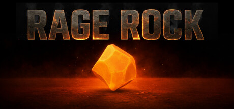
Rage Rock scored 63/100 on Steam Analyzer — Solid for a Action capsule. Top priority fix: [genre_clarity] Add a character or figure interacting with the rock (pushing, launching, or climbing) to immediately signal physics platformer mechanic at tiny size.

Capsule scores by dimension

  • Genre Clarity: 5/10 — Ambiguous genre signals. The glowing orange rock is eye-catching but doesn't clearly communicate 'platformer' or 'physics rage game' at tiny size. The dark, moody lighting and geometric crystal suggest puzzle or crafting game rather than action platformer. At small size, the rock reads as an object of focus but the genre remains unclear without additional UI or character context.
  • Title Readability: 7/10 — Strong readable title placement. RAGE ROCK is rendered in bold metallic bronze lettering at the top with clear outline and strong contrast against the dark background. The title reads well at full and small sizes, though at tiny size the metallic texture becomes slightly soft but letterforms remain identifiable. Tagline or secondary text is not present to clutter the hierarchy.
  • Contrast & Color: 8/10 — Excellent warm-cool separation. The bright orange-yellow glowing rock creates strong value contrast against the dark surrounding environment and Steam's #1b2838 background. The warm glow emanates outward with atmospheric haze, creating clear silhouette separation and immediate visual pop in quick scroll. Grayscale mental test shows solid mid-to-bright tones for the rock against dark surrounds.
  • Uniqueness & Polish: 6/10 — Competent but thematically generic. The glowing geometric rock is well-executed with clean lighting and particle effects, but the concept of a glowing crystal on dark ground is a common asset store trope. The image communicates 'object with purpose' but lacks distinctive visual storytelling that signals the unique mechanic of launching a stubborn rock up a mountain. Polish is present but the idea feels standard for indie action games.
  • Brand Consistency: 5/10 — No memorable identity cues. The capsule shows a solitary rock with no character, icon, or thematic motif that would be recognizable across marketing materials or store screenshots. The metallic title font is solid but generic to action games. Without reference to the 6 available screenshots, this image alone provides no distinctive brand signal or memorable identity marker.
  • Composition: 7/10 — Clear centered focal point. The glowing rock sits naturally centered in the frame with atmospheric ground haze creating depth and visual grounding. The title occupies the top safely away from crop lines, and the rock remains the primary focal point without competing elements. At tiny size, the centered composition reads cleanly, though the empty upper-left and right quadrants create slight imbalance.

What works

  • Vibrant warm contrast pop. The bright orange-yellow rock creates excellent value separation against the dark background and reads immediately in quick scroll.
  • Legible title hierarchy. RAGE ROCK title is bold, metallic, and maintains readability at small and tiny sizes with clean outline definition.
  • Professional lighting craft. The glow effect, particle haze, and atmospheric rendering around the rock feel polished and intentional.

What hurts the capsule

  • Genre ambiguity at thumbnail. The glowing rock and dark moody lighting suggest puzzle or crafting game rather than action platformer, creating confusion about game type.
  • Generic visual concept. The glowing geometric crystal on dark ground is a common indie asset store aesthetic without distinctive mechanical storytelling.
  • Weak brand identity signals. No character, icon, or thematic motif present to create a recognizable and memorable visual identity for the game.

Priority fixes

  1. [genre_clarity] Add a character or figure interacting with the rock (pushing, launching, or climbing) to immediately signal physics platformer mechanic at tiny size.
  2. [brand_consistency] Introduce a distinctive visual motif or character silhouette that appears in store screenshots to create recognizable brand identity.
  3. [uniqueness_polish] Incorporate visual storytelling that communicates the 'rage' mechanic—consider motion blur, frustrated impact, or environmental destruction around the rock.

Store copy priority fixes

  1. [feature_communication] Expand the mechanics section to explain how rock physics work (weight, momentum, bounce) and what makes steering it distinct from controlling a character.
  2. [uniqueness] Add a sentence differentiating the physics system or level design from other precision platformers, e.g., 'Each level requires mastery of momentum and timing in ways traditional platformers don't.'
  3. [feature_communication] Clarify the progression structure—number of levels, difficulty scaling, and what the 'maybe one checkpoint' actually means for players.

Related guides

Steam app ID: 4426580 · Tags: Action, 2D Platformer, Indie, Precision Platformer, 2D