Chess Defense scores 67/100 — better than 15% of Strategy capsules (n=5,103).

Quick text summary

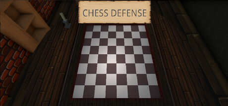
Chess Defense scored 67/100 on Steam Analyzer — Solid for a Strategy capsule. Top priority fix: [genre_clarity] Add 1-2 visible chess pieces positioned as defensive towers or show pieces in tactical formation to clarify the tower defense strategy layer.

Capsule scores by dimension

  • Genre Clarity: 7/10 — Chess strategy clearly signaled. The checkboard board dominates the center with iconic black-and-white squares, immediately communicating a chess-themed game. The wooden setting and formal presentation suggest strategy, though the tower defense + chess hybrid mechanic is not visually explicit at tiny size. At TINY size, the board remains readable and the genre is clear as chess-strategy, but the tower defense layer requires prior knowledge.
  • Title Readability: 8/10 — Clear title on controlled background. The title 'CHESS DEFENSE' appears in a cream-colored banner at the top center with strong contrast against the dark wood texture background. The letterforms are clean and legible at full size and remain readable at small size due to the light backing and sans-serif font. At TINY size, the text holds together, though slight loss of crispness occurs but does not impair recognition.
  • Contrast & Color: 7/10 — Strong value separation, warm tones. The light checkboard and cream title banner pop clearly against the dark brown wooden foreground and background, creating solid value contrast. Warm wood tones create visual depth, and the grayscale checkboard provides high contrast silhouette. The dark edges and brick/wood framing pull the eye inward, though some mid-tone blending occurs in the shadow areas around the board edges at tiny size.
  • Uniqueness & Polish: 6/10 — Competent but familiar execution. The presentation is clean and well-lit with intentional photorealistic rendering of the board and wooden setting, conveying premium craft. However, the composition is fairly literal and template-like—a board shot from above in a generic wooden room without visual storytelling of the tower defense mechanic or unique selling point. This reads as a solid but generic strategy game presentation rather than a memorable, distinctive identity.
  • Brand Consistency: 5/10 — Generic chess presentation, low identity. The capsule uses expected chess visual language (board, wooden setting) but contains no iconic character, signature color palette, or memorable motif that would allow recognition in future marketing. The brown-and-cream palette is pleasant but not distinctive, and there are no visual hooks that communicate the tower defense twist or differentiate this from a standard chess app. Internal elements are cohesive, but the overall brand signal is weak.
  • Composition: 7/10 — Clear focal point, good depth layering. The checkboard is the clear primary focal point centered in the frame with strong layering: wooden foreground (left/right edges), board in midground, blurred wood background creating depth. The title placement at top does not compete with the board. Safe margins are respected and the composition holds well across sizes. At TINY size, the board remains the clear anchor, though the surrounding wooden detail becomes abstract texture that supports rather than distracts.

What works

  • Readable title with strong backing. The cream banner provides clean contrast and keeps text legible even at small sizes without requiring decorative fonts.
  • Clear chess identity and immediate recognition. The iconic checkboard is instantly recognizable and communicates the game's core theme clearly at all viewing sizes.
  • Solid value contrast and depth. The warm wood framing and cool board squares create visual separation that pops against the dark Steam background.

What hurts the capsule

  • No visual communication of tower defense mechanic. The capsule shows only a static chess board with no chess pieces, units, towers, or gameplay elements that explain the tower defense hybrid genre.
  • Generic, unmemorable visual identity. The wooden-room-and-board aesthetic feels like a template common to many chess apps and lacks distinctive branding that would stand out in repeat exposure.
  • Literal composition lacks narrative hook. The shot is a straightforward overhead board photo without visual storytelling that communicates unique gameplay, tone, or core mechanic.

Priority fixes

  1. [genre_clarity] Add 1-2 visible chess pieces positioned as defensive towers or show pieces in tactical formation to clarify the tower defense strategy layer.
  2. [uniqueness_polish] Introduce a signature color accent or lighting effect (e.g., glowing piece, elemental aura, threat indicator) that hints at the tower defense combat and creates memorable branding.
  3. [composition] Layer a second focal point such as an active game state or incoming enemy visual to communicate conflict and reinforce the defense theme beyond a static board.

Store copy priority fixes

  1. [feature_communication] Expand the feature list to include: roguelike run structure (if present), progression or unlocks, difficulty modes, and number of playable chess pieces or map variety.
  2. [audience_targeting] Add a sentence clarifying the difficulty curve: e.g., 'Casual players welcome—start simple, master complex mazes' or 'Hardcore strategy veterans only' to set proper expectations.
  3. [uniqueness] Add a differentiation line such as 'The only tower defense where you build both the weapons and the battlefield' to strengthen the unique value proposition.
  4. [genre_clarity] Briefly mention roguelike structure early in the detailed description to reconcile the 'Roguelike' tag with the static tower placement mechanic.

Related guides

  • Steam page optimisationCapsule, copy, screenshots, tags — the full Steam page conversion stack.
  • Steam tags guideTag selection, ordering, and how it shapes Steam's recommendation rails.

Steam app ID: 4429130 · Tags: Strategy, Singleplayer, Chess, Tower Defense, Casual