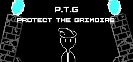
Protect the Grimoire scores 68/100 — better than 15% of Shoot 'Em Up capsules (n=814).

Quick text summary

Protect the Grimoire scored 68/100 on Steam Analyzer — Solid for a Shoot 'Em Up capsule. Top priority fix: [uniqueness_polish] Replace generic brick borders with thematic grimoire-related iconography or dynamic spell effect elements that reinforce the game's magical action identity and add polish.

Capsule scores by dimension

  • Genre Clarity: 7/10 — Bullet hell roguelite clearly shown. The stick figure protagonist with a grimoire above, cyan projectiles in corners, and dark wizard tower aesthetic communicate action gameplay and magic theme effectively. At tiny size, the cyan projectiles and centered character silhouette still read as combat-focused, though the specific roguelite/bullet hell subgenre requires prior knowledge to fully grasp.
  • Title Readability: 8/10 — Clear hierarchy, readable at all sizes. The acronym P.T.G in large white caps at top and full title PROTECT THE GRIMOIRE below maintain legibility from full header down to tiny thumbnail thanks to clean sans-serif and strong contrast against black background. Even at 120x45, the white text silhouette remains distinguishable, though the full tagline becomes less important at that scale.
  • Contrast & Color: 8/10 — Strong cyan and white against black. Bright cyan circular emblems in top corners and white title text create excellent separation against the pure black background. The white stick figure and outline art maintain silhouette clarity even at small sizes, and the grayscale contrast remains strong with high value separation across all viewing scales.
  • Uniqueness & Polish: 6/10 — Competent indie pixel style, generic execution. The pixel art aesthetic and stick figure protagonist fit the indie roguelite space but feel somewhat generic without distinctive visual storytelling or memorable art hooks. The layout is functional and clean but does not communicate what makes this game mechanically unique compared to other bullet hell titles in the crowded genre.
  • Brand Consistency: 5/10 — Minimal identity signals, lacks iconic hook. The stick figure and cyan projectiles are functional but do not establish a memorable or distinctive brand identity that would be recognizable across marketing materials or future promotional content. The black and white pixel aesthetic is common in indie games and does not suggest a unique visual trademark or signature motif.
  • Composition: 7/10 — Balanced layout, clear focal hierarchy. The centered stick figure acts as strong primary focal point with title stacked above and cyan elements framing the composition symmetrically on left and right. At small sizes the composition remains intact and readable, though the brick pattern side elements become visual noise at tiny scale rather than meaningful design support.

What works

  • Excellent title contrast and legibility. White text on pure black background ensures the P.T.G acronym and full title remain readable at all viewing scales including tiny thumbnails.
  • Clear visual hierarchy and focal point. Centered stick figure with title above creates an intuitive reading order that guides attention efficiently without competing elements.
  • Thematic cyan projectile framing. The cyan elements in corners immediately suggest magical action gameplay and break up the black background with strategic color placement.

What hurts the capsule

  • Brick pattern borders lack purpose. The gray brick textures on left and right edges add visual clutter that disappears or muddles at small sizes without meaningfully enhancing the design or narrative.
  • Generic pixel art without distinctive style. The stick figure and monochrome aesthetic feel placeholder-like and do not establish memorable brand identity compared to top-performing indie titles.
  • Lacks unique selling point communication. The capsule does not visually convey what differentiates this roguelite bullet hell from competitors; it reads as a functional game announcement rather than a compelling hook.

Priority fixes

  1. [uniqueness_polish] Replace generic brick borders with thematic grimoire-related iconography or dynamic spell effect elements that reinforce the game's magical action identity and add polish.
  2. [brand_consistency] Design a distinctive character or grimoire visual motif that is memorable and iconic enough to anchor future marketing and social media recognition.
  3. [composition] Replace or repurpose the brick textures as subtle background detail rather than prominent framing to reduce noise and increase focus on the central action.

Store copy priority fixes

  1. [uniqueness] Add a sentence explicitly stating what differentiates Protect the Grimoire from other roguelites (e.g., 'the pet-fusion system' or 'dynamic spell combination mechanics' if true).
  2. [feature_communication] Expand the detailed description to 200+ words and structure it with subheadings to clarify core loop: how runs work, how builds are created, and how progression unlocks new content.
  3. [audience_targeting] Add a sentence targeting a specific player type: e.g., 'Perfect for roguelite fans who want accessible difficulty with deep build crafting' or 'Ideal for players wanting cozy bullet-hell action without punishing difficulty.'

Related guides

Steam app ID: 4429260 · Tags: Shoot 'Em Up, Bullet Hell, Roguelite, Roguelike, Strategy