Scoring genre clarity...

Bighead Duel capsule

Bighead Duel

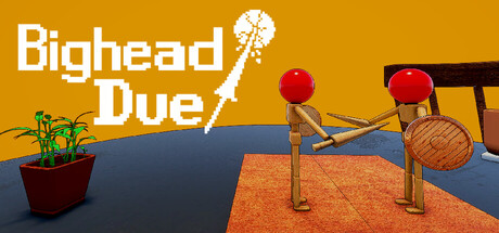
Experience physics-based tabletop duels nspired by balloon-popping games. Control both arms and burst your opponent’s head balloon to win! Complete challenging missions, earn rewards, and fight friends or players worldwide through quick matchmaking.

$3.993 user reviews
MultiplayerTabletop3D Fighter
Kim HyunwooApr 2, 2026

Bighead Duel scores 72/100 — better than 39% of Multiplayer capsules (n=2,820).

3 user reviews · $3.99 · Released Apr 2, 2026 · By Kim Hyunwoo

Quick text summary

Bighead Duel scored 72/100 on Steam Analyzer — Good for a Multiplayer capsule. Top priority fix: [composition] Shift the right arm cannon and balloon slightly left and lower to ensure critical focal elements stay safely away from edge crop zones at small and tiny sizes.

Capsule scores by dimension

  • Genre Clarity: 7/10 — Physics game with clear mechanics. The capsule immediately communicates a physics-based casual game through the wooden arm cannons with red spheres and tabletop setting. At tiny size, the arm cannons and balloon heads remain recognizable as the core mechanic, though the specific 'duel' competitive angle is less obvious. The potted plant and orange platform reinforce a miniature game world aesthetic.
  • Title Readability: 8/10 — Bold, clean, highly legible. The 'Bighead Duel' title uses large white sans-serif typography with excellent contrast against the warm gold background and is positioned safely in the upper left away from mechanical clutter. At small and tiny sizes, the title remains fully readable with no degradation in letterform clarity. The exclamation point adds personality without sacrificing legibility.
  • Contrast & Color: 8/10 — Warm gold background pops well. The rich golden-orange background provides strong value separation from the dark blue table platform and wooden elements, creating clear silhouette definition. At tiny size, the red balloon heads pop distinctly against both the gold and blue zones, maintaining visual clarity even under quick scroll. The grayscale squint test shows solid light-dark separation across all key elements.
  • Uniqueness & Polish: 7/10 — Charming tabletop aesthetic, minor generic feel. The wooden arm cannons and miniature diorama setting give the capsule a warm, handcrafted appeal that feels intentional and cohesive. However, the scene reads as a straightforward game mechanic visualization rather than a distinctive visual hook or narrative moment; it communicates 'what you do' but not 'why it matters.' The polish is solid—no cheap asset vibe—but positioning it among top indie peers reveals it lacks the memorable stylistic signature of games like Balatro or DAVE THE DIVER.
  • Brand Consistency: 6/10 — Competent but no strong identity marker. The warm color palette and wooden tabletop aesthetic are internally consistent and create a cohesive presentation. However, without iconic character silhouettes, signature symbols, or recurring motifs visible, the capsule lacks a memorable brand cue that would trigger recognition in a library view or social context. The style is functional and pleasant but does not establish a distinctive identity.
  • Composition: 7/10 — Clear hierarchy with slight crowding right. The title anchors the upper left with strong visual weight, and the tabletop scene is well-layered with potted plant, platform, and arm cannons creating depth. The focal point (red balloons and arms) sits in the center-right, which works well at full size; however, at tiny size, the mechanical elements on the right edge approach Steam's crop boundary and may lose impact. The composition balances nicely overall but benefits from the title's strong positioning to prevent a bottom-heavy feel.

What works

  • Title legibility at all sizes. Bold white sans-serif with excellent contrast against gold background remains fully readable and recognizable even at tiny thumbnail size.
  • Warm, inviting color palette. The golden background and natural wood tones create a welcoming, premium feel that stands out against Steam's dark interface.
  • Clear mechanic communication. Wooden arm cannons and red balloons immediately convey the physics-based dueling mechanic without ambiguity.
  • Depth and layering. Potted plant, platform, and mechanical elements create a cohesive miniature world with good foreground-midground-background separation.

What hurts the capsule

  • Generic visual hook. The scene shows game mechanics but lacks a distinctive narrative or stylistic moment that creates emotional engagement or lasting brand memory.
  • Right edge crowding at tiny size. The right arm cannon and suspended balloon sit close to the edge and may lose emphasis or get cropped when viewed as a small thumbnail in library lists.
  • No iconic character or symbol. The capsule relies entirely on mechanical depiction; there is no recognizable mascot, recurring motif, or symbolic element that could serve as brand recognition shorthand.

Priority fixes

  1. [composition] Shift the right arm cannon and balloon slightly left and lower to ensure critical focal elements stay safely away from edge crop zones at small and tiny sizes.
  2. [uniqueness_polish] Introduce a distinctive visual storytelling element—such as a character face expression, unique environment detail, or signature style flourish—that elevates the capsule beyond mechanical depiction and creates brand recall.
  3. [brand_consistency] Establish and prominently feature one recurring iconic symbol or character trait (e.g., a 'bighead' balloon character with personality) to build recognizable brand identity across store assets.

Store copy priority fixes

  1. [hook_strength] Fix the typo 'nspired' to 'Inspired' and reorder the short description to lead with 'Control both arms and burst your opponent's head balloon' before mentioning missions and matchmaking.
  2. [feature_communication] Add a sentence explaining how weapon and shield customization directly impacts playstyle (e.g., 'Choose a heavy shield for defense or dual weapons for aggressive rushes') to clarify progression and choice depth.
  3. [audience_targeting] Add language signaling the intended player: either 'Pick up and play casual fun' or 'Master timing and physics for competitive duels' to help the right audience self-identify immediately.

Related guides

Steam app ID: 4430740 · Tags: Multiplayer, Tabletop, 3D Fighter, Singleplayer, Swordplay